Widget Options
The ‘cog wheel’ button  (in the upper right corner of a widget) will open a pop-up window that allows you to change the options for the widget.
This Option Editor consists of several tabs. It depends on the widget type which tabs are available. Tabs that are available for most of the widgets are:
Widget Options List
Important
Note
Option changes are automatically saved to the WebUI Server.
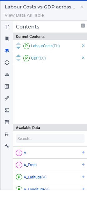
Contents
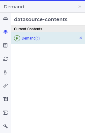
At the Contents tab of the Widget Options, you can specify for which AIMMS identifier(s) the widget should show the data.
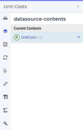
You can change the Current Contents by searching for a specific identifier at Available Data. By clicking on the identifier, it is added to the Current Contents list. In case only one identifier is allowed for a specific widget, adding another identifier will delete the previous identifier from Current Contents. If multiple identifiers are allowed in a widget type, adding an identifier will extend Current Contents.
You can delete an identifier from Current Contents by clicking on the cross on the right of it. You can re-order the identifiers at Current Contents by drag-and-drop, or by clicking on the triangles in front of the identifier.
Tip
In case you cannot find the identifier which you are looking for in Available Data, you might need to check whether the identifier is present in the (authorization) set AllPublicIdentifiers.
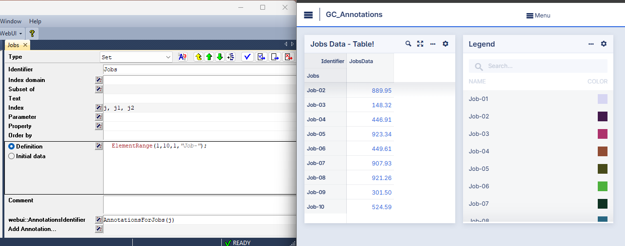
Identifier Annotations
For each identifier included in the Contents option of your widget, you can add annotations to it. Annotations are extra information added to an identifier that provide instructions to AIMMS WebUI on how to handle the identifier in specific situations.
Note
webui::AnnotationsIdentifier
To begin, you can specify annotations in the attribute form of the identifier by adding the webui::AnnotationsIdentifier annotation attribute. In this attribute, you refer to a string parameter that contains the desired annotations:
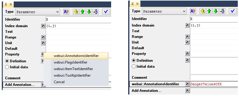
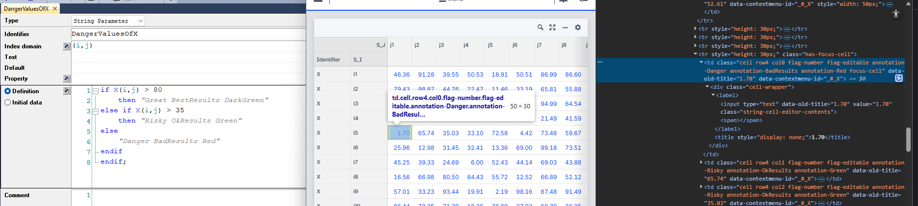
This string parameter should hold a space-separated list of class names. These class names are used in the WebUI to decorate the corresponding DOM elements. You can then use a project-specific CSS file to define or customize the styling of those elements. For more information, see the Data-Dependent Styling section.
The name of the string parameter is completely flexible — it does not need to match the name of the identifier. So if you later rename the original identifier, there’s no need to change the annotation parameter name as well.
If an identifier X does not have the webui::AnnotationsIdentifier annotation attribute added or this attribute exists but it is empty, then AIMMS will fall back on the values of X_annotations discussed later, if this is present in the model.
webui::FlagsIdentifier
Similarly, in the attribute form of the identifier for which you want to specify flags, you can add the webui::FlagsIdentifier annotation attribute and then fill in the string parameter containing the desired flags there:
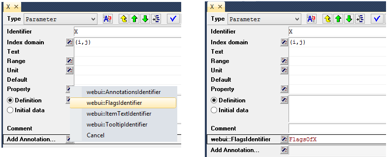
Again, such a string may be then used for front-end styling purposes, please see the Data-Dependent Styling section for more details. Also, the string parameter used in the flags annotation attribute may have any name of your choice, so it is no longer intrinsically linked to the name of the original identifier.
If an identifier X does not have the webui::FlagsIdentifier annotation attribute added or this attribute exists but it is empty, then AIMMS will fall back on the values of X_flags discussed later, if this is present in the model.
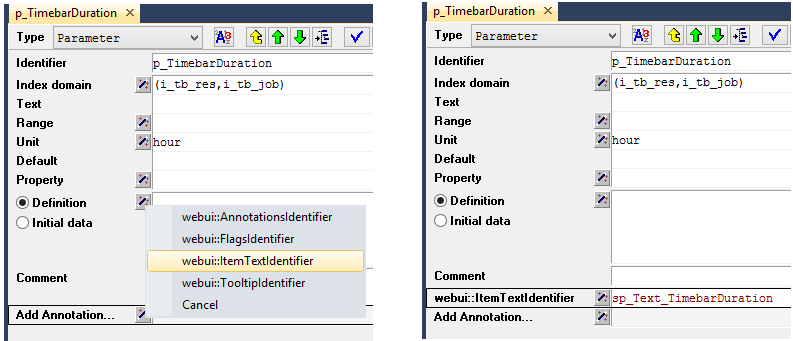
webui::ItemTextIdentifier
webui::ItemTextIdentifier annotation allows you to specify custom text that is displayed for itemsbars in the Gantt chart. This is useful for improving the readability and presentation of data within the widget.To use this feature, add the webui::ItemTextIdentifier annotation in the attribute form of the identifier you want to customize. The annotation takes a string parameter that holds the text to be displayed.
Note
The name of the string parameter used for the item text can be chosen freely; it does not need to match the name of the original identifier.
This annotation should be applied to the Duration identifier when it is used in the Gantt Chart widget.
If the identifier does not have a webui::ItemTextIdentifier annotation, or if the annotation is defined but left empty, AIMMS will fall back to using the value of the X_text identifier (if available), as discussed later in the documentation.
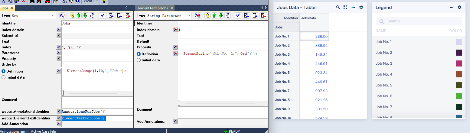
webui::ElementTextIdentifier
The webui::ElementTextIdentifier annotation allows you to replace the raw internal element names of a Set with more descriptive or localized text in the WebUI. This is especially valuable when you want to display human friendly or translated labels in widgets such as Tables, Selection-Boxes, or Charts.
By assigning a one dimensional string parameter to this annotation, the WebUI will display the corresponding text values instead of the default element names.
Before applying the annotation:
After applying the annotation:
This feature integrates seamlessly with AIMMS WebUI’s multi-language capabilities. If the string parameter’s values are populated based on the user’s language preference (for example, using webui::ClientBrowserLanguage), the WebUI will automatically render the appropriate translation. For more details, see the Multi-language support section.
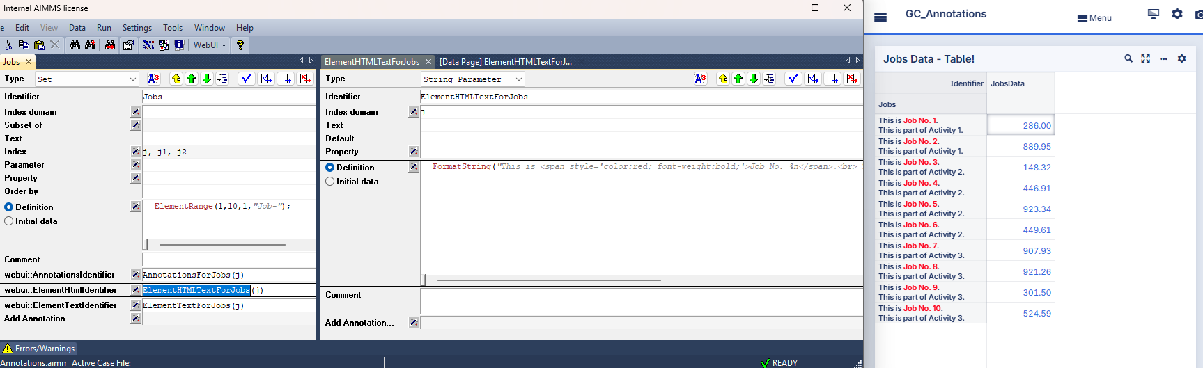
webui::ElementHTMLdentifier
webui::ElementHTMLIdentifier annotation allows you to display HTML-formatted text for the elements of a Set within supported WebUI widgets. This is especially useful for enhancing the appearance of Set element labels by adding icons, colors, line breaks, or other HTML-based formatting, particularly in Table widget headers.By assigning a one dimensional string parameter to this annotation, the WebUI will render the corresponding HTML content in place of the raw set element names, where supported.
Note
Only the Table widget supports rendering HTML in its row and column headers. To enable this, set the Table widget’s Misc
Show Html in Headersoption to true.If both
webui::ElementTextIdentifierandwebui::ElementHTMLIdentifierare applied to the same Set, the WebUI will prioritize the HTML version in widgets that support HTML rendering. In other cases, it will fall back towebui::ElementTextIdentifieror the original element name.
webui::TooltipIdentifier
Next, we come to the identifier annotations related to tooltips. Almost all widgets offered by the AIMMS WebUI support tooltips. These tooltips have some default value. For example, when hovering over a Table cell, its value is displayed. However, they can also be completely user-defined, giving the user freedom in determining the contents to be shown.
In order to create user-defined tooltips, in the attribute form of the identifier for which you want to specify tooltips, you can add the webui::TooltipIdentifier annotation attribute and then fill in the auxiliary string parameter containing the desired tooltips there:
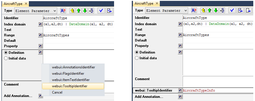
Such an auxiliary string parameter may have any name of choice, but must have the same index domain as the corresponding model identifier.
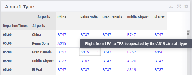
For example, consider the following table, which shows aircraft types for specific flights through the identifier AircraftType for which you want to override the default tooltips:
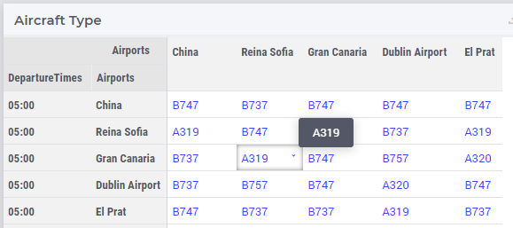
As one can see, hovering over the cell with value ‘A319’ just shows this value in the default tooltip. In order to change this, in addition to the displayed AircraftType(a1,a2,dt), the auxiliary AircraftTypeInfo(a1,a2,dt) string parameter is added to the model and filled into the webui::TooltipIdentifier annotation attribute of the original AircraftType identifier.
When using the following definition for AircraftTypeInfo(a1,a2,dt):
FormatString("Flight from %e to %e is operated by the %e aircraft type", a1, a2, AirCraftType(a1, a2, dt))
the result when hovering over the same cell as above looks like this:
If an identifier X does not have the webui::TooltipIdentifier annotation attribute added or this attribute exists but it is empty, then AIMMS will fall back on the values of X_tooltips discussed later, if this is present in the model.
A special case of the tooltip annotation is the webui::IdentifierTooltip annotation. It is not included in the ‘regular’ annotation (i.e. the list you see under the ‘Add Annotation…’ attribute of identifiers in the AIMMS model tree). Instead, it is an identifier which is indexed over the pre-declared set AllIdentifiers. With it, you can specify the tooltip which will be displayed when hovering any identifier name which is displayed in the WebUI. As of AIMMS 4.89, this is supported for the Table widget, but we aim to support it across the WebUI. An example of its use is:
webui::IdentifierTooltip('place_from') := "The place in the world from which the transport takes place.";
In the header section of a Table widget displaying the place_from identifier (the name of which might not be immediately clear to users), you can now hover this identifier name and you will see the string above in a tooltip.
We advise you to set up this identifier in your initialization routines, such as MainInitialization.
Important
webui::TooltipIdentifier annotation attribute or like X_Tooltips) with write-permission from multiple users would allow a malicious user to do Persistent XSS. For example a malicious user could record all actions done by another user.webui::IsHTML
webui::IsHtml annotation is a special case available only for String Parameters.webui::IsHtml to True enables the WebUI to interpret HTML tags embedded within the provided string data. By default, string content, including HTML tags, is rendered as plain text on widgets like the WebUI Tables. However, in scenarios where structured HTML data needs to be displayed with its intended formatting, setting webui::IsHtml to True allows the HTML tags to be interpreted and rendered as HTML elements rather than plain text.Note
webui::IsHtml annotation was introduced in AIMMS 24.3.Important
<script> tags or image tags that include onerror or javascript attributes will be removed before presenting the HTML data on the Table. This measure is implemented to mitigate potential security vulnerabilities stemming from the execution of arbitrary JavaScript code within the application.webui::UponChangeProcedure
Last (but not least), to trigger an action when the value of an identifier changes in the WebUI, you can use the webui::UponChangeProcedure annotation in the identifier’s attribute form. Specify the name of the procedure you want to run when the value is changed.
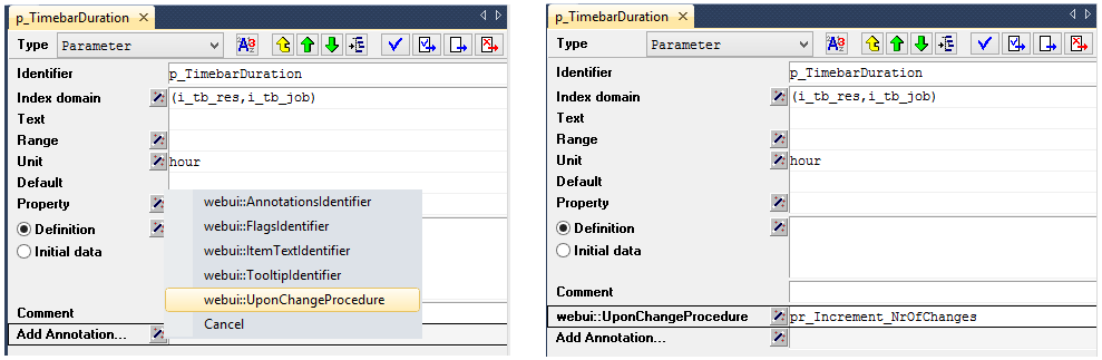
This UponChange procedure is triggered only when the value is changed through the WebUI, not when it is modified elsewhere in the model.
If an identifier X does not have the webui::UponChangeProcedure annotation attribute added or this attribute exists but it is empty, then AIMMS will fall back on the UponChange_X procedure discussed later, if this is present in the model.
Additional Identifier Properties (a.k.a. Old Style Annotations)
Note
X, you can define the following supporting identifiers:X_annotationsto hold WebUI annotations that are put as CSS classes on associated DOM elements in your model. Please see the Data-Dependent Styling section for more details.X_flagsto make updatable identifiers appear as read-only in the WebUI. Please see the Data-Dependent Styling section for more details.X_textto hold additional text to be shown within the DOM element associated with a data tuple. This option is currently only supported by the Gantt chart widget in the AIMMS WebUI. The CSS classes defined via the annotations identifier of the identifierXitself will also be set for text displayed in the associated DOM element. You can use this, for instance, to change the styling of the displayed text of elements you want your end-users to pay extra attention to.For the Gantt chart, you can set CSS for the task text via
.tag-ganttchart .label, possible compounded with the additional CSS classes set via the annotations identifier of the <duration> parameter.
X_tooltipsto hold a string representing some (additional) info which may be displayed in a tooltip associated with the identifierXused by a widgetA procedure named
UponChange_X, which will automatically be run whenever the value of identifierXis changed from within the WebUI. AIMMS accepts two forms of an UponChange procedure:a procedure without arguments. You can use this form if you are not interested in the which particular values changed, but do want to get a notification that a change took place
a procedure with two input arguments, both with the same domain as the identifier
X. The first argument should be a numeric parameter, and will hold a 1 for each tuple that was changed. The second argument should have the same type as theXand will hold the old value for such a tuple, the changed value can be obtained viaX.
Parameter X {
   IndexDomain: a;
}

Procedure UponChange_X {
   Arguments: (hasChanged,OldValue);
   Parameter hasChanged {
      IndexDomain: a;
      Property: Input;
   }
   Parameter OldValue {
      IndexDomain: a;
      Property: Input;
   }
}
In the above example,
XandOldValueshould have the same type.The latter form can be used, for instance, to detect which tasks in a Gantt chart has moved, or to act upon a block edit in a table.
HTML Tooltips
Besides the simple text-based tooltips illustrated above, one may also use HTML-based tooltips, which allow to display more sophisticated contents when hovering over the data entries in a widget.
In this case the data of the string parameter filled in the webui::TooltipIdentifier annotation attribute (or the data of the old style X_Tooltips associated with an identifier X) must be in HTML format. For more info on HTML in general, please see for example websites like html.com or www.w3schools.com .
Next we illustrate this feature based on some concrete examples for various widgets.
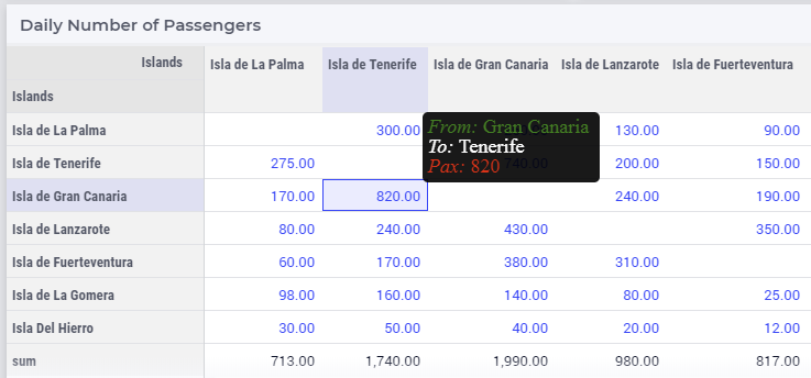
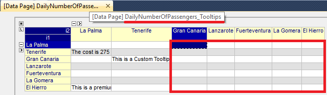
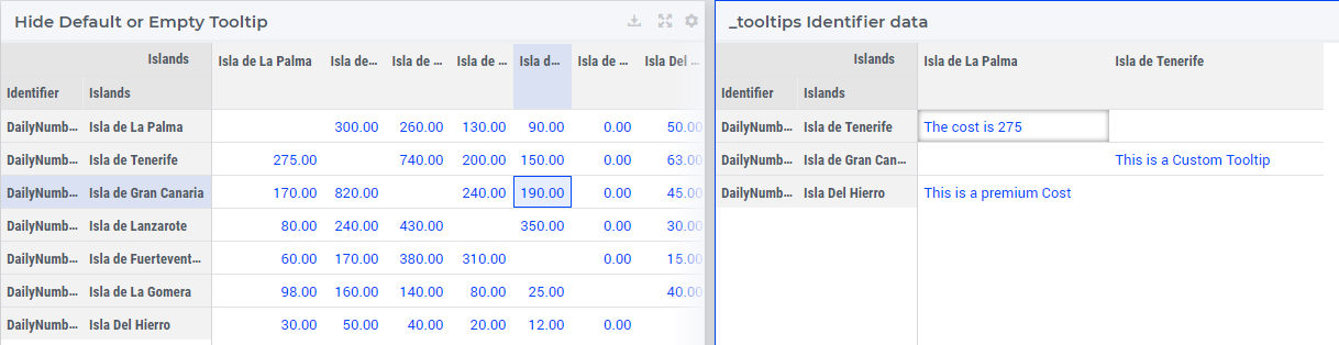
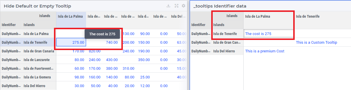
Suppose the data of a 2-dimensional parameter DailyNumberOfPassengers(i1,i2) is shown in a table widget, where i1 and i2 are alias indexes in a set Islands.
One can declare the string parameter DailyNumberOfPassengersInfo(i1,i2) to be filled in the webui::TooltipIdentifier annotation attribute and defined its HTML data value in the AIMMS model as follows:
FormatString(
"<div align=\"left\"> <font size=\"+1\" color=\"green\" face=\"times new roman\"> <i>From:</i> %e <br><font color=\"white\"> <i>To:</i> %e <br><font color=\"red\"> <i>Pax:</i> %n",
i1,
i2,
DailyNumberOfPassengers(i1,i2)
);
In this case the tooltip for a cell in the table looks like in the following picture:
Note
Using HTML format:
Where in a simple text-based tooltip you used \n to move to a new line, in a HTML-based tooltip this needs to be replaced by <br>, see example above.
Similarly, the usage of \t in text-based tooltips should be replaced by HTML tables, see further below.
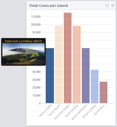
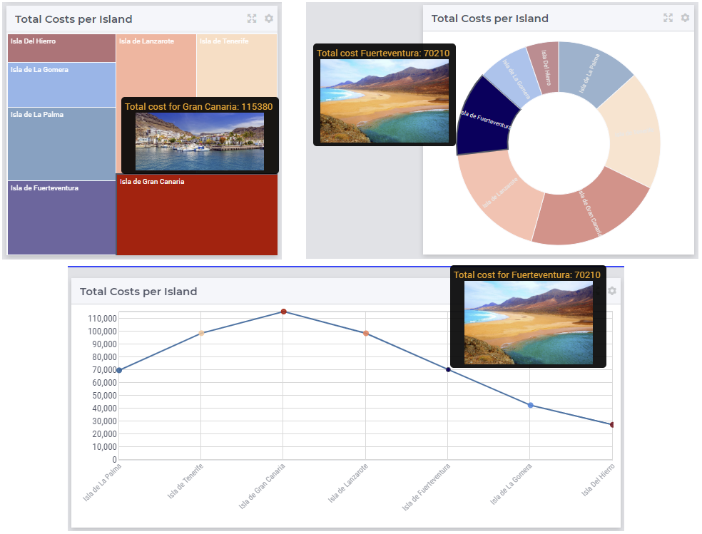
Next, suppose that the data of a 1-dimensional parameter TotalCostPerIsland(i) is rendered in a barchart widget. A HTML-based tooltip may be added to the webui::TooltipIdentifier annotation attribute of this parameter by using an auxiliary string parameter, say TotalCostPerIslandInfo(i), defined in the AIMMS model as
FormatString(
"<font size=\"-1\" color=\"orange\"> Total cost %e: %n <br><img src=\"%s\" width=\"180\">",
i,
TotalCostPerIsland(i),
IslandImageURLs(i)
);
where for each element i of the set Islands, IslandImageURLs(i) is a string parameter holding the web URL of a corresponding (island) image. In this case the tooltip for a bar in the chart looks like in the following picture:
Of course, one can easily change type of the widget to linechart, piechart, or treemap, and the same tooltip contents may be used for these widgets as well:
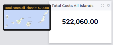
In case the costs of all islands were aggregated in a scalar parameter TotalCostALLIslands which is then shown in a scalar widget, a similar HTML-based tooltip contents may be added
using a TotalCostALLIslandsInfo string parameter in the webui::TooltipIdentifier annotation attribute of TotalCostALLIslands. This string parameter may be defined in the AIMMS model for instance as follows:
FormatString(
"<font size=\"-1\" color=\"orange\"> Total costs all islands: %n <br><img src=\"%s\" width=\"180\">",
TotalCostALLIslands,
ALLIslandsImageURL
);
where ALLIslandImageURL is a string parameter holding the web URL of a corresponding (all islands) image. In this case the tooltip in the WebUI looks like in the following picture:
Note
Using Application-Specific Resources: By using a string of the form “/app-resources/resources/images/Canarias.png”, one may refer to an image included in the resources/images subfolder of the WebUI folder of the application directory.
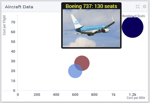
Now, suppose that some aircraft data is shown in a bubblechart, where the size of the bubbles is determined by a parameter NumberOfSeats(p) with p being the index of a set Planes.
Again, one may add and fill in a string parameter NumberOfSeatsInfo(p) to the webui::TooltipIdentifier annotation attribute of NumberOfSeats. This string parameter may be defined for example by using the HTML data value as shown here:
FormatString(
"<font size=\"+1\" color=\"yellow\">%e: %n seats <br><img src=\"%s\" width=\"200\">",
p,
NumberOfSeats(p),
PlaneImageURL(p)
);
where for each element p of the set Planes, PlaneImageURL(p) is a string parameter holding the web URL of a corresponding (plane) image. Then the resulting tooltip in the bubblechart widget looks as follows:
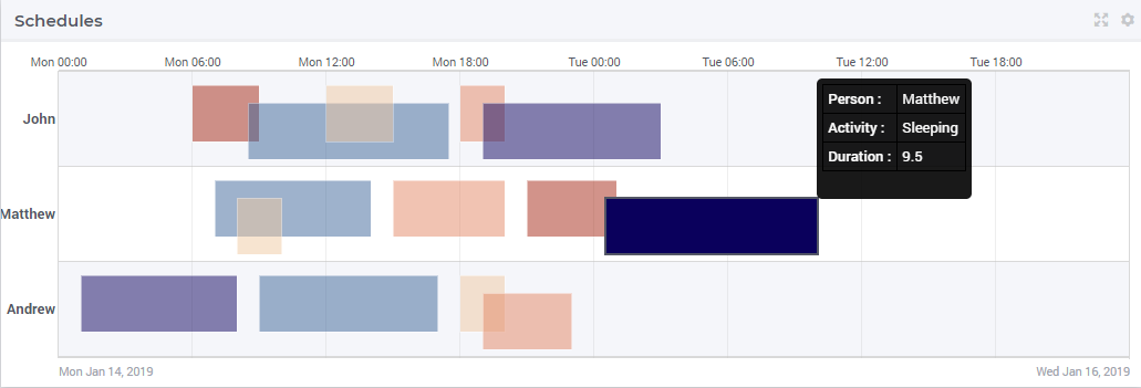
Finally, suppose that in a Gantt chart widget we show some schedule data for several activities performed by a few people, with the duration given by the data of a parameter JobDuration(pe,j),
where pe is the index of the set Persons and j is the index of the set Jobs. When using the default tooltip, the info for a block in the chart is rendered as:
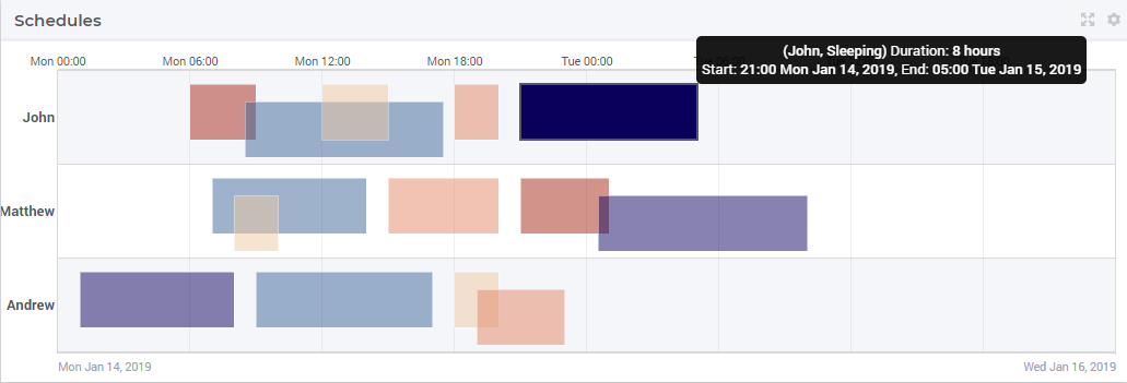
However, one may customize the info by adding a string parameter JobDuration_Tooltips(pe,j) to the webui::TooltipIdentifier annotation attribute of JobDuration, holding HTML data for example as shown here:
"<div align=\"left\">"  +
"<Table>" +
        "<TR>"  +
                "<TD>"  +
                                "<B> Person : </B>" +
                "</TD>" +
                "<TD>"  +
                                pe +
                "</TD>" +
        "</TR>" +
        "<TR>"  +
                "<TD>"  +
                                "<B> Activity : </B>" +
                "</TD>" +
                "<TD>"  +
                                j +
                "</TD>" +
        "</TR>" +
        "<TR>"  +
                "<TD>"  +
                                "<B> Duration : </B>" +
                "</TD>" +
                "<TD>"  +
                                JobDuration(pe,j) +
                "</TD>" +
        "</TR>" +
"</Table>"
In this case, the customized tooltip based on the HTML table layout (see also the Note above regarding HTML format) looks like in the following picture:
You can display icons from our icon list, in the HTML tooltips. You will need to include a class property with the value of the icon name as illustrated below:
data {
Product-1 : "<p class=\"aimms-presentation\">  \; Electronic Products </p>",
Product-2 : "<p class=\"aimms-hour-glass\">  \; Household Products </p>",
Product-3 : "<p class=\"aimms-stackoverflow\">  \; Kitchen Equipment</p>",
Product-4 : "<p class=\"aimms-safari\">  \; Gardening Products</p>",
Product-5 : "<p class=\"aimms-steam\">  \; Heavy Equipment</p>",
Product-6 : "<p class=\"aimms-dropbox\">  \; Industrial Products</p>",
Product-7 : "<p class=\"aimms-eraser2\">  \; Stationery Products</p>",
Product-8 : "<p class=\"aimms-dribble\">  \; Kids Products</p>",
Product-9 : "<p class=\"aimms-markup\">  \; Misc</p>",
Product-10 : "<p class=\"aimms-share\">  \; Non Categorized</p>" }
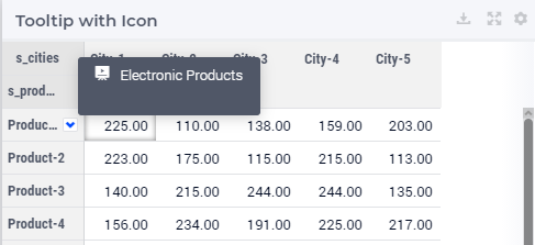
Note
Ensure you escape the quotes in the HTML properties. e.g., \".
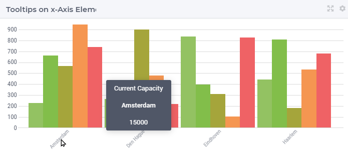
From AIMMS version 4.79 it is possible to configure custom tooltips for the elements in the row and column headers of the Table and on the x-axis elements of the Bar Chart, Line Chart and Bar-Line Chart.
You need to add the webui::TooltipIdentifier annotation attribute to the set and specify the string parameter indexed over the respective set. For example:
Set Netherlands {
    SubsetOf: AllLocations;
    Index: net;
    Definition: data { Amsterdam, 'Den Hague', Eindhoven, Haarlem };
    webui::TooltipIdentifier: NetHeaderTooltips;
}

StringParameter NetHeaderTooltips {
    IndexDomain: net;
    Definition: {
        formatstring("Current Capacity <br><br> <b>%e</b> <br><br> %n",net,CurrentCapacity(net));
    }
}
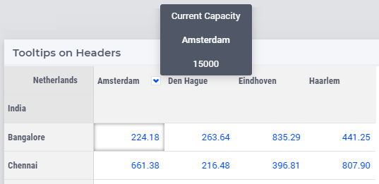
The same tooltip will show for the x-axis elements on the Bar, Line and Bar-Line charts, as illustrated below:
If you do not want to show the default tooltips for certain identifiers or data items, you can make this possible by clearing or emptying the data for the respective identifier or data point in the string parameter defining the tooltips.
For example, consider the table below. Say, you do not want to show the tooltip with the same value as the cell value, or if the value of a cell is 0.
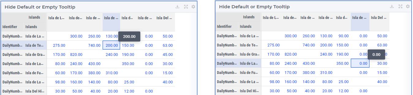
Then in the string parameter defining the tooltips, you can just clear/empty the data for these specific cases that you desire to hide the tooltip for.
Note
This feature for hiding tooltips is available from AIMMS version 4.65 and onwards.
Identifier Settings
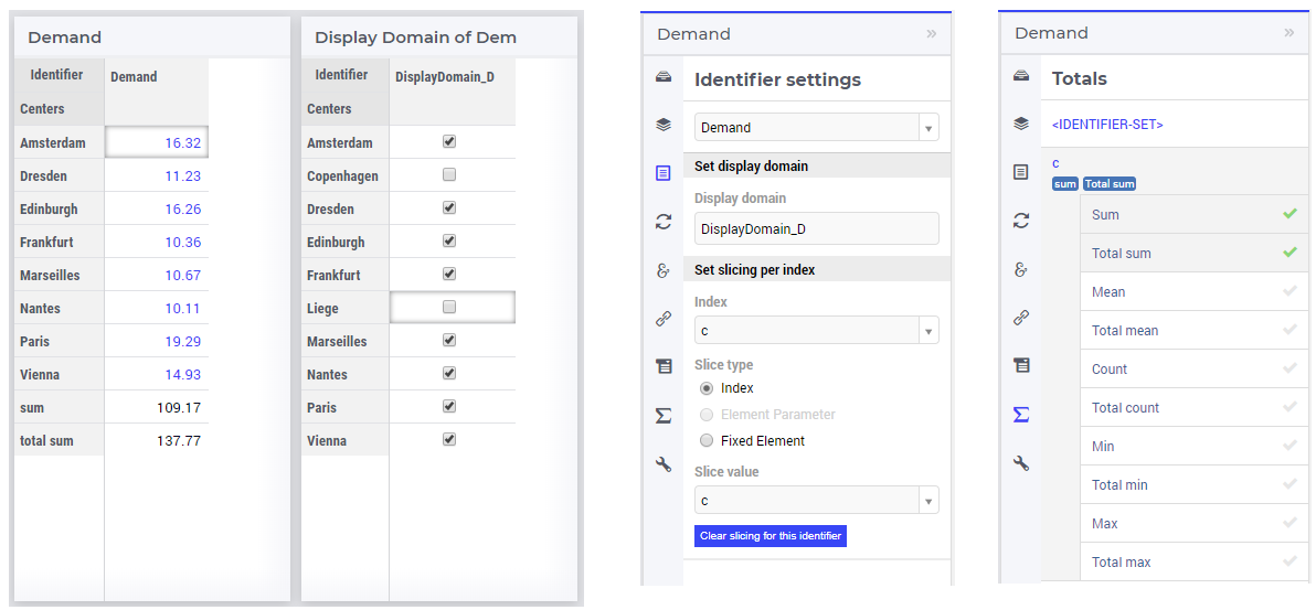
The various widget types in the WebUI offer the possibility to specify settings for identifiers that are specific for the widget at hand. Currently, in the Identifier Settings options editor, you can specify the Display Domain and Slicing for each identifier that is specified in the Contents section of the widget:
Display Domain
Sparse vs. Dense
In both AIMMS and the WebUI, the data is displayed in a sparse manner by default. In the WebUI, this means that, for example, a Table widget showing an identifier that has a complete row or a complete column with only default (0) values, does not display such a row or column at all. When merely displaying your data, this is usually convenient, but if you want to edit your data, it becomes hard if the row/column that contains the default (0) value that you want to edit is not displayed at all. For such situations, it makes sense to display the data in a dense way.
Specifying Display Domain
In order to provide you with control over the sparsity pattern of your widget data, you can specify a so-called display domain for each identifier that is present in your widget:
The domain that you enter in the options editor above, can be an identifier, or, in its simplest form, just a 0/1 value:
Specifying no value at all (the default situation) means that the identifier displays in a sparse way, i.e. only the rows/columns containing non-default values are displayed. (except for the scalar widget, please see warning below)
Specifying a value of 0 means that the identifier displays nothing at all.
Specifying a value of 1 means that the whole identifier will always be displayed, even if it only contains default values.
You can obtain a more fine-grained level of control by specifying an identifier which contains a sparsity pattern.
Note
When using an identifier for specifying display domain, please make sure that the slicing of the indexes of the display domain identifier match exactly the slicing of the indexes of the content identifier.
Warning
The default behavior of the scalar widget (when specifying no value Display domain : <empty> ) is Display domain : 1, whereas it is Display domain : 0 in every other widget. This enables you to see by default every identifier added in the scalar widget.
Examples
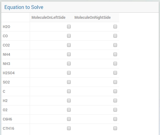
To illustrate the above, here are some examples that show the difference between all usages of the display domain, applied to the same table. This table contains two columns and a number of rows containing checkboxes.
First, here’s the table, with the display domain not specified at all (i.e. the default behavior) and the table containing only 0 values:
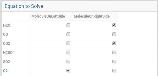
As expected, no rows are displayed at all here, which makes it impossible to change any value. To overcome this, we can set the display domain of the first identifier to 1, which leads to the following table:
As you see, editing the values is possible now. Checking a number of checkboxes could for example lead to the following table (with the display still set to 1):
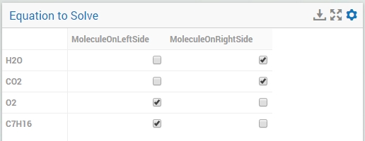
Now let’s remove the ‘1’ again for the display domain of both identifiers and set it to its default value (i.e. not filled in):
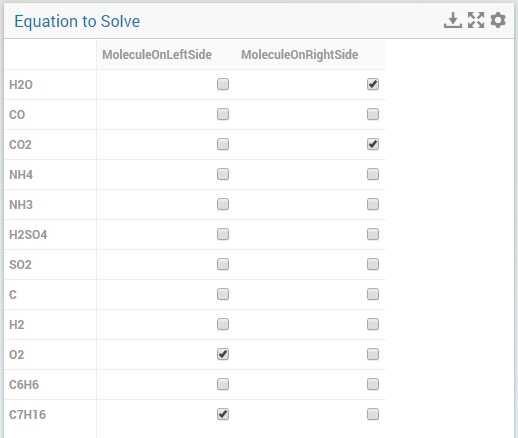
As you can see, now only the rows (and columns) which contain non-zero values are displayed. To illustrate the effect of specifying an identifier for the display domain, the following table shows what happens to the table if we create a binary identifier MoleculeDisplayDomain(m), with the following definition:
if StringOccurrences(m, "O") then 1 else 0 endif;
In English, this means: for all rows for which the molecule m contains the symbol O (oxygen), the display domain should be set to 1. If we fill in this identifier for the display domain option, the table changes as follows:
As expected, this table only shows the rows for which the molecules contain an O in their name, regardless of the value of their associated checkboxes (note the non-displayed row for the C7H16 molecule!). Specifying an identifier for the display domain is the most flexible way of determining the display domain. You can also use it to only display a slice of a displayed identifier, by only setting the associated display domain identifier to 1 for a specific value of one of its indexes.
Warning
Please be aware that you should define the display domain rigorously over the same set (or subset) as the domain of the shown identifier.
Slicing
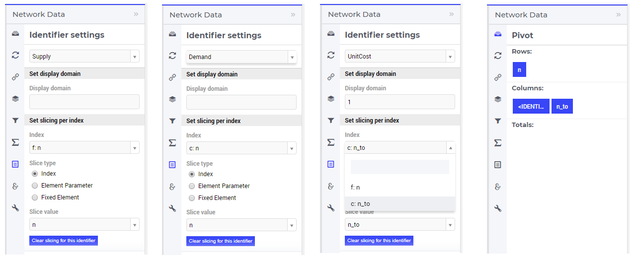
Identifiers in AIMMS can have multiple dimensions. You can specify these dimensions in AIMMS via the index domain of an identifier. These identifiers can be displayed in the WebUI and their data is shown over all these dimensions by default. However, there are also cases where you only want to see part of the dimensions/data. In situations like this, you can slice the indices of one or more identifiers in your widget. This can be done by the ‘Set slicing per index’ option at the Identifier Settings tab of the Widget Options.
Set slicing per index
For each identifier in the widget, you can specify a separate slicing. To do so:
On top of the Identifier Settings tab, select the identifier that you want to slice.
At ‘Set slicing per index’ you select the index that you want to slice (every index can have its own slicing).
Specify the ‘Slice type’ that you want to apply for this index.
Specify the corresponding ‘Slice value’.
Slice type and Slice value
You can select from three different types of slicing, with corresponding slice values:
Index - You can slice the selected index to another (related) index. At ‘Slice value’ you can then select from all indices that have the same rootset. Slicing to a different index is useful when you e.g. only want to see a subset of the elements of the original identifier, in which case you would slice to an index of a subset of the original index.
Element Parameter - You can slice the selected index to a (related) element parameter, which you can specify as the ‘Slice value’. The selected index is then fixed to the current value of the selected element parameter. The widget will show the data of the identifier, only for the element in the element parameter for the selected index.
Fixed Element - You can slice the selected index to a fixed element, which you can specify as the ‘Slice value’. The selected index is then fixed to the selected literal element value. The identifier data will only be displayed for the selected element for the selected index.
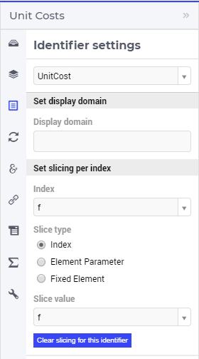
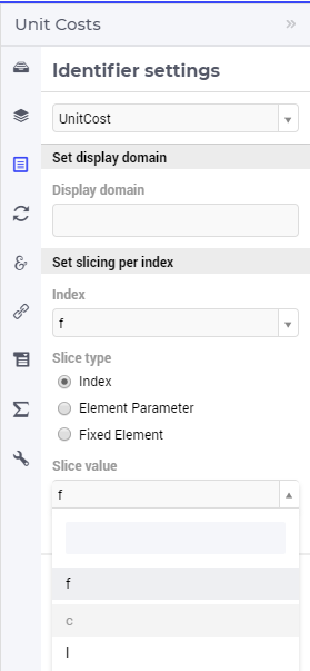
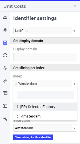
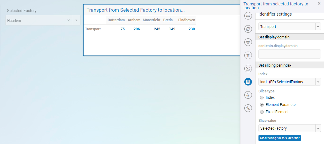
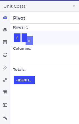
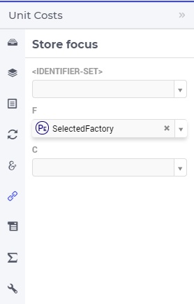
Index
When selecting an index in the index selectionbox, you can also see an overview of how all the indices in your widget are sliced. E.g. in this picture, you can see that there are 2 indices, both sliced. The first index, f, is sliced to the Element Parameter (EP) ‘SelectedFactory’. The second index, c, is fixed to element ‘Amsterdam’:
Clear slicing
To easily clear the slicing of an identifier for all its indices, you can press the ‘Clear slicing for this identifier’ button. Of course you need to make sure that you have selected the identifier for which you want to clear the slicing in this widget.
Important
Some of the widgets require multiple identifiers as input (contents). When you slice one or more of these identifiers, you need to make sure that the resulting index domains match.
Tip
Whenever you slice one dimension (index) of an n-dimensional identifier to a fixed element or element parameter, its dimension will become n-1. This is good to realize, as some widgets require identifiers of a certain dimension. E.g: In the map widget, the arcs identifier needs to be two-dimensional over the set nodes x nodes. Whenever you slice one dimension to a fixed element (or element parameter), you effectively loose a dimension and it becomes impossible for the map widget to map data to arcs. As a work around you can consider to create a set containing a single element and use subset slicing here: whenever you do subset slicing, the dimension of the data that is displayed, is not reduced.
Please mind when slicing over a subset in a table, other identifiers defined over the corresponding superset are considered as defined over a different set. Thus you might end up with the following unexpected behavior:
Where slicing all your identifiers (not just one) over the same subset will fix the display:
Examples
The transport table is not sliced. All non-default data is displayed.
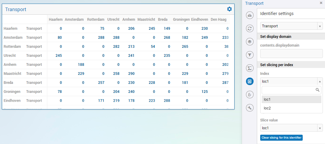
The transport table is sliced to show the transport from a single selected factory (via element parameter) to all locations.
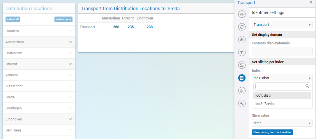
The transport table is sliced to show the transport from all distribution locations (subset with index distr) to the fixed location (fixed element) ‘Breda’.
Expanding indexes
Note
The feature described in this section (and in the Example underneath) is available only in AIMMS releases from 4.62 onwards.
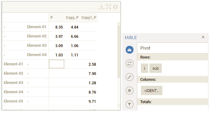
In some situations, some identifiers may be declared in the model over some super-sets and other identifiers may be declared over some sub-sets of those super-sets. However, it may be beneficial to show all the data of several such categories of identifiers in the same widget, for example in a table widget. If all indexes involved are used as separate indexes in a widget, then they are treated as “independent” in the Pivoting section and the resulting layout of the data in the widget may not be an “intuitive” one.
For example, in the Transnet application (see the “Quick Start: My First WebUI” section) the parameters Latitude(l) and Supply(f) are declared over the super-index l of the set Locations and over the index f of the sub-set Factories, respectively. If the data of both parameters is shown in a table widget with their indexes as declared originally in the model, then the table layout may look like in the following picture on the right:
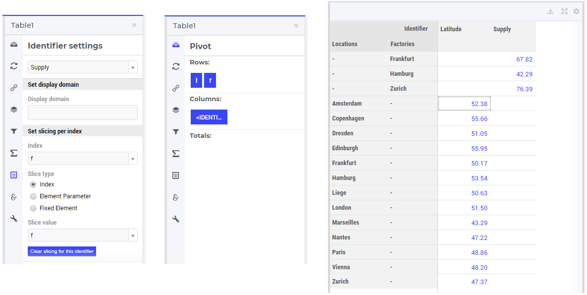
However, such a layout may not look “intuitive”, because the set of Factories may be regarded more naturally as “contained” in the set Locations, instead of as an “independent” set.
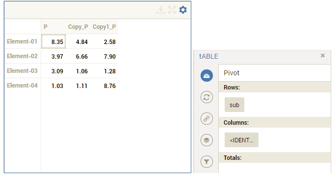
In such situations, it is possible to expand an index to a super-index, that is, to an index in a super-set of the initial index set. Such expanding may be achieved through the same options in the widget editor which are used for slicing, as explained above. However, in this case an identifier may be rendered over a larger domain than its declared domain and some “values” may be just empty, i.e. flagged as “outside-domain”. When an index has been expanded to a super-index, it will no longer be treated as a separate index in the Pivoting section, but rather as “contained” by its super-index. Please note that, like slicing, the index expanding is also applied per each identifier specified in the widget Contents.
For example, in the Transnet application, the index f of parameter Supply may be expanded to the super-index l corresponding to the super-set Locations. In this case, the index f no longer appears in the Pivoting section and the resulting layout of the data in the widget looks more intuitive as illustrated below:
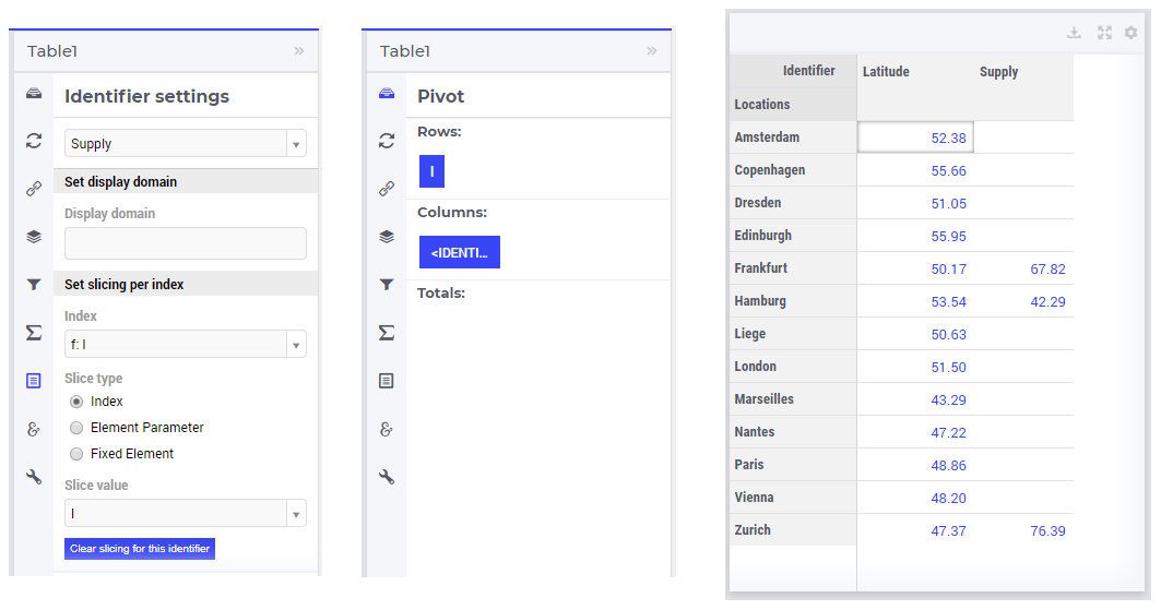
Note that, in this case the cells of the column Supply which are outside domain are simply empty and not editable.
Example
The index expanding may be involved in more complex data layouts as illustrated by the example in this section.
Assume that our TransNet application has been extended with a super-set AllNetworkNodes (with alias indexes n, n_from, n_to) of the set Locations, which also has another sub-set PotentialSites (with index s) with elements { Munich, Nuremberg }. Moreover, assume that the parameters Latitude and Longitude are now declared over the root index n and that the parameters LocationSize(l) and PotentialSize(s) have been declared additionally in the model. Then one can show the data of Latitude(n), LocationSize(l), PotentialSize(s), Supply(f), Demand(c), and UnitCost(f,c), all in the same table widget, by expanding each sub-index l, s, f, or c to one of the super-indexes n or n_to in the super-set AllNetworkNodes as illustrated below:
In this case, the layout of the data in the table widget looks like in the following picture:
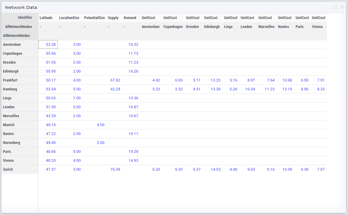
So, in this table all the data of the above mentioned identifiers is shown together, while the Pivoting section of the table only consider 2 indexes instead of the 5 original indexes used in the model declarations. All the cells which show no value are simply empty (“outside-domain”) and not editable in the table.
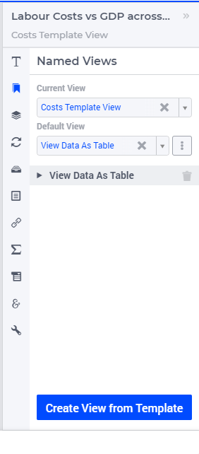
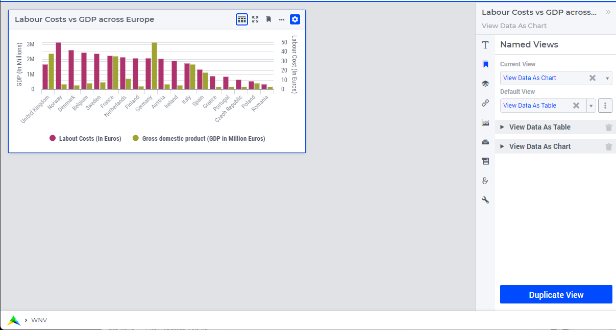
Widget Named Views
Important
Note
The Widget Named Views Management feature, which introduces support for Template View and Views derived from these Templates, is applicable only to the Table, Map, Combination Chart and other chart type widgets. It does not extend to the Gantt chart, Diagram, or Tabbed widget types.
The widget header section now includes a new button  . Clicking on it allows end users to see the available named views for this widget, from which they can choose and load a view.
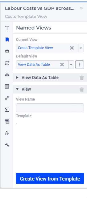
Creating Views
 tab, you’ll find controls for adding, editing, and deleting template views.
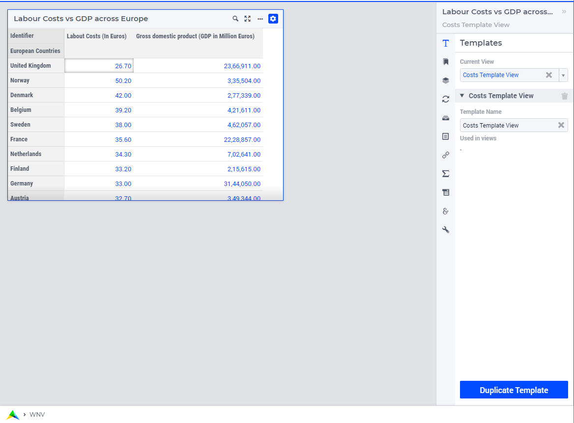
 tab, you’ll find controls for adding, editing, and deleting named views.
 and Down
  controls appear, allowing you to order the different named views that have been created.
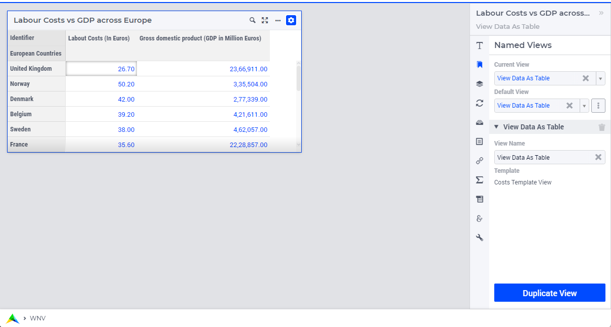
Managing Derived Views
 icon within, indicating that the option derives its value from the template. icon is not shown anymore. Instead, an
  icon is displayed. Clicking on this icon clears the modified entry in the option and restores the value from the template.
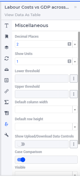
On certain option editor tabs, such as Contents, Pivoting and Totals, the icon is displayed at the top to signify that all the data visible on this tab is derived from the template.
Current View
Default View
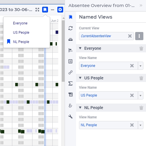
To illustrate this, in the context of the image above, the model contains a set AbsenteeViews with data {‘Everyone’, ‘US People’, ‘NL People’}; as its definition, an element parameter CurrentAbsenteeView with this set as its range which is specified for the Default View option. In the image, the value of CurrentAbsenteeView is NL People. As you can see, this is reflected in the widget header menu showing the named views and the currently selected one.
Please be aware that it is possible to have more literally specified named views than the set belonging to the Default View option element parameter. If you specify, let’s say, six named views and the set contains just two of them, then if you specify the element parameter for the Default View option, the widget header menu will only show those two views.
When one or more named views are created for a widget, the button is made available on the widget’s header section. When you click on it, a list of the various named views made for this widget appears, in the order the views were arranged. The  icon serves as an indication of the currently active view.
Any of the views are available for selection by the end user from the list and the corresponding widget configuration loads.
Important
If no named views have been created yet, the widget will still load as usual.
For a named view, the current widget configuration is only saved when you assign it a name using the View Name option.
When all of the earlier-created named views are removed, the widget loads with the settings of the most recent view selected for the Current View option.
Note
All widget options are recorded when you create a Widget Named View. There is one special case, the Visibility option. If you change the Visibility value, it will be recorded across all Named Views. The rationale for this is to prevent a scenario where you have two Named Views, and one has Visibility set to 0. In such a case, if a user switches to that view, the widget may disappear from the page, and the user would be unable to switch back to the original Named View (where Visibility is set to 1) because the entire widget, including the Named Views menu, would no longer be visible.
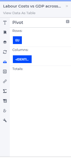
Pivot
You can pivot the indices in most of the widget types. E.g. you can change which indices should appear in the row or column of a Table widget, or which index should be stacked in a Bar Chart widget. To pivot indices, you should open the widget options and go to the Pivot tab:
There you can drag-and-drop the indices to the different areas in your widget. E.g. in case of a Table widget, to the Rows, Columns or Totals area.
Store Focus
Some WebUI widgets offer you the possibility to store the (combination of) element(s) that currently have focus in the widget. E.g. in the Table widget you can store the focus cell, in the Bubble chart widget you can store the focus bubble. In WinUI you have similar functionality like this, called ‘Reverse Link’. Specifying the Store Focus option opens up all kinds of interactive opportunities. E.g. by changing the focus cell in a table, other widgets could display relevant information for that specific cell.
At the Store Focus tab in the widget options you will see a list of indices. For each index you can specify the element parameter that should be filled with the element that has the focus in the widget.
The list of indices also includes an index referring to IDENTIFIER-SET. You can specify an element parameter over the set AllSymbols there. This allows you to also store the identifier that currently has focus in the widget. This could be relevant when you display multiple identifiers in your widget.
Important
Clicking again on the currently Selected/Highlighted chart element, gets the highlighting cleared from the respective chart element. However, the value stored in the corresponding element parameter remains unchanged and is not cleared. This behavior also applies to cells on the Table widget.
Clicking on aggregator cells within the Table widget, such as those found in the Sum or Total’s row/column, results in the value stored in the corresponding element parameter being cleared.
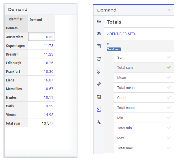
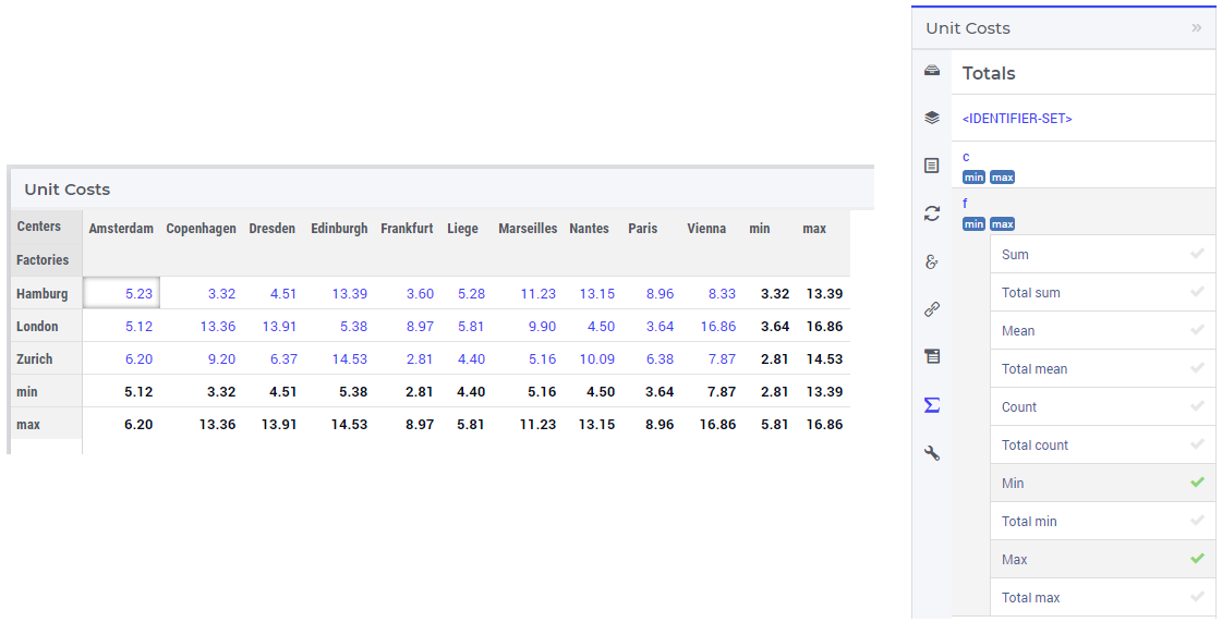
Totals
You can add totals, i.e. aggregators of (numerical) values to most widget types, such as tables or bar charts. To do so, open the Widget Options and go to the Totals tab:
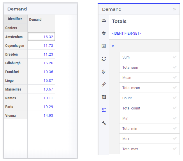
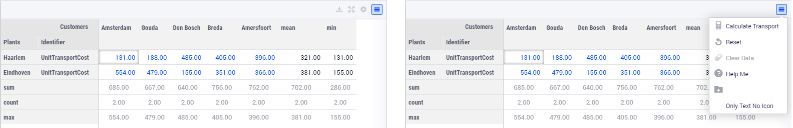
For each index in your widget, you can turn on one or several aggregators, such as summation, mean value, count of the number of entries, minimum value, maximum value. Clearly, adding such totals results in additional data being displayed in the widget view. For example, activating the “Total sum” aggregator for one index adds up all (numerical) values corresponding to that index and displays the resulting sum as an additional value in the widget view:
If no display domain has been specified for the shown identifier, then the “Sum” aggregator has the same effect (i.e., same value) as the “Total sum” aggregator. However, if a restricting display domain has been specified such that the widget displays less values than the full identifier domain, then the “Sum” aggregator only considers the displayed values, whereas the “Total sum” aggregator still considers all the values from the full domain. Consequently, in this case the “Sum” and the “Total sum” aggregators may result in different values being added to the widget view:
In case of an active display domain, the differences between the other aggregators, e.g. between “Mean” and “Total mean”, between “Count” and “Total count”, etc, are similar to the difference between “Sum” and “Total sum” illustrated above.
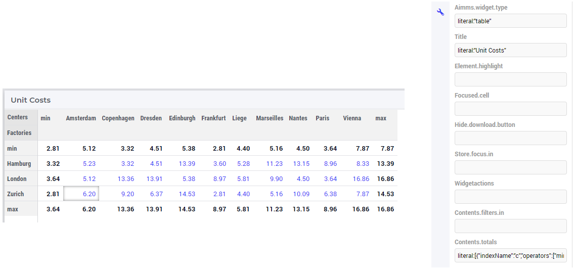
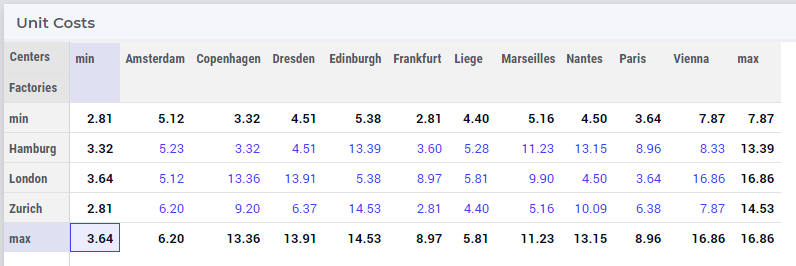
By default, totals are added “at the bottom” of a sequence of (numerical) values. For example, for the parameter UnitCost(f,c) we may add two aggregators such as “min” and “max” for each of the indexes of the factories f and the distribution centers c, which results in the corresponding aggregated values being displayed at the bottom:
In this case the Advanced option Contents.totals has as value the following string:
literal:[{"indexName":"c","operators":["min_only_visible","max_only_visible"]},{"indexName":"f","operators":["min_only_visible","max_only_visible"]}]
However, it seems more natural to move one aggregator, for instance “min”, “on top” of the shown sequence of values. For now, this possibility is provided through editing the Advanced option above.
More specifically, one may append the postfix “_on_top” to any existing total specification. For example, if we edit the Advanced option Contents.totals to read as
literal:[{"indexName":"c","operators":["min_only_visible_on_top","max_only_visible"]},{"indexName":"f","operators":["min_only_visible_on_top","max_only_visible"]}]
then the “min” aggregators are rendered on top of the corresponding sequence of values:
Note
Please note that once having specified a “_on_top” postfix, the existing option editor should not be used anymore on aggregators, as it removes any existing “_on_top” total once you use the total options editor to make a change. So, it is advisable to add the “_on_top” postfix at the end of the process of specifying the widget options.
For the values for the “corner cells” (i.e. grand totals) AIMMS uses the natural reading order in the sense that a cell that contain aggregated values will only use information from cells to the left or on top of that cell. This is natural in the sense that the top right cell (containing the value 7.87) contains the maximum of the cells on its left (instead of the minimum of cell underneath that cell):
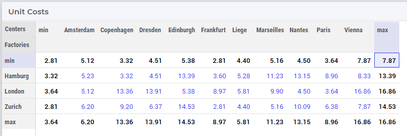
Similarly, the bottom left cell (containing the value 3.64) shows the maximum of cells on top (instead of the minimum of cell on the right):
We envision that in future AIMMS versions, the possibility to add totals “on top” will be provided through dedicated, more user friendly features in the widget options editor.
There are some scenarios where specific total values do not really make sense. For example, when displaying a column with percentages, it is better not to show the sum of those. On the other hand, in the same table, there may also be columns present where showing the sum makes perfect sense. For such situations, all total cells (or bars, in case of bar charts), get an extra annotation class applied to them in the underlying DOM tree. Targeting this class in a custom CSS file, you can then for example hide specific total cells. The format of the class is
annotation-total-<identifier-name>
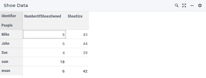
To illustrate this, please see the table below:
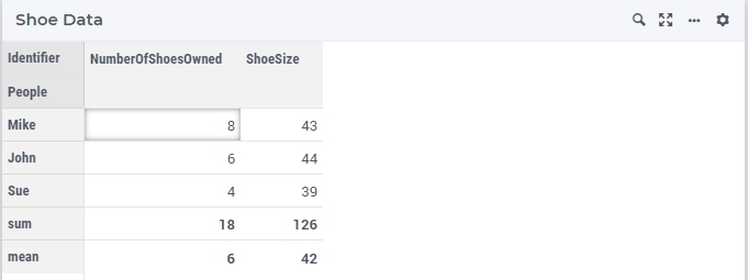
In this table, showing the sum and the mean of the number of shoes owned by the people listed makes perfect sense. However, although the mean of the shoe sizes for these people is meaningful, the sum of it does not make sense. By targeting the annotation-total-ShoeSize class of this particular widget, in combination with the annotation-sum class, like in this .css code:
[data-widget\.uri='Shoe Data'] .annotation-sum.annotation-total-ShoeSize .cell-wrapper {
    display: none;
}
We obtain the following resulting table:
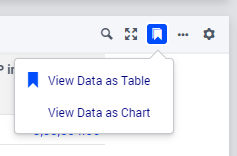
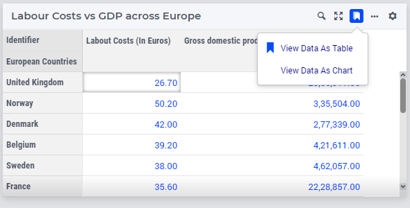
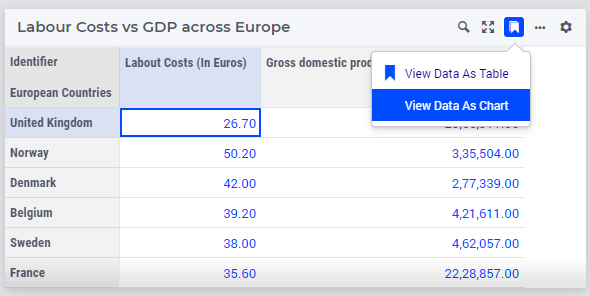
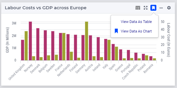
Change Type
You can use all kind of widgets to display your AIMMS data. By changing the type of a widget, you can easily switch between e.g. a table or a chart, without creating a new widget for that. To do so, you should open the widget options of your widget and go to the Change Type tab. There you will see the possible types to which you can switch.
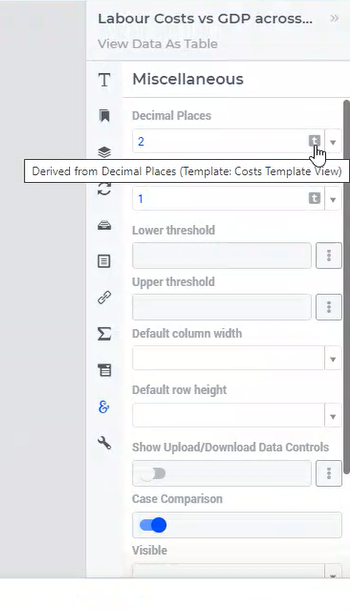
Miscellaneous
Several widget options which are easier to specify are available under the Miscellaneous tab of the widget option editor.
Number of decimals
You can change the number of decimals for a widget:
Open the option editor for the widget
Go to the Miscellaneous tab, and
Change the Decimal Points option.
The number of decimals displayed has a limit, the default is 2 decimals.
Hiding Widgets
There are situations where you may want to hide certain widgets for certain users. Especially if many ‘roles’ can be identified among the users of your applications, this may apply: for some users, data displayed in a particular widget is of no interest, while for others it is.
To help you in situations like this, every widget has an option called Visible, located on the Miscellaneous tab in its option editor. Setting this option to False (or 0) has the effect that the widget is not visible anymore. In order not to lose track of these widgets while developing your WebUI, there is an ‘eye’ icon  in the top bar, with which you can still show the hidden widgets. These are displayed in gray, in order to distinguish them easily from the visible widgets. This icon is not visible when running your WebUI app in a PRO environment (i.e. in the end-user scenario), or when you have no widgets that have the Visible option set.
It is not only possible to just specify literal values like True/1 or False/0 for the ‘Visible’ option: you can use any scalar AIMMS parameter that you like. This is especially powerful, since it allows you to steer the visibility of each and every widget using whichever logic you want. As an illustration, you could create an AIMMS parameter like:
if CurrentUserGroup = 'Finance' or CurrentUserGroup = 'Management' then
    1
else
    0
endif;
to make sure that only finance people and people from the management can see one or more specific widgets.
Important
Please note that if you want to make sure that not all your users can see all available data (e.g. because some of it is confidential), hiding certain widgets is not sufficient. Users can still create new widgets for showing all available data. To avoid this, you need to adapt the set AllPublicIdentifiers, such that it only contains the identifiers that the current user is allowed to see. Furthermore, you need to make sure that users cannot edit the parameter that you specified for the Visible option (e.g. by giving it a definition).
Important
Advanced
The Advanced tab of the widget options is kind of a special case. It basically lists most options that are already available through the other tabs already discussed above in a technical format that requires knowledge of the AIMMS Widget Framework.
Important
We strongly advise not to change any of these options, unless you know really well what you are doing or are advised to do so by AIMMS Support. Changing values is quite error-prone due to the specific formatting requirements.
There are a few exceptions to this advice:
The
Contents.totalsoption is currently the only way to force aggregators to appear at the start of a row/column instead of at the end, as described in the Totals section.By default, WebUI Tables show a refresh button when (procedurally) adding or removing rows. You can force a table to always automatically refresh by setting the option
Fast.editing.disabletoliteral:1.By default, WebUI Tables jump to the next row after editing a cell. You can disable this behavior by setting the option
Focus.next.disabletoliteral:1.
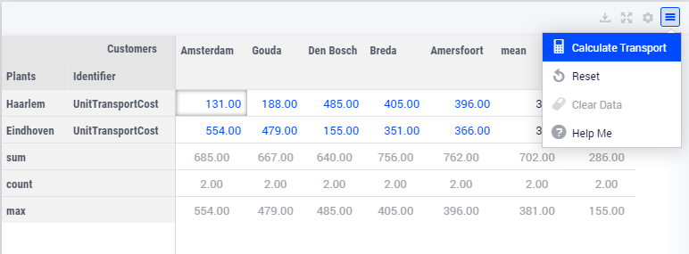
Widget Actions
Important
Widget Actions are available in software versions from AIMMS 4.66 onwards.
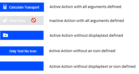
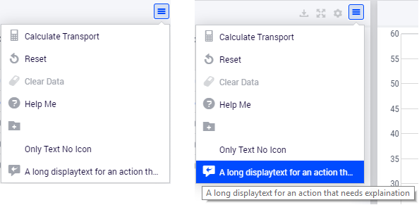
Widget Actions are a set of actions/procedures that can be defined via the model and configured for individual widgets. These widget actions are grouped under the  icon in the widget header. The widget action displays up to 10 actions. In case you configure more than 10, only the top 10 active and/or inactive actions will be displayed.
The widget actions can be associated with any procedure in your model. For example: Resetting data, Saving data, etc.
Note
The Widget Actions icon in versions before AIMMS 4.75 used to be  and before AIMMS 4.89 it used to be
  . The screenshots on this page have been taken with a version between AIMMS 4.75 and 4.89.
Configuring Widget Actions
Widget Actions can be configured by the application developer via the AIMMS model. The set webui::WidgetActionSpecification declared inside the Pages and Dialog Support section is used for configuring the widget actions, as illustrated here in the next steps.
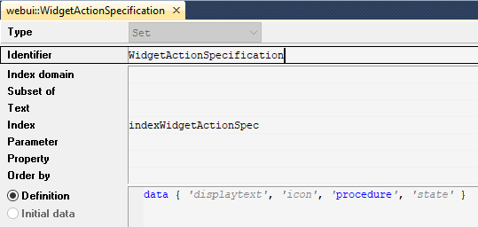
This set has 6 elements representing widget action properties:
displaytext: Is the text/label you would like to give the action.tooltip: Ignore this! This field has no effect on standard widget actions. It is only relevant for the “Inline actions” experimental feature of the List widget type.icon: The icon you want to associate with the respective action. You can select from a list of 1600+ icons, the reference can be found in the icon list.procedure: The procedure you want to call when the respective action is clicked.state: This is the state for the action, i.e. Active (displayed and clickable), Inactive (displayed and not clickable) and Hidden. By default, the state is Hidden.actiontype: This determines the type of action the procedure implements. It can either beprocedure(any procedure without arguments),upload(an upload procedure, see below) ordownload(a download procedure, see below). By default, the actiontype isprocedure.
Tip
If you find it difficult to browse the icon list, navigate to IcoMoon List and find an icon. Hover over the desired icon and write down the icon name. Append aimms- to the selected icon name when adding it to the model. For example: if the icon name is “calculator”, then in AIMMS it needs to be aimms-calculator.
Custom icons can also be used if required.
To configure widget actions, create a string parameter indexed by the webui::ExtensionOrder set with webui::indexPageExtension and webui::WidgetActionSpecification with the index webui::indexWidgetActionSpec, for example MyWidgetActions(webui::indexPageExtension,webui::indexWidgetActionSpec) as shown here:

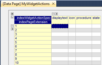
Right click the string parameter and click on the Data option to open the data page:
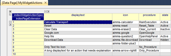
Add the details for the widget actions you would like to show for the widget. For example:
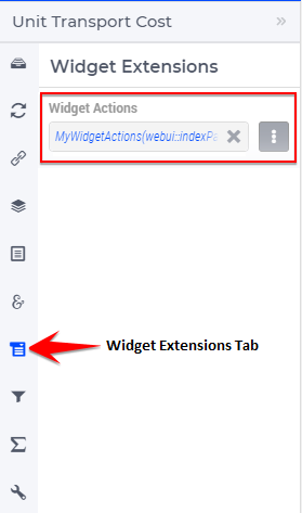
To activate the widget actions on a widget, go to the respective widget’s settings by clicking on the in the widget header. Click on the Widget Extensions tab. Add the string parameter in the Widget Actions field using the identifier selector.
You will notice the  icon on the widget and when you hover over the icon it highlights and when you click it you will see the configured widget actions.
Note
Widget Actions can be configured for the Table, Bar Chart, Line Chart, Gantt Chart, Bubble Chart, Pie Chart, Tree Map, Multiselect, Slider, Legend, Map and Scalar (except in Compact Mode) widgets.
Interacting with Widget Actions
The widget action menu can be opened and closed by clicking on the icon on the widget header. When the menu is open and you click anywhere outside the menu or on any other widget, the menu will close.
To select any of the widget actions, just click on the respective action. You will not be able to click an inactive action; the cursor will also indicates this.
Please notice the different combinations in the widget action menu.
If a procedure is not defined for a certain action, clicking on the action will result in a “No action specified” error.
In case you have a long displaytext for an action, the widget action menu will stretch to a width of 2 columns and ellipsis the text that does not fit. Hovering over the action will show the complete text in the tooltip.
Upload and Download Procedures
As described above, the actiontype for a widget action can be either procedure, upload or download (since AIMMS 4.96; previously the actiontype setting was not present). When specifying procedure (or leaving the actiontype empty), you should provide a procedure without arguments, which will be executed as described in the section above.
If you specify either an upload or a download actiontype, you should provide a special procedure which takes care of preparing a download file, or post-processing an upload file. Such procedures are exactly the same as the procedures used for the Upload widget and the procedures used for the Download widget, respectively.
The upload and download process works the same as it does with the separate Upload and Download widgets. The main advantage of doing the upload or download from a widget action is that is saved the space of the official widget on your page. Another advantage is that it is immediately clear that the upload or download action is relevant for the specific widget for which you have defined such a widget action.
Custom CSS for Widget Actions
Starting from AIMMS WebUI version 24.5, the widgets which have widget actions specified through a configuration string in their option editor get automatically the annotation “has-widget-actions” in the DOM.
The app developers can query on this class name and apply CSS styling through custom CSS for any widget-menu-button control which includes custom widget actions.
Item Actions
Important
Item Actions are available in software versions from AIMMS 4.74 onwards.
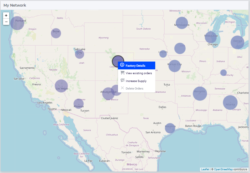
When using the right mouse button on an item in a widget, a menu can appear with different actions depending on the context. In UI design this is often called a contextual menu. In AIMMS WebUI, we use the term Item Actions to create a link with Widget Actions and Page Actions.
Item Actions are a set of actions/procedures that can be defined via the model and configured for identifiers that are specified for a widget. These item actions are displayed when the user performs a right-click on the data elements in the widget. Item actions are defined per identifier and the right-click item action menu only appears on the data element associated with that identifier.
Item Actions give users quick access to frequently used commands related to the selected item.
By default, Item Actions are hidden from view and there is no way for users to know if Item Actions are configured for a widget or not. Especially when the feature is new, the users will not yet expect it to be there. It is therefore wise to mention it in the documentation or the onboarding for your app. On the page inside the app itself it can be mentioned in the Help sidepanel.
The right-click item action menu displays up to 10 actions. In case you configure more than 10, only the top 10 active and/or inactive actions will be displayed.
The item actions can be associated with any procedure in your model. For example: Resetting data, Saving data, etc.
Configuring Item Actions
Item Actions can be configured by the application developer via the AIMMS model, similarly to how widget actions are configured. This includes the actiontype specification, as available in AIMMS from version 4.96 onwards.
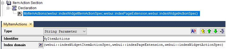
To configure item actions, create a string parameter indexed by the set webui::WidgetItemActionSpecification with the index webui::indexWidgetItemActionSpec, the set webui::ExtensionOrder with the index webui::indexPageExtension, and
the set webui::WidgetActionSpecification with the index webui::indexWidgetActionSpec; for example, a string parameter as shown here:
MyItemActions(webui::indexWidgetItemActionSpec,webui::indexPageExtension,webui::indexWidgetActionSpec)
Note that, starting from AIMMS 4.92, the second index above may also be any index in a sub-set of the pre=defined set of Integers.
You can double-click the created string parameter, open its data page and enter or modify its data values (you do need to save your model data after that):
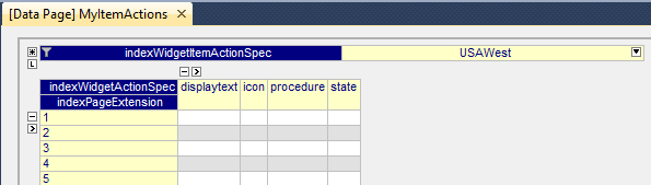
Select the identifier that you want to define the item actions:
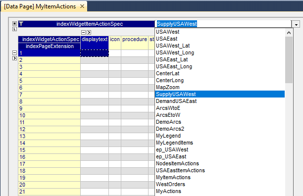
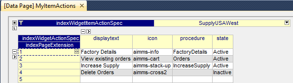
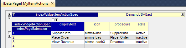
Add the details for the item actions. In the illustration below we are adding four item actions to the identifier SupplyUSAWest(usw).
Similarly, you can add item actions to other identifiers as well. As illustrated below, we have added 3 item actions to the identifier DemandUSAEast(use).
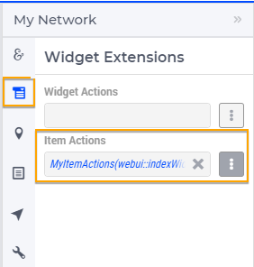
To activate the item actions on a widget, go to the respective widget’s settings by clicking on the in the widget header. Click on the Widget Extensions tab. Add the string parameter in the Item Actions field using the identifier selector.
Once the string parameter is added, right-click on the element and the item action menu will be displayed.
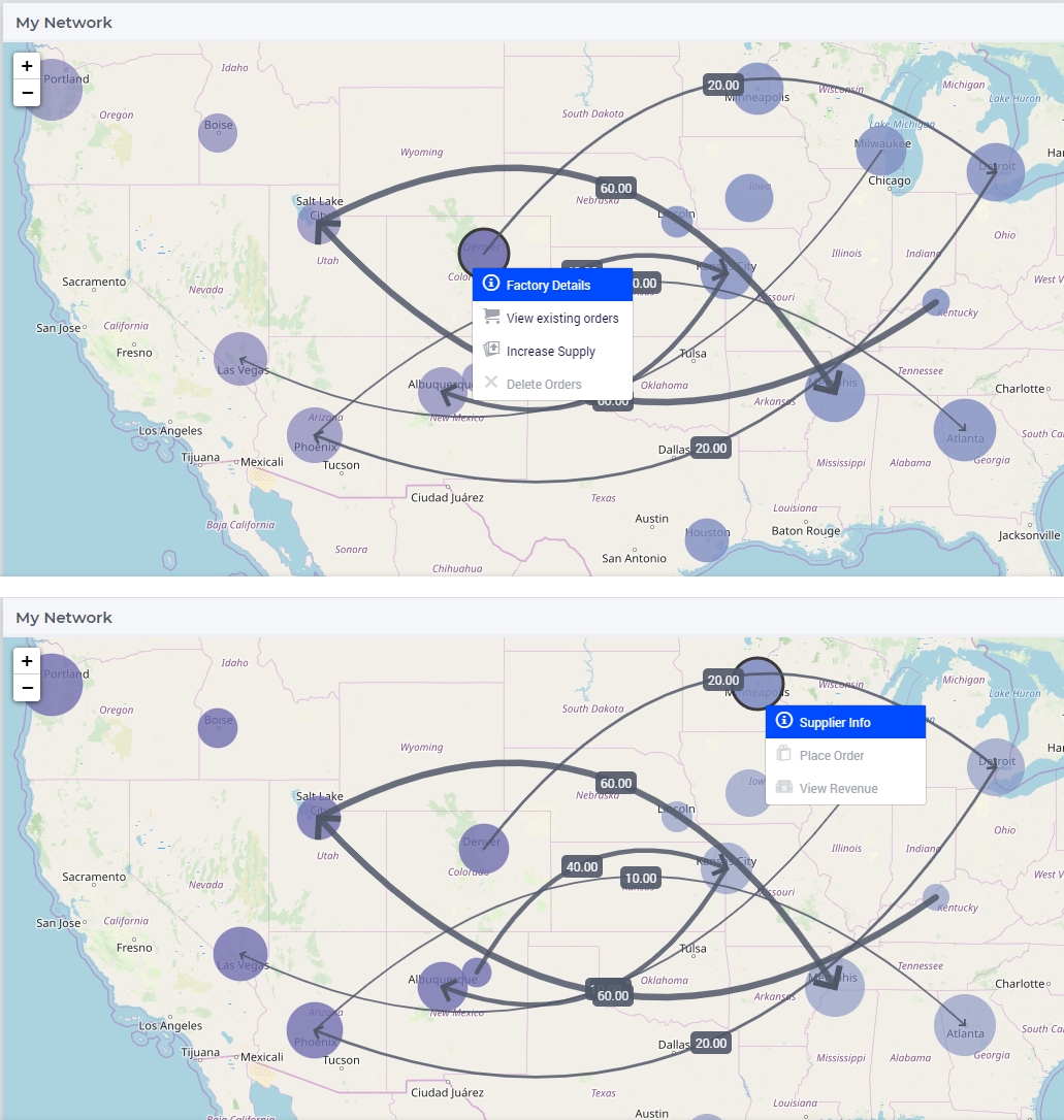
In the illustration above, the two identifiers SupplyUSAWest(usw) and DemandUSAEast(use) are specified as the Size identifier for their respective node sets. Hence, you can see the respective item actions appear for the nodes.
Configuration for Specific Widgets
Here are some practical considerations to keep in mind for configuring item actions in some specific widgets.
In the table widget, item actions may be applied to the cells in the table grid or to the table headers. To configure item actions for the grid cells the actions should be added to one of the identifiers shown in the table Contents.
Item actions for the table headers are available starting from WebUI version 24.7. The item actions can only be specified on a per-identifier or on a per-index level. In order to apply them for an index in the table headers the actions should be added for that specific index in the model.
To configure item actions per identifier in table headers the actions should be applied to the pre-declared index webui::IDENTIFIER_SET from the WebUI library.
So, the webui::IDENTIFIER_SET is just used as a placeholder to be able to specify item actions for the ‘identifier index’ in the table (which is not present in the model as an explicit index). It has no other use in the model than in the item actions specification. You can use this one to be able to specify item actions for elements in the set AllIdentifiers that occur somewhere in the row or the column header of the table.
The advantage of this approach (using webui::IDENTIFIER_SET) is that all item actions (also the ones for the identifier elements) can be specified through a single item actions configuration (string) parameter in your model.
Note
If you want to specify different actions for a different slice of the same identifier (or index) you will have to do this in combination with the Store Focus functionality and Upon Change procedures triggered for changes in the element parameters used for store focus (this way of working is valid both for the grid cells and for the table headers).
In the map widget, for node sets, you can configure the item action to either the identifier that will be specified as the Size of the node set or the set used to define the node set. If item actions have been defined for both the size identifier as well as for the set, the item actions configured for the size identifier will be considered. For arc sets, item actions need to be defined on the identifier specified as the Value for the arc set.
To configure item actions for the Gantt chart the actions should be added to the identifier that is used as the Duration property in the Gantt chart settings.
To configure item actions for the Bubble chart the actions should be added to the identifier that is used as the Size property in the Bubble chart settings.
Note
You could also define different item actions for the same identifier but in two different string parameters and configure each of those string parameters to different widgets.
Note
For the right-click item action menu to appear you will need to ensure that the widget contains the identifier for which the item actions were configured in the string parameter.
Note
Item Actions can be configured for the Table, Bar Chart, Line Chart, Gantt Chart, Bubble Chart, Pie Chart, Tree Map, Map and Scalar widgets.
Interacting with Item Actions
The item action menu can be opened by right-clicking on the data elements in the widget. When the menu is open and you click anywhere outside the menu or on any other widget, the menu will close.
Note
If the <IDENTIFIER-SET> index is pivoted on the Totals partition the item actions menu cannot be displayed since the identifier cannot be uniquely determined.
Please note that when you right-click on a data element to reveal the item action menu, that element will get selected. If any store focus has been defined for the widget, the respective element parameter will also be updated.
To select any of the actions, just click on the respective action. You will not be able to click an inactive action; the cursor will also indicate this.
Please notice the different combinations in the item action menu.
If a procedure is not defined for a certain action, clicking on the action will result in a “No action specified” error.
When Item actions are configured for a widget the default right-click menu for the browser will not be displayed in that widget.
In the case of the table and scalar widgets, when the cell is in edit mode (the user double-clicks the cell or is entering any data in the cell) the item action menu will not be displayed.
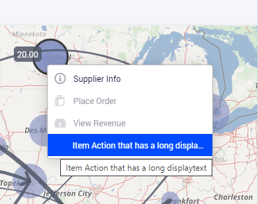
In case you have a long displaytext for an action, the item action menu will stretch to a width of 2 columns and ellipsis the text that does not fit. Hovering over the action will show the complete text in the tooltip.
Best Practices for Item Actions
Include only commands that have a direct relation to the selected item. For example when doing a right click on a Distribution Center on a map, “Exclude From Forecast” has a direct influence on the node, while “Save Scenario” does not.
Text for actions should be clear and concise.
Use verbs and verb phrases for menu items that initiate actions. Describe the action that occurs when the item action is chosen, such as Consider or Exclude. This avoids confusion compared to Considered and Excluded. Is Excluded the state it is now, or is this what occurs when clicking the action?

Refrain from using articles in menu item titles. For example, use Place Order instead of Place an Order, or Increase Capacity instead of Increase the Capacity. Articles rarely add value and make the text longer.
Use title case. The convention for AIMMS is to use Title Case in words. Sticking to this convention gives users a consistent experience.

Use adjectives or adjective phrases for Item Actions that toggle item states. Describe the attribute the action affects. Adjectives appearing in menu item titles imply an action and can often fit into the sentence “Change the selected object to…”—for example, At Capacity or Closed.
Use an ellipsis whenever choosing a menu item requires additional input from the user. The ellipsis character (…) means a dialog or separate window will open and prompt the user for additional information or to make a choice.
Disabled state is an item that is greyed out and gives a not-allowed pointer when hovered. This can be because the item is currently unavailable until a certain condition is met. Another use case can be for toggling between options, where the currently active option is disabled.

Note
Most of these best practices also apply to Widget Actions.
Some content of this guide is taken from the Apple Human Interface Guidelines. These guideline provide a wealth of information on human-computer interactions.