Theming
With CSS Styling you can style your WebUI app any way you like. This flexibility does have a drawback though: it (obviously) requires CSS knowledge and you have to know quite some details about the DOM-tree that AIMMS is using for displaying WebUI apps, in order to target specific parts of the WebUI for styling. With theming we offer you a different way of styling your app. It requires less detailed knowledge than regular CSS styling, while still offering a way to make your apps look the way you want in most cases. Should you still require some additional tweaking after theming your app, you can just use the regular CSS styling side-by-side with it.
How To Use Theming
Setting up WebUI theming is quite straightforward. It requires just one .css file in the
MainProject/WebUI/resources/css/
subfolder of your AIMMS project. You can name this CSS file as you like. It should contain a series of themable properties, which you can assign your own values. These properties are listed in logical groups in the base-theme-<WebUI Library Version>.css file, which you can use as a starting place for your work.
C:\Users\<your name>\AppData\Local\AIMMS\AutoLib\<WebUI UUID>\<WebUI Library Version>\x64_vc143_Release\webui\resources\css\base-theme-<WebUI Library Version>.css24.10.2.0) is visible from within AIMMS, in the Library Manager (File > Library Manager).File > Library Manager > Add Library from Repository > WebUI). For example 69378F70-E906-486F-8F2C-1D606AEB9669.base-theme-<WebUI Library Version>.css within the entirety of the AutoLib folder might be convenient too.For AIMMS releases older than 24.2, the file is still part of the AIMMS installation folder itself:C:\Users\<your name>\AppData\Local\AIMMS\IFA\Aimms\<your AIMMS version (before 24.2)>\WebUIDev\www\resources\css\base-theme-<your AIMMS version>.css
With the file now ready to be copied to your own Project’s resources, and edited to perform your desired changes, you could benefit from reading the comments inside the file. Each group and property is commented, to give you an idea for which part of the WebUI you can influence the appearance by changing its value.
On a side-note: a pretty large section of that file is aimed at providing a Data Color palette for widgets that can show annotated data, like Charts. If you’re interested in exploring your options there, please read Data Coloring and Palettes too. Also, please ignore the header comments in the file, as they are meant for internal reference only but could not be kept out of this file without also removing the other comments. The real comments start with “General guidelines for what the property name prefixes mean”.
The values assigned in this base file are the values that are used by default in the WebUI AIMMS theme. Please note that in your own .css file, you do not have to specify properties from the base file which you do not want to change. This will make sure that you will benefit from the effect of potential future updates to the default values in the base file and that your own file shows your clean changes only.
So the intended way of using this file is: #. Find it, copy it to your project using a new useful name, #. read the comments and grasp the potential. #. Make your changes. See the effect. #. Remove all the lines you did not change.
Since AIMMS 4.95 the amount of themable properties has grown significantly to further enlarge the number of areas the theming applies to. Many of these new but also existing properties have been re-applied throughout WebUI so practically all aspects of Widgets and the application can be coherently influenced from as few properties as possible.
While the base theming file and its (brief) comments are always up-to-date for each release, we also keep some longer documentation about the css properties, which should help you with Understanding Theming.
An Example
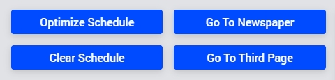
As an example of the usage of theming, suppose that you would like to change the background color of your WebUI app and the coloring of the buttons. In the default AIMMS theming, part of an app could look like this:
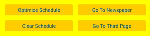
To accomplish the change, you should create a file (let’s call it yellow_theme.css) in the subfolder mentioned above. In the file, it requires just these lines:
:root {
/* Global app properties */
--color_bg_app-canvas: yellow;

/* Button properties */
--color_text_button_primary: #0768a9;
--color_bg_button_primary: #ffcc00;
}
to change the appearance of the app fragment into this:
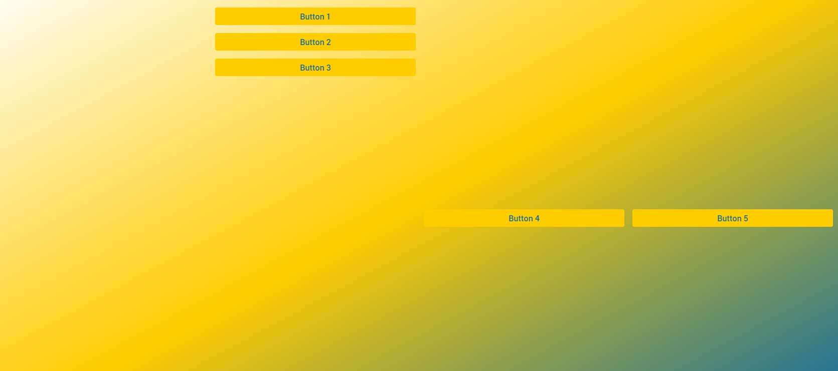
As you see, it is a matter of selecting the right properties for your theming wishes and assigning them the right values to get the effect that you are after. For these values, you are not restricted to ‘simple’ values, like the color names/numbers above. It is perfectly possible to use, for example, the CSS-function linear-gradient(). This .css file:
:root {
/* Global app properties */
--color_bg_app-canvas: linear-gradient(
    to bottom right,
    #ffffff 0%,
    #ffcc00,
    #0768a9 100%
);

/* Button properties */
--color_text_button_primary: #0768a9;
--color_bg_button_primary: #ffcc00;
}
will result in the following WebUI theme:
Obviously, using a function like linear-gradient(), it needs to make sense. That means that it can only be applied to background coloring options, but not to, say, text coloring options.
Note
Although the base theme file contains an explanation that suggests that all properties prefixed with color_bg or bg_ will be purely applied to real backgrounds (allowing for URLs and gradients), there are a few exceptions where only a (straightforward) color values will work to theme some elements with these properties. We have not managed to iron these out yet. Using color values only is currently the safest. Contact us if you run into areas that behave unexpectedly and always keep Chrome’s DevTools at hand to check where and how theming is being applied.
For borders, for example, by adding a specific border value like this:
--border_button_primary: 4px dotted blue;
the example above will change into the following:
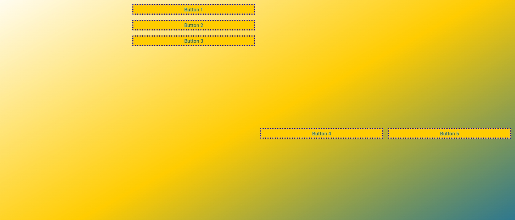
Obviously it is a matter of taste whether you deem these last two examples beautiful, but it does illustrate that with changing just a handful of theming property settings, you can achieve far-reaching effects.
A Special Case: the Application Logo
Theming offers you the possibility to easily specify a logo for your application. It will be displayed to the left of the application name in the menu bar. It has a special ‘rule’ for specifying the location of the image that you want to use as a logo. As an example, take this specification:
--bg_app-logo: 8px 50% / 35px 35px no-repeat url(/app-resources/resources/images/icon.gif);
Aside from the values which define the size and positioning here, the url part requires some explanation. Obviously, the image that is referred to is called icon.gif in this example. The path, however, is perhaps less intuitive. If you want to refer to an image file somewhere in your project folder structure, you must include the /app-resources/ part. In terms of your project folder structure, this points to the MainProject\WebUI subfolder. Anything after this should follow the sub-path in your project folder. So, in the case of the example above, the image file is located in the MainProject\WebUI\resources\images folder of the AIMMS project.
Next to the path to the logo file itself, you also need to specify the width that you want to allow your logo to occupy:
--spacing_app-logo_width: 50px;
Please note that if you omit this second property, no image will be visible(!). The reserved height for the logo is always equal to the entire height of the header.
So to get the final layout right, you also need to get the values for positioning and size in bg_app-logo right, combined with this reserved area.
The property value for bg_app-logo adheres to the CSS specifications for background shorthand. It can take several orders and combinations of attributes, but here is a quick primer to what the example above would mean to the browser:
8px 50%-> within the reserved area, position the image8pxfrom the left-hand edge, and automatically center it vertically.35px 35px-> size the image to measure 35 by 35 pixels. The first value sets the width and the second sets the height. If your own image has different dimensions, use them here and when scaling them, make sure to scale both width and height equally (i.e. keep the aspect ratio of your image) to prevent distortion. Instead, you could also specifycontainorcoverhere, but that will make specific sizing a bit difficult. Also note that background sizing must come after the position, separated from it by a/.no-repeat-> stops the 35px x 35px image from repeating itself across the available area (50px by the height of the header, in this example).
As opposed to using a location relative to your project folder, it is also possible to use an image that resides somewhere on the web. In that case, you can simply specify the precise URL of its location in the url. So, for example:
--bg_app-logo: 8px 50% / 35px 35px no-repeat url(https://www.aimms.com/wp-content/themes/aimms/images/logo-aimms.svg);
Will show the AIMMS logo which is displayed on our website. That is, if you don’t forget to reserve some space for it with the --spacing_app-logo_width.
Manipulating borders on cells in a Table
Borders on table cells are another interesting case for those who want or need changes on specific cells or on entire rows and columns. There are a few reasons for that and with the release of WebUI 25.2.5 we have also changed the way in which you should customize them.
The standard Table widget shows only a few dividers, most obviously the horizontal lines between the rows. The row and column headers use some more subtle borders. Both use an almost translucent black line to basically darken whatever background color they are placed on top of. This setup works with any color (that you can set through theming too) as long as it is not too dark. If you want to change the color of these lines, you can use the following properties:
--color_overlayed-border_cells: rgba(0,0,0,0.1);
--color_overlayed-border_within-header-title: rgba(0,0,0,0.035);
If however you want more dividers, thicker dividers or dividers on the edges of specific cells, you will have to apply some styling through a selector in a custom css file (just like anything else that you can “style” but can’t “theme”).
Most important fact to know about dividers in the Table Widget, is that none of these should be created by applying borders on the cells. This is due to the fact that the Table Widget uses a layout that optimizes performance, but which cannot cope with borders on the edges of table tiles very well. Tiles are the subsets of rows and columns that span the entire dataset, but which are placed strategically to make sure that only the visible part of the table is rendered. If borders are present on the edge of tiles, horizontal or vertical, they risk being partially overlapped by a neighboring tile, which will make the border look ‘thin’ or missing altogether. Altogether an unreliable experience.
For that reason WebUI (since WebUI 25.2.5) also no longer uses css border properties to achieve ‘dividers’. Instead, box-shadow is used.
Box shadows work differently from borders, in the first place because they do not take up space in the layout (the intended effect) but also because box shadow syntax is not as flexible and logical as border setup syntax. However, by defining multiple, inset box shadows we can still achieve the same effect as a border. The following example shows how to create a mild blue vertical border between all cells in the actual data section of a table:
.tag-table .grid-viewport .cell {
      box-shadow: inset -1px 0 rgba(0, 0, 128, 0.25);
}
However, since this rule overwrites the standard WebUI horizontal ‘border’ between rows, you’ll have to add a second box shadow that brings these back. To stick with theming, you can refer to our own color reference for that:
.tag-table .grid-viewport .cell {
      box-shadow: inset -1px 0 rgba(0, 0, 128, 0.25), inset 0 -1px var(--color_overlayed-border_cells);
}
Please take note of the following characteristics of this setup:
the box shadows are always
insetsuch that they project inside the cell, not outside of it (where another cell will likely overlap it, rendering it invisible).looking at the coordinates: The first value is the horizontal offset, the second the vertical offset. With this being an inset shadow, a negative value will ‘drag’ in the shadow from the right hand or bottom edge of the cell. A positive value will push the shadow out from the left hand or top edge of the cell. The distance determines the exact thickness of the border.
to show ‘dividers’ on more than one edge, simply define multiple box shadows, separated by a comma. Remember, this is a regular CSS box-shadow property, so you can use all the options that come with it. You could have 6 stacked on top of each other on one edge in 6 different colors and widths if you wanted to (but please don’t).
transparent colors (rgba values as shown in the example) are not a requirement, but they will help in blending with the background color of the cell.
because the box shadows do not ‘take’ space from the content, that content also will not re-align to keep clear of the shadow: using thick shadows will obviously bring them closer to the value of the cell, which might look odd.
when specifying a shadow on both sides of a cell, and if the targeted cells have similar neighbors, you will have that shadow on two sides of the shared edge of those cells. They will not ‘collapse’ into a single shadow like a real border definition would do. So when attempting to frame a cell, make sure you either target a cell that has no neighbors (i.e. which does not repeat), or that you specify the shadow on just 2 sides of the cell (where the end result looks like a grid, like in the example above).
Some final remarks on this topic:
to remove a box shadow (all of them), set the box-shadow property to
none. Or, if you just want to make the regular horizontal row dividers invisible, set the css property for the border to transparent (--color_overlayed-border_cells: transparent;)instead of the
.grid-viewportpart in the example, you can also target cells in the column, row or title headers, using the classes.colheader-viewport,.rowheader-viewportand.titleheader-viewportrespectively.using an annotation to for example signal a specific value in a cell, and wanting to put a full border on that cell, might seem cumbersome, but simply amounts to putting 4 box shadows in that cell. Although setting a background might be even easier. Or you combine them.
.tag-table .grid-viewport .cell.annotation-extraordinary {
      box-shadow: inset -1px 0 red, inset 0 -1px red, inset 1px 0 red, inset 0 1px red;
      background-color: darkred;
      color: white;
}
all of the above was documented to make you use box shadows. Which will work as intended and described. However, you could still specify borders on cells if you wanted to. Just be aware that the main WebUI stylesheet will try to suppress the cell borders of cells placed on the edges of the table’s tiles. Where even in small tables, all the outer edges will have suppressed borders.
Value Inheritance
Since WebUI theming is based on CSS, it is also possible to use inheritance of property values using CSS’s var function. For example, if you want to color the background of the widget headers the same as the default text, you can write:
--color_bg_widget-header: var(--color_text_default);
Next to this kind of inheritance, it is also possible to ‘inherit’ from the standard AIMMS color palette. In the same folder as the base theme example file, in the global-custom-prop-constants.css file, these colors are listed for your reference. So, for example:
--color_bg_widget-header: var(--COLOR_AIMMS-YELLOW-DARK);
Would display the background of your widget headers in the standard AIMMS dark yellow color.
If you look at the base theming file, you will notice that the base definitions use inheritance for quite a few properties too. It allows similar color types to be adjusted from a single property, but if needed the properties can still be changed separately.
Moving From Custom CSS/Theming
Many clients have their apps styled using custom CSS. We advise you to move to the new AIMMS Theming, since it offers better maintainability and probably also backward compatibility in the future. The best way to migrate is to put aside all your existing custom CSS files by moving them somewhere outside your project folder, to keep as backup. From this ‘clean’ state, start theming your app as explained above. If, after that, you are not fully satisfied with the result, you can re-visit your previous custom CSS to see whether selected parts of it can be re-used to fill the gap.
Also, it needs to be emphasized that you can combine custom CSS constructs with theming because it is CSS after all. And with your ‘custom css knowledge’ you can also come up with constructions that change theming only locally.
For example, instead of putting all definitions on the :root{...} element, like we do by default, you can also target a single widget, or type, or any context using well-known selectors:
[data-widget\.uri=my_special_table] {
    --color_text_edit-select-link: #9400d3;
    --color_bg_widget-canvas: #ffb6c1;
}
Or, on all pages with ‘red_page’ in the page name, you could just have different colored primary buttons:
[data-widget\.uri*=red_page] {
    --color_bg_button_primary: Red;
    --color_text_button_primary: White;
    --border_button_primary: 1px solid Yellow;
    --color_bg_button_primary_hover: DarkRed;
    --color_text_button_primary_hover: Yellow;
    --border_button_primary_hover: 2px solid White;
    --color_bg_button_primary_active: DarkGoldenRod;
    --color_text_button_primary_active: White;
    --border_button_primary_active: 1px solid White;
}
Be warned, that if you intend to target anything other than :root, and when using a url(...) for one of the several --color_bg... properties, and when publishing to the cloud, you will not be able to use images in the project resource folder. The special treatment we apply to those URLs in the cloud, can only be done for the root element.
You can still use resources like that, but you will have to manually insert and maintain the Application name and version number into the resource path and it will then also only work after publishing. There is, unfortunately, no other way for us to predict where you might have been applying theming to specific elements.