WebUI Grid Pages
This section describes various tasks related to WebUI grid pages.
Important
Grid WebUI pages are available starting from the AIMMS software version 4.75 onwards as part of Experimental Features. Please check the Experimental Features page on how to enable the feature.
Starting from AIMMS software version 4.81 onwards the Grid WebUI pages are available by default as standard feature (no longer experimental).
When running an AIMMS project which was created with AIMMS 4.80 (or with a newer version) and that has Dialog Grid Pages or Side Panel Grid Pages added, in AIMMS 4.79.3 (or an older version) you might face an invalid schema error. Please contact support if you face such issues.
Grid pages introduce in AIMMS WebUI the CSS Grid concept of visualization based on page layouts, which is currently a widely used standard in web design. For more information on CSS Grid in general please see websites such as:
The CSS Grid concept features several advantages such as better responsiveness, fluid layouts, and the possibility for full page widgets. What is taken out compared to the classic WebUI pages is the repositioning of all widgets when the browser window is resized. The intention is to support moving an entire WebUI application to this grid page format, such that this may be achieved gradually, by converting one page at a time (the idea is that the classic WebUI page style will become obsolete and will be deprecated in time).
When a page layout is applied to a grid page, the page is divided into a number of rectangular areas and each area is to host a group of widgets. In order to become visible on a grid page, each widget on that page must be assigned to one of the areas defined by the page layout. Currently, all the standard layouts use so-called fractions for resizing. This way, the layout areas always preserve their relative size and position on the page, even when the entire browser window is being resized. However, Grid supports more options for (re)sizing like pixels, percentages or em’s, and also supports combinations of those. These options can already be used in custom layouts, please see further below in this section for more details.
Note
Currently, if you assign a fixed height widget like the button, compact scalar, label, etc. to a grid area with “gridAutoFlow”: “row” and when the visibility of the widget is toggled from visible to hidden, other widgets assigned to the respective grid area will not be distributed correctly. Until this matter is addressed in future software versions, the usage of hidden widgets in this specific scenario is not recommended for the time being.
Toggling the visibility of widgets in a an area with “gridAutoFlow”: “column”, or when you only have widgets that do not have a fixed height in a grid area, should not lead to any problems though.
The organization of a page and the widgets on the page by using page layouts is supported by dedicated functionalities in the WebUI Page Manager.
Page Manager with Grid Pages
When opening the Page Manager two tabs are now available: the App tab and the Page tab. The App tab shows the list of all the pages in the application:
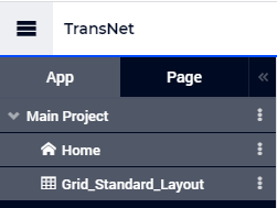
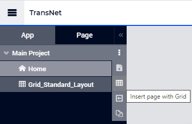
The actions for adding, renaming, moving, changing the visibility, and deleting a grid page in the Page Manager are the same as for a classic page. In particular, adding a new grid page can be done by selecting the grid icon in the page (create) options:
Note
You may also select one of the existing pages in the App tab if you want to convert them to the grid layout.
Once a page has been selected in the App tab of the Page Manager, the Page tab shows more details about that particular page:
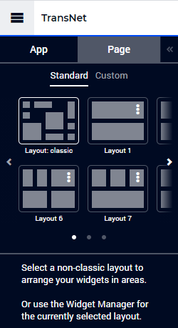
The upper part of the Page tab allows the user to select a certain layout for the page, either as one of the Standard layouts or as a Custom layout. First we are going to discuss options for applying Standard layouts. Afterwards, we will also discuss relevant topics for using Custom layouts.
Standard Layouts
As shown in the last picture above, a particular case of a standard layout is the “Layout: classic”. When this layout is applied to a grid page, then there are actually no specific areas defined and the widgets are placed on the page in the same way as done for a classic page. Resizing the entire browser window will result in the same repositioning of the widgets as the one applied to the classic pages.
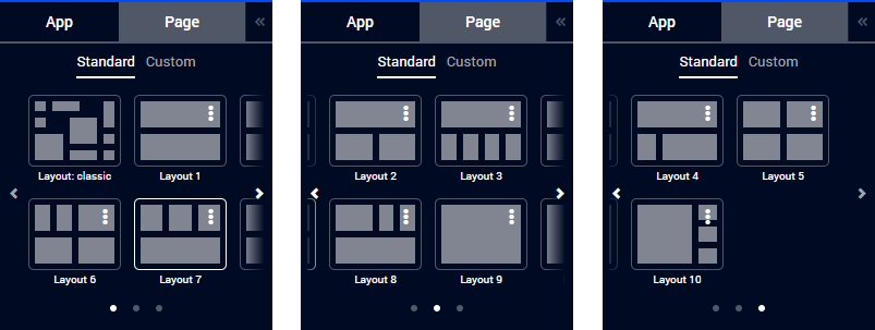
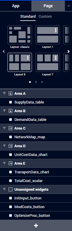
The user may choose to switch to another layout from the standard list. Currently this list offers ten standard layouts, Layout 1 to Layout 10 (please use the left arrow < and the right > in order to scroll horizontally through the list):
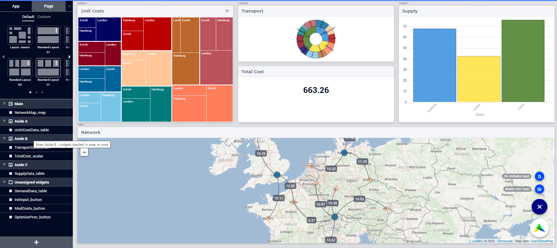
For example, if we choose Layout 6 for a newly added grid page Grid_Standard_Layout in our TransNet application and add widgets for input and output data as explained in the “Getting Started” section, then we may assign widgets to the five areas Area A, Area B, Area C, Area D, and Area E as shown in the following pictures:
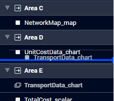
Adding widgets can be done by following the steps described in this section . Unassigned widgets may be moved from the “Unassigned widgets” section to one of the defined areas by using drag-and-drop. Assigned widgets may also be moved from one area to another by using drag-and-drop:
Important
If you assign a fixed height widget like the button, compact scalar, label, etc. to a grid area with “gridAutoFlow”: “row” and when the visibility of the widget is toggled from visible to hidden, other widgets assigned to the respective grid area will not be distributed correctly. Until this matter is addressed in future software versions, the usage of hidden widgets in this specific scenario is not recommended for the time being.
The deprecated group widget is not supported in the grid layout. If you had a group widget in the classic layout, the widgets that were part of the group widget will appear in the “Unassigned Area” as separate widgets. You can then assign these widgets to designated areas as required.
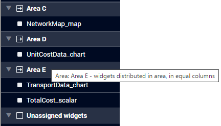
The icon before the name of an area contains either a horizontal arrow from left to right, or a vertical arrow from top to bottom. These arrows indicate how the widgets are distributed within each area, either column-wise in equal columns or row-wise in equal rows, which is also indicated by the corresponding tooltip:
The layout selection and the assignments of widgets to areas as shown above results in the following page visualization:
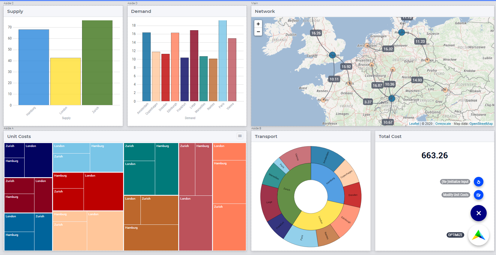
Note that the area “Aside B” is here in the lower right part of the page and contains the two widgets for Transport and Total Costs values, which are distributed column-wise in equal columns.
Switching between Layouts
When the user switches to another layout , for example to Layout 7, then the widgets stay assigned to areas with the same name, if these areas exist in the newly selected layout. If not, then the corresponding widgets appear in the “Unassigned widgets” section and may be moved by drag-and-drop to one of the currently available areas, if required:
In this example, the Demand widget (which used to be assigned to area “Area E” in Layout 6) has been moved to “Unassigned widgets” section (because the area “Area E” is not defined in Layout 7). Also, the distribution of widgets in area “Area C” is now row-wise in the current Layout 7 (whereas it used to be column-wise in Layout 6).
In general, widgets will always remember which named area they were assigned to, also upon switching layouts. Only when you explicitly move a widget to another area, will they store their new assignment. In other words, one can switch layouts without breaking the assignments of the widgets, as long as one does not re-arrange them.
As apparent from this example, the standard layouts provide some convenient basic options to start with. However, specific requirements for a page may require the usage of a Custom page layout.
Custom Layouts
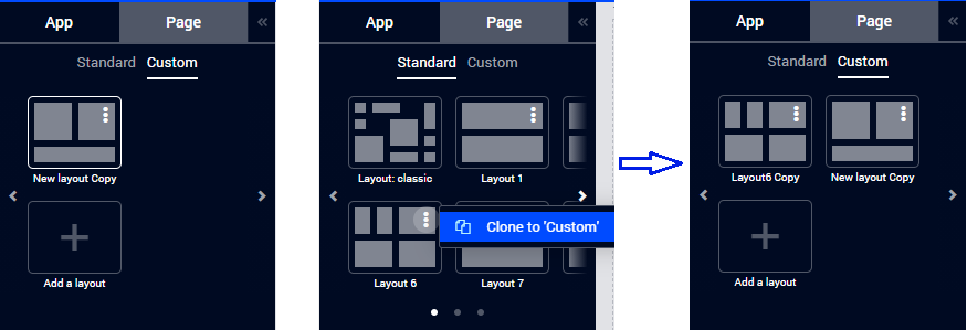
A new custom layout may be added by using the corresponding “+” button in the Custom section of the Page (layout) tab or by cloning one of the standard layouts (which is to be modified afterwards):
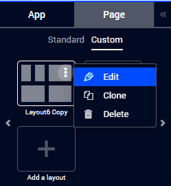
A custom layout may be edited (i.e. modified) by using the Edit option in its upper right corner:
This will open the layout Editor where the layout name and format may be adjusted and then saved:
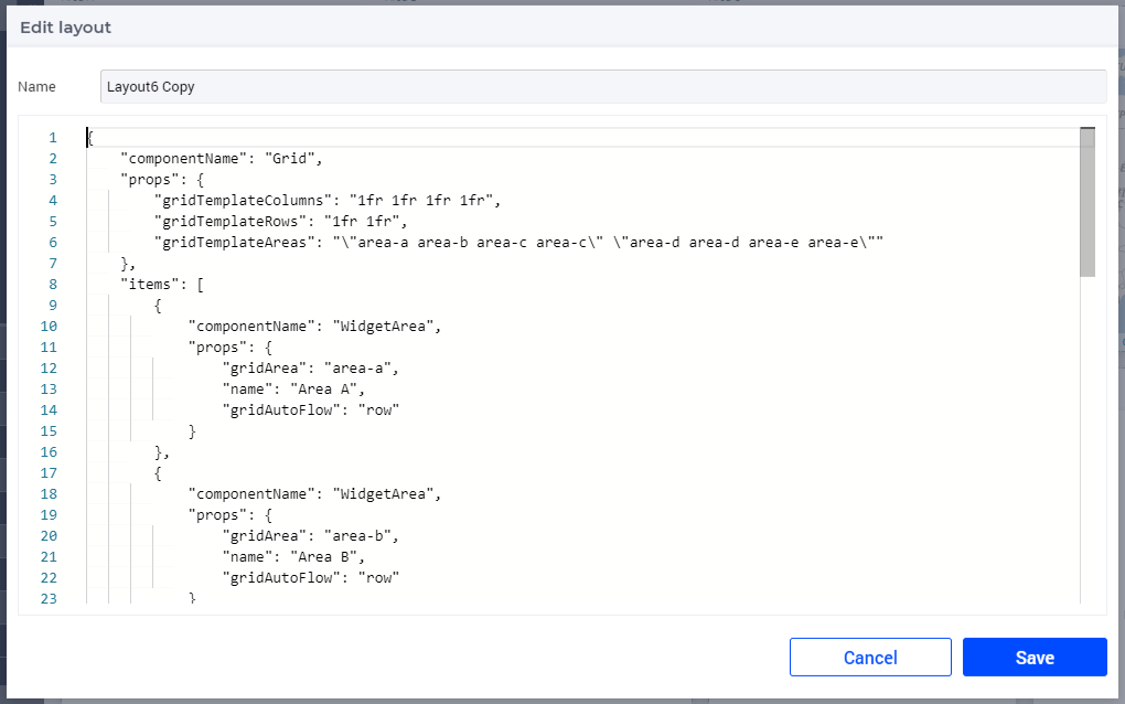
In particular, the editor contents above describes a layout with 4 columns and 2 rows. We can modify this layout and save the modified layout under the name “Custom Layout 6”, for example, as follows:
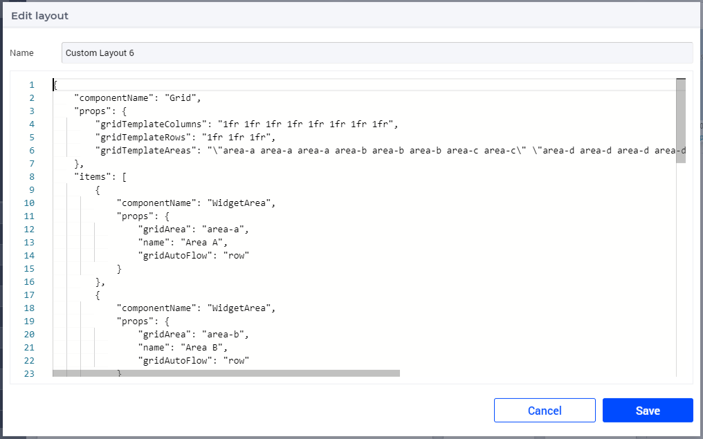
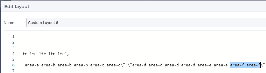
Note that in this case the grid has 8 columns and 3 rows (instead of 4 columns and 2 rows as it used to have initially). Also a new (sixth) area “area-f” has been added to the layout:
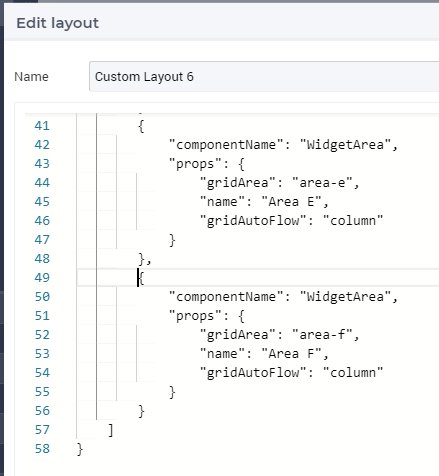
Clearly, this new area “area-f” is used when defining the adjusted grid template areas in the modified layout format:
When we apply the resulting custom layout as defined above to our page, the resulting visualization is as follows:
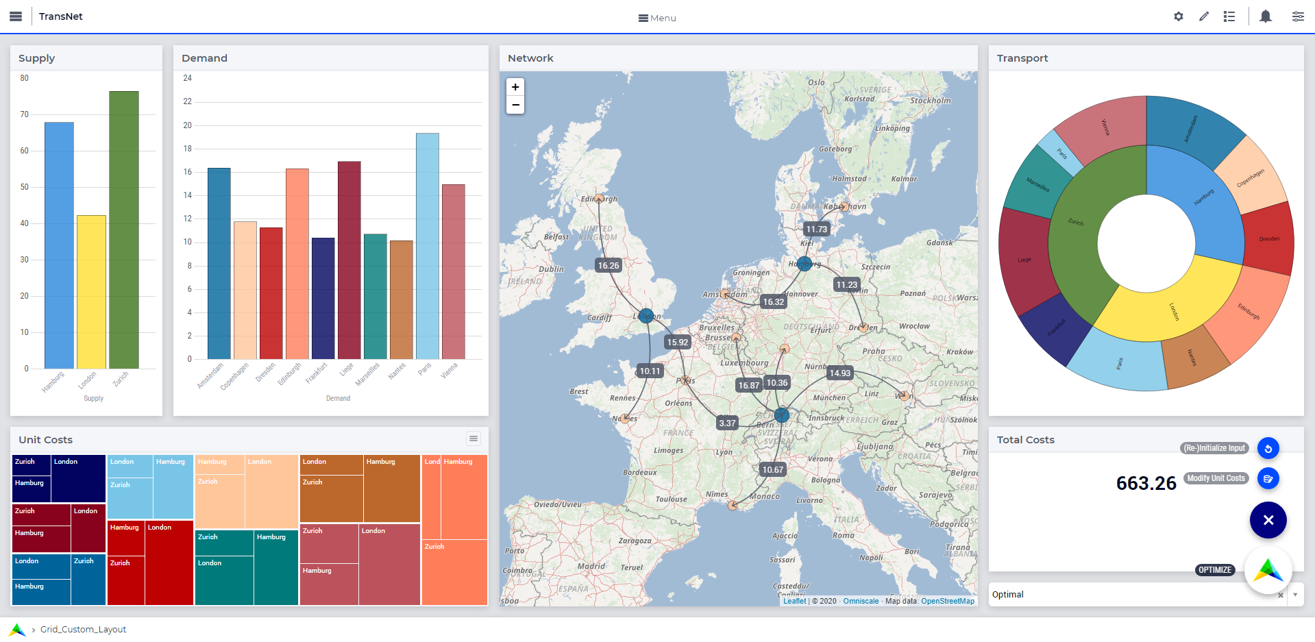
This resulting page looks better than the one achieved only based on Layout 6 discussed above. In particular, we have gained more space for the map widget such that the network is better visible now. Also, this page preserves the clear division between the input, optimization, and output data in a similar way as discussed in the “Getting Started” section of this manual.
Creating Grid Definitions
This section provides more details about creating (custom) grid layouts using the layout editor exemplified above.
Warning
The special layout editor will only save valid layout definitions. The description of a (custom) grid layout created using the layout editor will be saved in the webui.json file mentioned in the WebUI Folder section. Please DO NOT change this layout description in the webui.json directly. In particular, do not change any layout property names manually in the webui.json file. Failure to comply with this rule may lead to unexpected results. For more details, please check also the last two sub-sections below.
A layout is a technical description of a specific component (Grid), its properties and the items (sub-components) which live within that component. We currently (only) support Grid as the main component and WidgetArea as the sub-components.
The properties of the Grid component are closely related to how CSS Grid works (see websites links in the beginning of this section). In AIMMS WebUI we currently support grid-template-rows, grid-template-columns and grid-template-areas. By combining these you get virtually all of the power of CSS grids, using your choice of fractions, fixed pixel sizes or percentages. The gridTemplateAreas then serves to tell how your areas are supposed to overlap with the positions you made available as rows and columns.
Please note that the format you see in the layout editor will serve to create real CSS. This is also the reason why the gridTemplateAreas need to contain the quotes in their escaped version. The output of that needs to be a set of row definitions, grouped between quotes, while the property itself is also a string in quotes (the outer ones).
Warning
The names you give to your areas should re-appear as WidgetAreas components below the items of the Grid. The gridArea properties of it should be the same as of one of the defined areas in gridTemplateAreas of the Grid. Failure to do so may lead to unexpected results.
If you change the area name in the gridArea property and if any widgets were earlier assigned to that area, the widgets will get unassigned. To avoid this you could only change the area name in the name property.
Only the areas that you define as sub-components will end up in the Page Configurator tab of the Page Manager, ready to be used to place your widgets in, so please keep these two in sync when you change the (CSS) names or the number of areas of your custom layout.
WidgetArea components support a number of properties:
gridArea: the CSS name you also used in the definition ofgridTemplateAreasfor the parent Grid component,name: the display name you will see in the Page Configurator (which can contain white space and ‘odd’ characters, unlike the
gridAreanames; see the CSS grid specification),gridAutoFlow: either “row” or “column”. It defaults to “column”, if not specified. When multiple widgets are placed in this area, this property determines whether the widget either shares space vertically (=row, so stacked widgets) or horizontally (=column, so distribute width).Note that when widgets are stacked, certain widgets will never increase their height beyond their inherent size. For example: buttons, up/download widgets, scalar widgets.runIntoGridGap: true or false. It defaults to false. This property will make an area ‘expand’ into itsgridgap/marginsin all directions, so probably best used in combination with one single area. The adjacent areas which are also running into their grid gap will simply overlap.separateFixedHeightWidgets: true or false. It defaults to false. This property triggers different sizing and ordering behavior for the fixed-side widget mentioned above. Those widgets will be grouped together and placed at either the far right (column based flow) or bottom (row based flow) of all widgets. This is slightly different from just grouping your widgets yourself, especially for the column-based flow where you can have a group of vertically stacked buttons on the far right without having to create a new area for that.
We also support most other css-grid-spec properties for either Grid or WidgetAreas, like grid-gap, dir, z-index and several alignment properties, but do note that our own styling will either heavily influence or overrule these. Therefore, please consider their usage as experimental.
Different types of Custom Layout
The previous explained the general framework for creating custom layouts. The following sections illustrate more specifically how to use pixels (px) or percentages (%) in order to set a fixed width or height to columns or rows in your layouts.
This is useful when you either require a vertical scroll bar or in some cases a horizontal scroll bar, or if you do not want to use the full height or width of your viewport.
To control the height of your application either to a fixed height or to introduce a vertical scroll bar you need to customize the values in gridTemplateRows i.e. for the rows.
To control the width of your application either to a fixed width or to introduce a horizontal scroll bar you need to customize the values in gridTemplateColumns i.e. for the columns.
Using pixels (px)
In order to use pixels, you might want to first determine the height (in pixels) of the browser viewport.
Note
Please understand that, when using px or %, the spacing between the grid’s rows and columns (‘grid gap’, currently 16px) also adds to the total height or width of a Layout. Keep that in mind when summing up to a particular height/width.
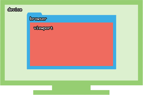
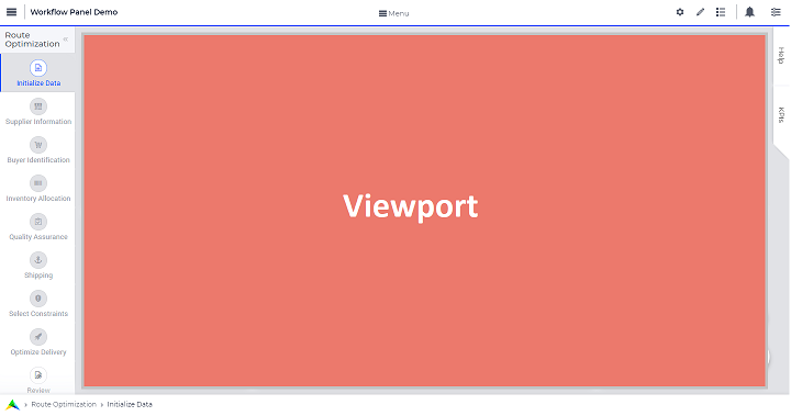
When you use the Workflow Panel and the Side Panels, your viewport size is slightly smaller as illustrated in the image below:
Once you know the height of the viewport, if you want to fix the height of your application to half of your viewport’s size, for example, just divide the values such that the sum of the values defining the height of the rows is half of the height of the viewport, minus 2x16=32px grid gap.
To illustrate the above example, let’s consider that the height of the browser viewport is 1000px. In this case, the specification of the gridTemplateRows could be, for instance, as follows:
"props": {
            "gridTemplateColumns": "2fr 1fr 1fr",
            "gridTemplateRows": "84px 84px 300px",
            "gridTemplateAreas": " \"Title Title Extra\" \"Data Data Data\" \"Map Output Optimize\" "
    },
As long as the sum of the values used to divide the rows does not exceed the browser viewport, no scroll bar will appear. To introduce a vertical scroll bar the sum needs to exceed the browser viewport height.
So, assuming again that the viewport height is 1000px, if you want to introduce a vertical scroll bar you can use a code snippet such as the following:
"props": {
            "gridTemplateColumns": "2fr 1fr 1fr",
            "gridTemplateRows": "300px 400px 500px",
            "gridTemplateAreas": " \"Title Title Extra\" \"Data Data Data\" \"Map Output Optimize\" "
    },
Now let’s consider the situation where the width of the browser viewport is 1000px.
Similarly as above, for fixing the width such that the layout is half of the browser viewport, just divide the values such that the sum of the values used to divide the columns is half of the viewport’s width, minus 2x16=32px grid gap:
"props": {
        "gridTemplateColumns": "100px 184px 184px",
        "gridTemplateRows": "1fr 1fr 1fr",
        "gridTemplateAreas": " \"Title Title Extra\" \"Data Data Data\" \"Map Output Optimize\" "
},
If you want to introduce a horizontal scroll bar you can use a code snippet like the one below, where the sum exceeds the browser viewport width:
"props": {
        "gridTemplateColumns": "300px 500px 500px",
        "gridTemplateRows": "1fr 1fr 1fr",
        "gridTemplateAreas": " \"Title Title Extra\" \"Data Data Data\" \"Map Output Optimize\" "
},
Using percentages (%)
Similar to the case of pixels, in order to avoid a scroll bar when using percentages the sum of the values should not exceed 100%, and if you want a scroll bar then the sum must exceed 100%.
Note
Please understand that the spacing between the grid’s rows and columns (‘grid gap’, currently 16px) also adds to the total width/height of the page and that the percentages work on the total viewport width/height without taking grid gap(s) into account. Keep that in mind when summing up to a particular height/width, especially when you expect the total to add up to 100%. So 50% 50% would add up to 100% of the viewport, plus 16px for the one grid gap. Leading to a scrollbar where you did not really expect that!
Warning
If your row or column definition turns out to be using only percentages, you are probably better off converting them to ‘fractions’ (fr). Just replace the % with fr and the grid gaps will be taken into account in a much more manageable way. So the 50% 50% above is better represented as 50fr 50fr (which is simply equal to 1fr 1fr).
To illustrate an example where you want to avoid scroll bar or want the application to be (about) half the size of the browser viewport, you can use a snippet such as below:
"props": {
            "gridTemplateColumns": "2fr 1fr 1fr",
            "gridTemplateRows": "10% 20% 20%",
            "gridTemplateAreas": " \"Title Title Extra\" \"Data Data Data\" \"Map Output Optimize\" "
    },
If you want to introduce a vertical scroll bar you can use, for instance, this snippet below:
"props": {
            "gridTemplateColumns": "2fr 1fr 1fr",
            "gridTemplateRows": "10% 40% 80%",
            "gridTemplateAreas": " \"Title Title Extra\" \"Data Data Data\" \"Map Output Optimize\" "
    },
Similarly, if you want to control the width of the application, to avoid a horizontal scroll bar or use only (about) half the width of the viewport you can use the below snippet.
"props": {
        "gridTemplateColumns": "10% 20% 20%",
        "gridTemplateRows": "1fr 1fr 1fr",
        "gridTemplateAreas": " \"Title Title Extra\" \"Data Data Data\" \"Map Output Optimize\" "
},
If you want to introduce a horizontal scroll bar you can use a snippet such as the following:
"props": {
        "gridTemplateColumns": "10% 40% 80%",
        "gridTemplateRows": "1fr 1fr 1fr",
        "gridTemplateAreas": " \"Title Title Extra\" \"Data Data Data\" \"Map Output Optimize\" "
},
However, there is one fundamental difference between using pixels and percentages/fractions: pixels are fixed width/height regardless of the browser viewport size, whereas
percentages adjust according to the browser viewport size
fractions adjust to being a size relative to the remaining available space (which depends on both viewport size and other row or column definitions).
Pixels can cause trouble if your target audience is using a browser with a viewport that differs from your expectations (especially when smaller), although a single fixed-width column or row certainly has its use cases.
Using combinations of fr, px, and %
You can also use a combination of fractions and pixels and percentages. This is typically useful when you might want to fix the size of a particular row or column but not restrict the rest of the layout.
The snippet below illustrates the use of fractions (fr) and pixels (px), where the first and second columns have a fixed width of 200px each, and the first row has a fixed height of 100px. This will result in the Title and Extra areas having a fixed height of 100px and the Map area with a width of 400px.
"props": {
        "gridTemplateColumns": "200px 200px 1fr 1fr",
        "gridTemplateRows": "100px 2fr 1fr",
        "gridTemplateAreas": " \"Title Title Title Extra\" \"Data Data Data Data\" \"Map Map Output Optimize\" "
},
Note
Fractions (fr) and percentages (%) are similar since they are a measure of proportion, however they are calculated from a different base measure. Fractions adjust to being a size relative to the remaining available space (which depends nicely on both viewport size and other row or column definitions and grid gaps). Percentages are derived from the viewport size (only), regardless of the other row or column definitions and gaps.
Syntax and Semantics
It is important to understand some of the syntax and semantics of the JSON used to create custom layouts.
Please ensure the structure is intact. It should follow the structure below:
{
        "componentName": "Grid",
        "props": {
                "gridTemplateColumns": "NUMBER OF COLUMNS AND PROPORTIONS",
                "gridTemplateRows": "NUMBER OF ROWS AND PROPORTIONS",
                "gridTemplateAreas": "AREA-NAMES WITH DIVISIONS/LAYOUT"
        },
        "items": [
                {
                        "componentName": "WidgetArea",
                        "props": {
                                "gridArea": "AREA-NAME",
                                "name": "DISPLAY OF AREA-NAME IN THE LAYOUT",
                                "gridAutoFlow": "ORIENTATION OF WIDGETS"
                        }
                }
        ]
}
Examples of what can be changed:
NUMBER OF COLUMNS AND PROPORTIONS: “1fr 1fr” : Two columns with equal proportions.
NUMBER OF ROWS AND PROPORTIONS: “1fr 1fr” : Two rows with equal proportions.
AREA-NAMES WITH DIVISIONS/LAYOUT: ” "Area-A Area-A" "Area-B Area-C" ” : The first row and both columns are assigned to the same area i.e. “Area-A”. The second row has two areas one for each column i.e. “Area-B”, and “Area-C”.
DISPLAY OF AREA-NAME IN THE LAYOUT: Area-A, Area-B and Area-C : This property is case sensitive. Use the exact names used in AREA-NAMES WITH DIVISIONS/LAYOUT here as well. Also, each area needs to be defined separately.
ORIENTATION OF WIDGETS: “row” or “column” : Use “row” if you want the widgets to appear one on top of the other and use “column” if you want widgets to appear side by side. This property is case sensitive as well.
In the
propssection, only change the values forgridTemplateColumns,gridTemplateRows, andgridTemplateAreas, as explained above.While defining “
gridTemplateColumnsandgridTemplateRowsno spaces should be given between the numeric and measure of proportionality. e.g., 1fr, 50px, 20%.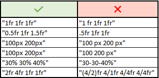
To understand the
gridTemplateAreasrefer to the illustration below: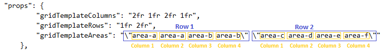
The above illustration results in the below layout.

Troubleshooting
If you are not able to get your desired output you might want to check a few aspects for troubleshooting:
Check if you have defined all the areas that you used in
gridTemplateAreas.Check if your division matches the rows and columns and if the grouping is correct.
Check if the values in
gridAreaused to define each area has the correct case sensitive names.Check if there are no spaces in
gridTemplateColumns:1fr, andgridTemplateRows:1fr 1fr, between the numeric and measure of proportion.Check for errors in the JSON using a JSON Parser. You can use the links here.