Combination Chart Widget
The Combination Chart widget supported in the AIMMS WebUI is a rich and flexible widget based on the so-called Highcharts offered by the Highsoft AS company, see https://www.highcharts.com/.
The Combination Chart widget can combine several chart types in a single chart widget, which explains the name of this widget and provides its power and flexibility. More specifically, this widget has been built upon the combination chart presented by the Highcharts platform at https://www.highcharts.com/docs/chart-and-series-types/combining-chart-types.
The formal widget type used for adding it to a WebUI page is called “combinationchart”. This type is only available in the Add Widget dialog on a page with a grid layout.
Note
The Combination Chart widget is supported only on the Grid pages and it is incompatible with the Classic pages. When a combination chart ends up on a page with classic layout (for instance, by copy and paste), then the widget becomes no longer usable and shows an incompatibility message. In order to use a combination chart, the page must first have a grid layout applied on it.
Converting other widget types to Combination Chart Widget
Since the Combination Chart widget offers more flexibility and options than the existing Bar, Line and BarLine chart widgets, we can imagine that you would like to replace your existing widgets with the new type. The WebUI offers you this possibility. Do the following steps to do so:
Open the options editor of the existing widget that you wish to convert;
On the ‘Change Type’ tab, you will notice a ‘Convert Type’ section at the bottom, with ‘combinationchart’ as an option to choose:
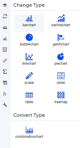
Click on ‘combinationchart’;
This will bring up a dialog that tells you what is about to happen. Click on ‘Continue’.
After these steps, your existing widget will have been replaced by a Combination Chart widget, complete with all the options from the existing widget which could be converted. Currently, a non-binary display domain cannot be converted yet and neither can aggregators (because these do not exist in the Combination Chart). The Combination Chart widget is present at the original position of the existing widget, with a numerical suffix in its name (because two different widgets may not have the same name).
As not all options have an equivalent in the Combination Chart, we have made sure that you have not lost your old widget. It is still present, with its original name, in the ‘Unassigned widgets’ area of your WebUI page. If you need to compare both, you can simply drag it onto an active area on your grid page to do so. If you are sure that the new widget is fully functional, you can delete the original one.
Note
It is only possible to convert widgets of type Bar, Line and BarLine chart, so only these widgets offer the option ‘Convert Type’ on the ‘Change Type’ tab. Also, the widgets must reside on a page with a grid layout in order to allow for conversion to a combination chart (otherwise, on a classic page, the ‘Convert Type’ option is greyed out and not applicable).
The Combination Chart
A combination chart can render data in your model by using a X/Y-plane and by displaying a dot or a column (vertical bar) on the Y-axis for each data point on the X-axis. The height of a column or a dot on the Y-axis equals the value of the rendered identifier for the corresponding data point.
The Combination Chart widget supports the following chart types: Area, Area Spline, Column, Line, Scatter, Spline. The user may specify one chart type from this collection for each identifier added to the widget contents.
The plain characteristics of the various chart types supported by the combination chart can be summarized as follows. The Column chart type represents data as vertical bars, also called columns. The Scatter chart type renders data as dots which are not connected to each other. By contrary, the Line chart type shows dots connected by straight line segments, while the Spline chart type connects all the dots by one smooth (curved) line function. When the chart also shows the area underneath the line or the spline, the corresponding chart type is called Area or Area Spline, respectively.
Below you can already find a glimpse of the chart types supported by the combination chart widget:
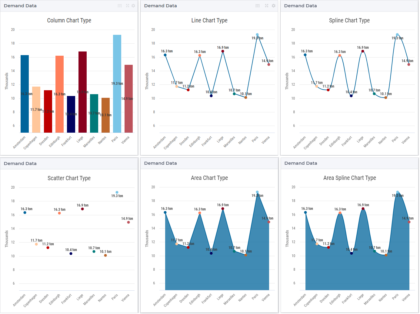
For example, in the TransNet application, the demand for products of every distribution center may be represented using any of the chart types, as already illustrated in the glimpse above. Similarly, the unit transport costs or the actual transport for every combination (factory, center) may be rendered using any of the chart types as well.
In this vein, note that the combination chart widget can now also be used to create a bar-line chart directly, for example, by assigning the chart type ‘Column’ to one identifier and the chart type ‘Line’ to another identifier. The sub-section Y-axis (Secondary) below presents such an example in more detail.
As will become clearer below, we use such concrete examples in many places of this section in order to illustrate as intuitively as possible the usage of the various chart features.
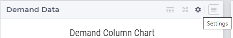
The chart’s options may be accessed and set through the options editor which opens upon clicking on the Settings cog-wheel in the widget header:
Besides literal (constant) values, most chart options may also be specified using identifiers declared in the AIMMS model.
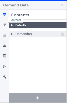
Contents
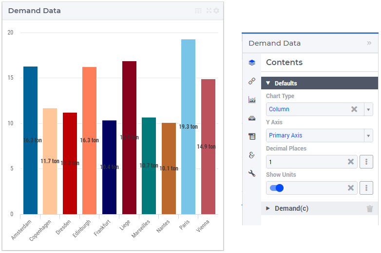
Firstly, a data identifier to be rendered in the combination chart has to be specified in the Contents tab of the widget’s options editor. An identifier may be added to the contents by using the “+” functionality at the bottom:
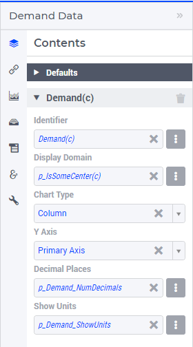
For each identifier added to the Contents tab the following settings can be specified:
the identifier name (as declared in the AIMMS model),
its display domain,
the chart type to be applied to this identifier,
the Y-axis (Primary or Secondary) to be applied to it,
the number of decimal places to be shown,
and the indicator for showing or hiding its units of measurement.
These values may be literal or given through identifiers present in the AIMMS model, as shown below:
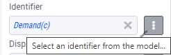
An AIMMS model identifier may be selected by using the icon on the right side of each option field:
Clicking on this icon opens an option dialog which allows to select the identifier itself as well as to specify some slicing which is to be applied to the identifier indexes:
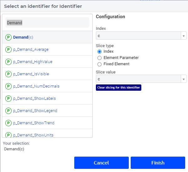
In the “Configuration” section of the option dialog shown above it is possible to slice one index to another index of a subset, to an element parameter, or to a fixed element in the corresponding set. For instance, we can slice our center index c to the fixed element ‘Amsterdam’ in the Centers set. Similarly, one could slice the index c to an element parameter CurrentCenter having the declared range the set Centers (where the value of CurrentCenter may be determined from within the model or by a choice made through another widget in the user interface). Clearly, each slicing specification will result in a different data view in the chart showing only the data points corresponding to those tuples (set element combinations) which are still valid according to current slicing. For a more detailed explanation, please refer to Widget Options > Indentifier Settings > Slicing.
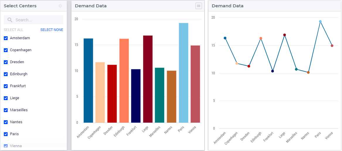
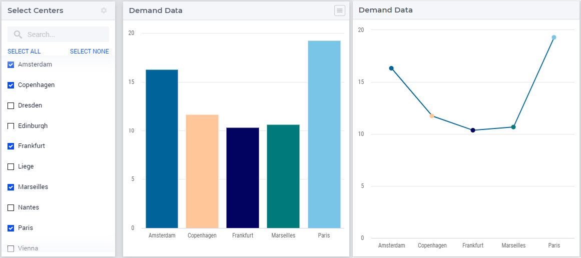
Moving on, in the “Display Domain” field of the identifier settings a constant or a model identifier may be specified as well. The combination chart will then only display data points for which the display condition is evaluated as true. In our example, if the indexed (binary) parameter p_IsSomeCenter(c) is specified as the display domain for Demand(c), then the combination chart only displays the demand values of the distribution centers c for which the parameter p_IsSomeCenter(c) is not 0. We can visualize this effect, for instance, by showing the values of p_IsSomeCenter(c) in a selection widget of type “multiselect” next to the combination chart which shows Demand(c) using ‘Column’ or ‘Line’ type:
Note
Please note that entering the constant value 1 as the display domain will result in a dense view of your data in the chart.
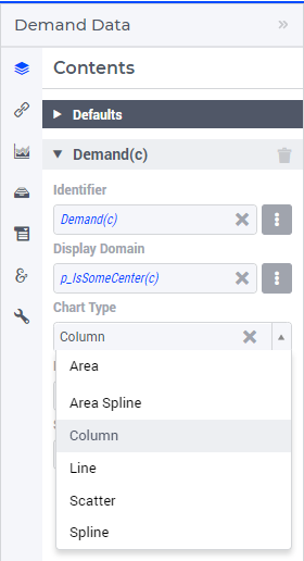
For each identifier in the Contents, the chart type to be applied to it can be specified in the “Chart Type” field of the identifier settings by choosing one type from the drop-down list:
Note
Many examples in this section use the ‘Column’ or the ‘Line’ chart type for illustration. However, the explanatory information is also valid for the other chart types, unless explicitly mentioned otherwise.
Next, in the “Y Axis” field under the identifier options one can select from the drop down list either the Primary Axis or the Secondary Axis as the Y axis on which the identifier values are rendered (for more info about the primary Y axis and the secondary Y axis please see the Chart Settings section below).
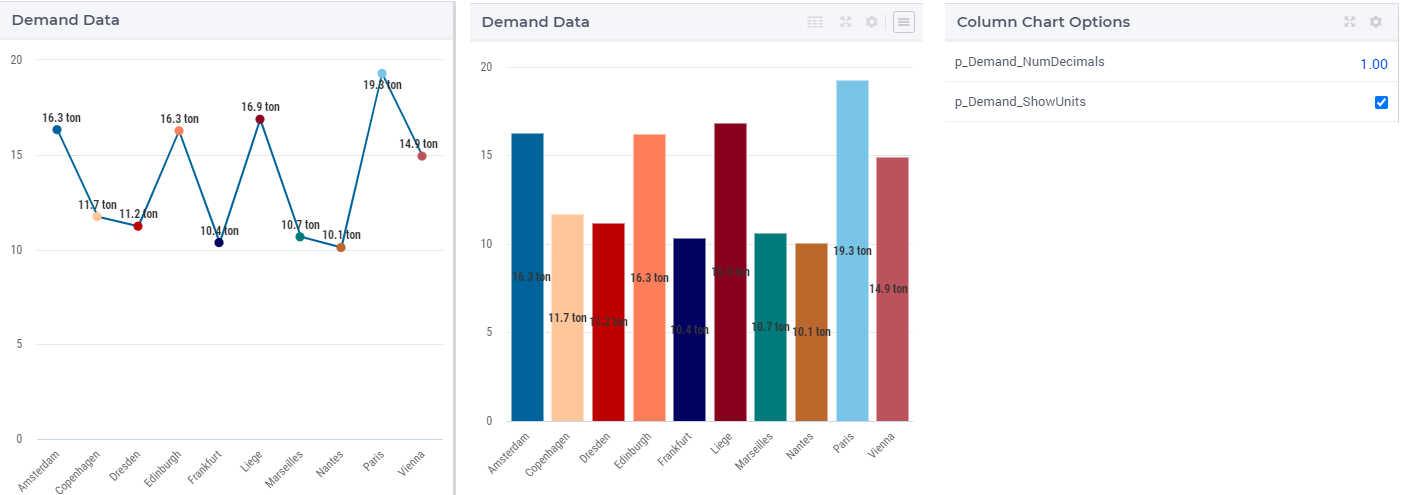
Finally, the number of decimal places and the indicator for showing/hiding the units of measurement may be specified in the corresponding fields of the identifier settings, as already shown above. Please note that either option needs to be resolved to a scalar value. So, in particular, it is not possible to specify an indexed identifier like p_NumDecimals(c) for the number of decimals. This means that you cannot show a different number of decimals for different data values which belong to the same identifier. These “per identifier” options are then reflected in the chart view provided that the data labels are toggled on (see more info about toggling labels in the Chart Settings section below):
Note that, if the chart type, the Y axis, the number of decimal places and/or the indicator for showing/hiding the units of measurement are not specified for a certain identifier, then the corresponding values from the Defaults section of the Contents tab will be inherited and applied to that identifier:
Each of these options can be specified explicitly per identifier or can be inherited from the Defaults section independently from the other options.
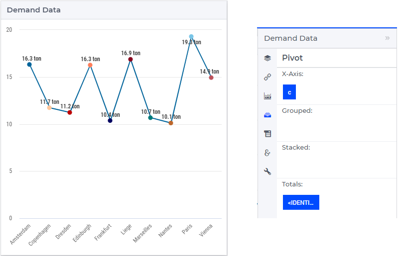
Pivoting
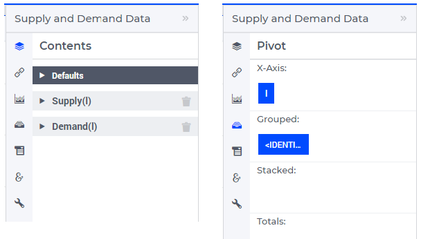
In the Pivot tab of the chart options editor, one can specify how the data dimensions are to be organized in the chart. The dimensions shown correspond to the union of the domain indices of the model identifiers that have been specified on the Contents tab.
A common pivoting situation is when the indexes of an identifier appear in the X-axis section as shown below for a chart with ‘Line’ type:
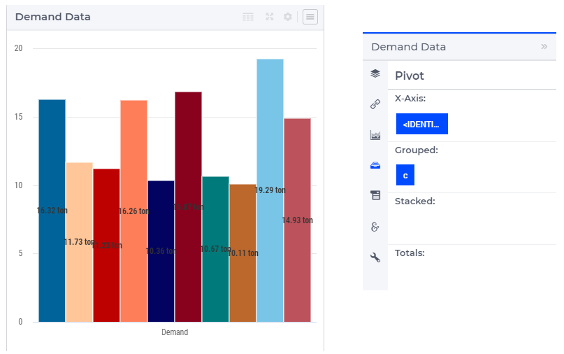
However, depending on the chart type and the identifiers to be shown, other pivoting may be chosen as well. For instance, if the <IDENTIFIER-SET> index is placed in the X-axis section while the center index c is moved to the Grouped section, then the resulting combination chart with ‘Column’ type looks like in the picture below on the left:
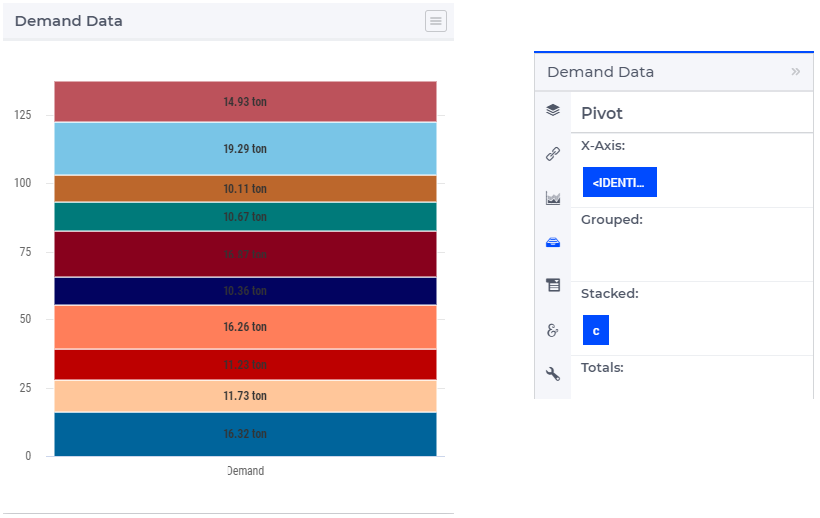
Similarly, one may move some data indexes in the Stacked section of the Pivot tab. In our example, moving the center index c to the Stacked section results in a column chart view as follows:
Typically, the identifiers which are put in a single chart will share the same (or at least have a very similar) index domain, but this is not mandatory. In case some index (that is present on the Pivot tab) is not present in the index domain of a certain contents identifier, the corresponding missing index is denoted with a dash (‘-’) character.
As already mentioned, the combination chart widget allows you to specify a chart type per identifier. In case you want to use several different chart types, the dimensions should be pivoted in such a way that, for each sequence of data points in the chart, the corresponding identifier can be uniquely determined. This means that, in case you want to mix different chart types, the <IDENTIFIER-SET> index should not be pivoted in the X-Axis or in the Totals section.
When the <IDENTIFIER-SET> index is put in the X-Axis section, the different data points in a single data series may correspond to different chart types. When the <IDENTIFIER-SET> index is put in the Totals section, each single data point is a total over multiple identifiers, each with their own chart type. In both cases, the chart type of the first identifier will be used.
Chart Settings
In the Chart Settings tab of the widget options editor there are several groups of options which may be specified:
Next, we discuss each of these option groups in turn.
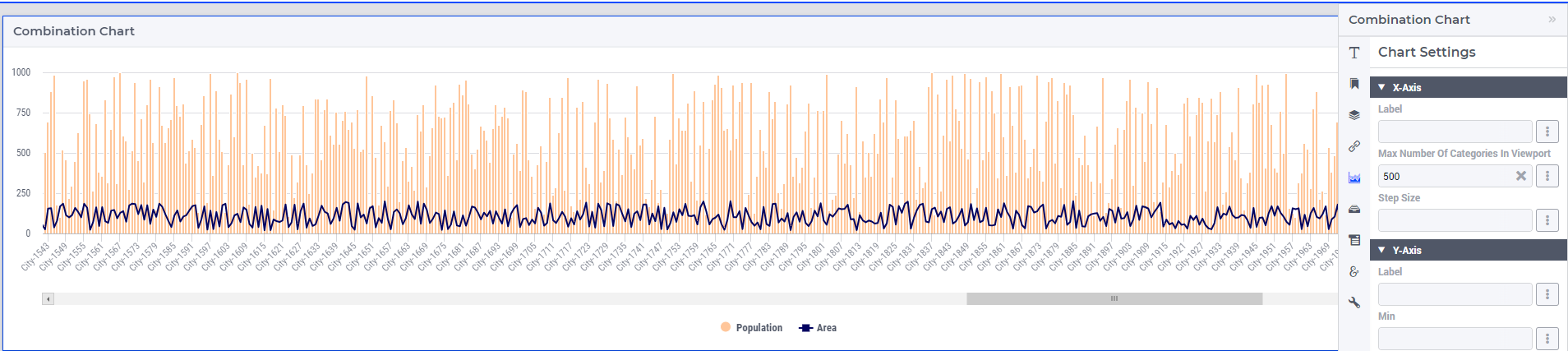
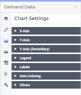
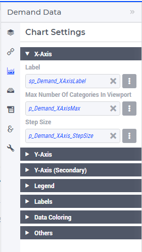
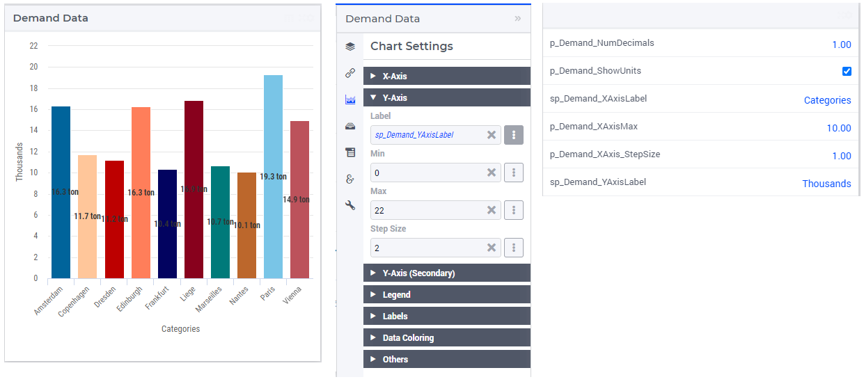
X-Axis
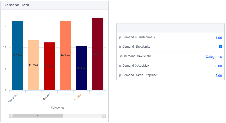
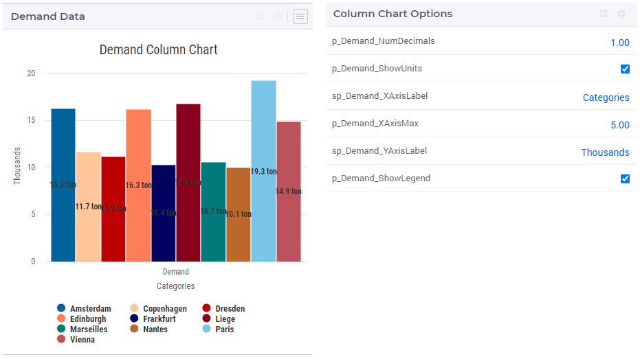
In the X-Axis group it is possible to specify the Label for the X-axis, the so-called “Maximum Number of Categories in Viewport” and the so-called “Step Size”:
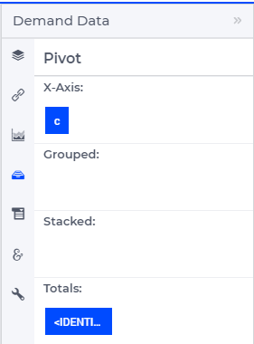
In order to illustrate the effect of these settings, assume for the time being that the Pivoting is adjusted as follows:
The Label value adds the corresponding text as label of the X-axis. The value of the “Maximum Number of Categories in the Viewport” specifies the maximum number of data tuples from the X-axis in the Pivot tab which are shown at a time in the chart. If there are more data points than this maximum number in viewport, then a horizontal scroll bar appears along the X-axis such that the user can scroll through all points. The value of the “Step Size” specifies for which data points the labels are shown on the X axis. For example, if this option is 2, then the label is shown for the first data point and then for every second data point in the sequence. These effects are illustrated in the following picture:
Y-Axis
In the Y-Axis group it is possible to specify values for the following options:
the Label for the Y-axis itself,
a minimum bound for the Y-axis,
a maximum bound for the Y-axis,
and a step size which determines the distance between the horizontal grid lines drawn in the chart.
These all may be constant literals or given by model identifiers, as illustrated here:
Y-Axis (Secondary)
Next to the Y-axis, it is possible to display a secondary Y-axis in your charts. This can be tremendously helpful in situations where the identifiers that you display are using a different order of magnitude in their values, and/or even completely unrelated units. A typical example of the latter case is a climate chart, which displays precipitation levels (usually expressed in millimeters) and temperatures (expressed in either degrees Celcius or Fahrenheit).
The secondary Y-axis has the same properties as the primary Y-axis has: Label, Min, Max and Step Size. For an example, see this climate chart:
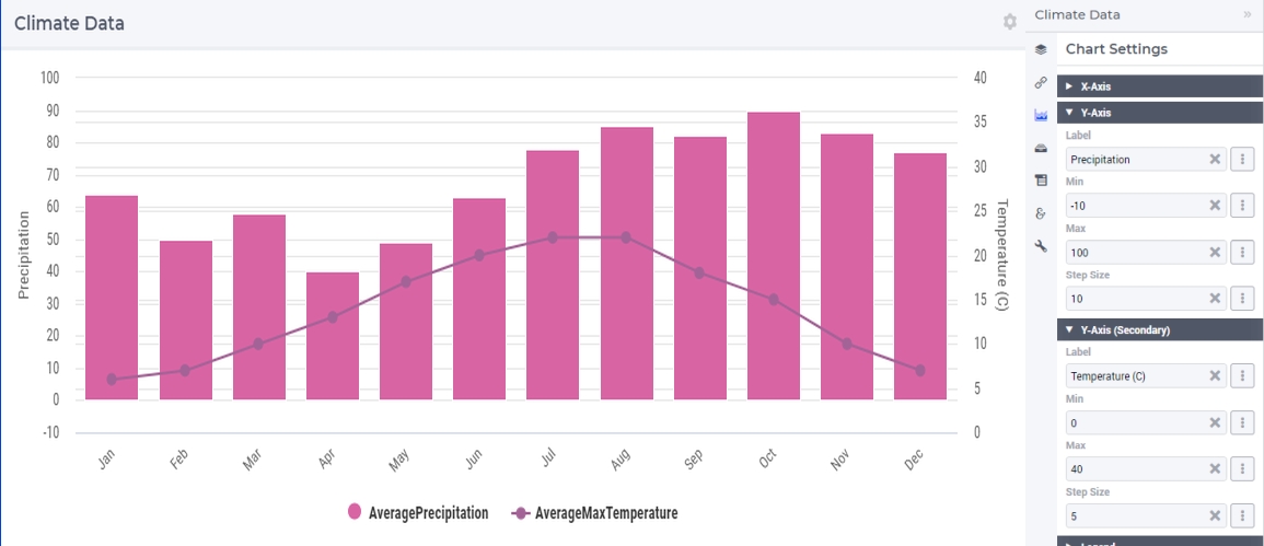
In this chart the line represents the temperature, as can be seen in the legend, and it follows the scaling of the secondary Y-axis.
In this climate data example it is rather obvious which identifier should be interpreted based on the values of which Y-axis. Imagine, however, a situation where you display more than two identifiers in the same chart. There is no third Y-axis.
For scenarios like this, we let you specify against which Y-axis the values of each identifier should be interpreted. This can be done with the Y-axis option, available for each identifier on the Contents tab.
Possible values for the option are ‘Primary’ (for the left axis) and ‘Secondary’ (for the right axis). If we would change the option for the temperature identifier in the previous example to ‘Primary’, this would be the result:
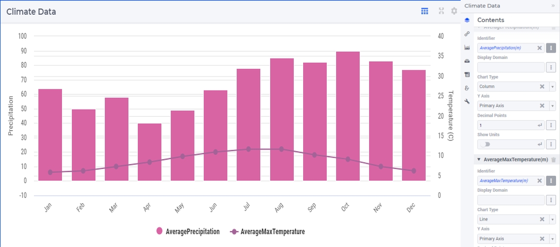
As you can see, the line is rendered lower than in the first chart, to plot the values against the primary Y-axis. This gives you a good idea about the effect of setting this Y-axis option, but, as mentioned, it is more useful in situations when displaying three or more identifiers in the same chart.
For the secondary Y-axis, the remarks above on the pivoting of indexes also apply.
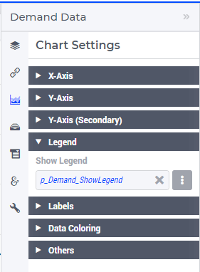
Legend
In the Legend group it is possible to specify an indicator whether to show or to hide the legend provided by the chart:
When the Legend is turned on, then it is displayed at the bottom of the chart, as illustrated below:
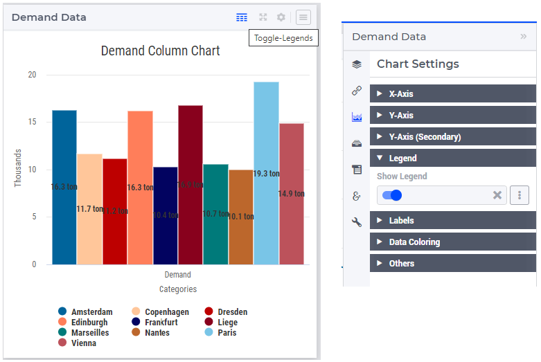
When the Legend option is not specified by a model identifier, but by the literal (binary) indicator instead, then the option of toggling the Legend on/off is also available through a dedicated icon on the widget header:
The Legend also offers the functionality to show or to hide some of the data values in the chart. More specifically, if you click on a legend label, you can hide the data values associated with that label and the label itself becomes greyed out. When clicking on it again, the label will be shown again with its own color and the data values will reappear in the chart. Note that one label may correspond to a single data value or to several data values (for example, all data values for one identifier), depending on the chosen pivoting of the indexes, as explained above.
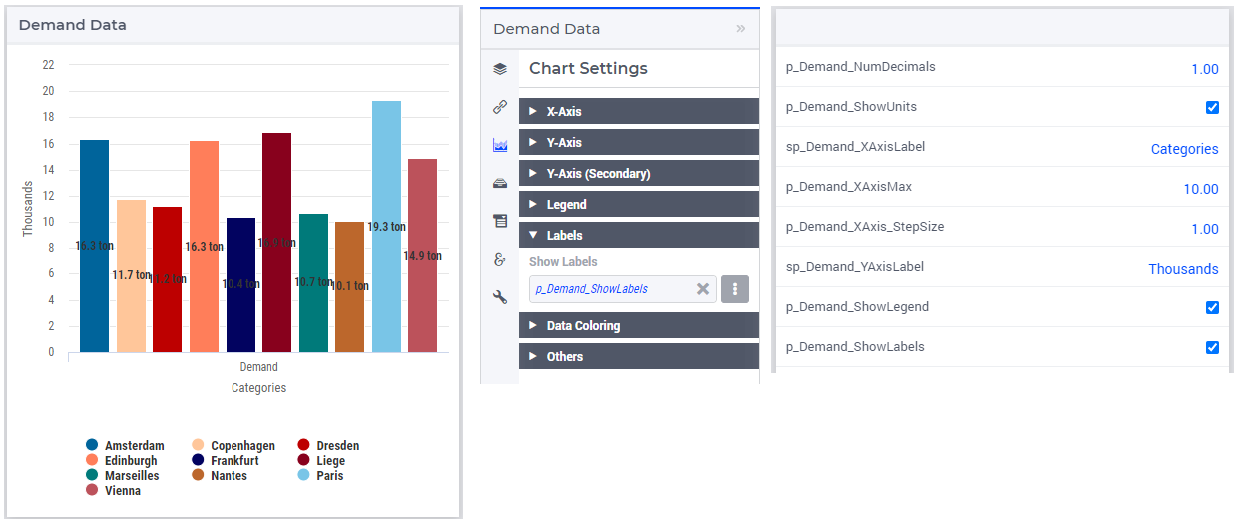
Labels
In the Labels section of the chart settings it is possible to specify an indicator whether to show or to hide the text labels of the rendered data values (columns or dots) in the chart :
Data Coloring
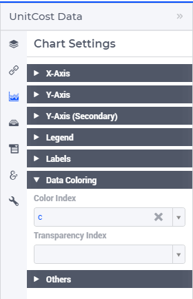
The Data Coloring section in the Chart Settings offers support for Color Index and for Transparency Index.
One of the indices can be specified as Color Index. This means that all data points will be colored based on the set element corresponding to the Color Index. For example, consider a chart that displays data for the identifier UnitCost(f,c). When specifying the f index as the Color Index, the chart element (e.g. the column) corresponding to UnitCost(‘London’,’Liege’) will be colored with the second color out of a 19 color palette as ‘London’ is the second element in the (root set of the) set Factories. Note that a modulo 19 operation will be applied to determine the color. As a result, the twentieth factory will have the same color as the first. Similarly, when specifying the c index as the Color Index, the chart element will use the sixth color out of the color palette as ‘Liege’ is the sixth element in the ‘Centers’ set.
If not specified explicitly, the combination chart will use the last index in the Grouped section as a Color Index. If there is no such index, the last index in the Stacked section will be used and if both the Grouped and Stacked sections are empty, the last index in the Header section is used as the Color Index.
In most cases, it makes sense to select an index in the Stacked or Grouped section as the color index, as indices in the Header section are already explicitly displayed in the chart (meaning there already is a way to visually distinguish between them).
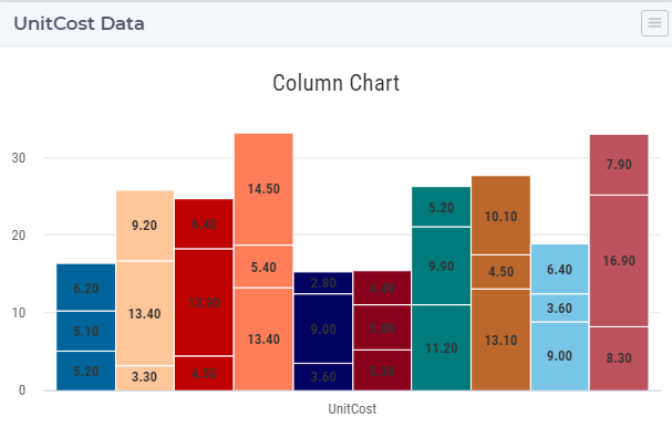
Consider a column chart with a single identifier UnitCost(f,c) in which the <IDENTIFIER-SET> index is in the Header group, the f index is in the Stacked group and the c index is in the Grouped group.
If you would specify the c index as the Color Index
in the resulting chart all Centers c will each have their own color:
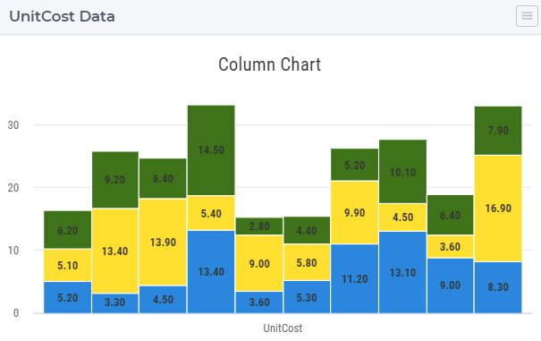
On the other hand, if in the same chart, you would specify the index f to be the Color Index, all (stacked) factories will each have their own color.
Selecting a Color Index will allow you (as an app developer) to help your end users view the data from the viewpoint of a specific dimension.
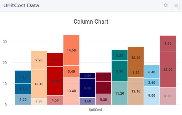
Only one of the indices in your chart will be used as the Color Index. In case your chart contains multiple indices, you may end up with duplication of colors for different elements. For instance, in the example (from the previous section) in which the c index was specified as the color index, you see that all three factories (which are stacked upon each other) have the same color. By specifying the f index as the Transparency Index, a transparency/shading pattern will be applied to each color depending on the ordinal number of the set element in the (root set of the) Factories set. The hard-coded transparency palette that is currently being used distinguishes 5 different levels of transparency. The resulting chart now looks like this:
To be able to see differences between colors in combination with transparency, it works best if the colors in the color palette are well distinguishable from each other. Therefore, you may want to create a special custom color palette (and provide it as an application specific resource) to be used in charts where also a Transparency Index has been specified.
Others
In the Others group it is possible to specify the Chart Title which will be shown on the top of the chart:
The illustration above also shows the possibility to specify a binary indicator value for turning on or off the so-called “Data Interpolate” option. This option is only applicable to the Line and Spline chart types and the meaning of it can be easily explained by the following example.
Suppose that we want to show the values of both Demand and Supply in the same chart using as common index domain on the X-axis the root set Locations with index l:
However, Supply only has values for the elements in the subset Factories (with index f), while Demand only has values for the elements in the subset Centers (with index c). If we showed these in the chart with the option “Data Interpolate” turned off, then the rendered values would look as follows:
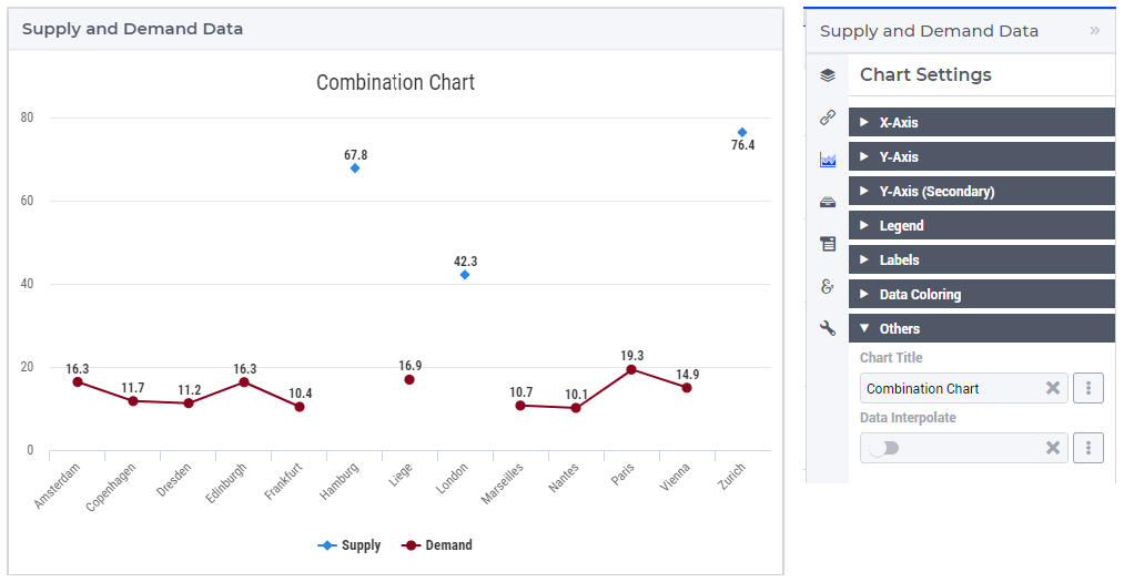
As can be seen in this picture, by default, the highcharts with type Line or Spline do not connect two consecutive value dots (that is, corresponding to two consecutive data points on the X-axis) if they do not represent data in the series of the same identifier (in this example, all identifiers are in the Grouped section of the Pivot tab, see above). This behavior may result in some discontinuity in the line chart for some identifiers, as it is obviously the case here for both Demand and Supply. Such a discontinuous graph may look unexpected and not consistent with the initial intention of showing several identifiers in the same combination chart with Line or Spline type. In order to draw a continuous graph for each identifier, the option “Data Interpolate” may be turned on. In this case, the dots representing data in the series of one identifier are connected one by one through a continuous line, skipping the dots in between which do not belong to that identifier:
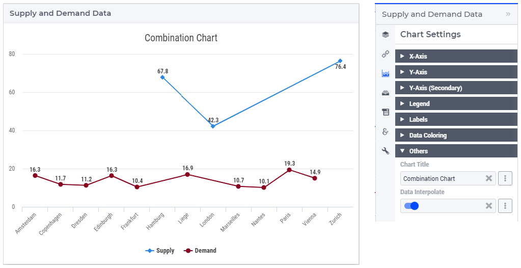
So, the option “Data Interpolate” may be literally “connecting the dots” for the same identifier when that identifier is missing data for some of the points on the X-axis. In this vein, another example of a possible use case for this chart option is when the set elements on the X-axis are timeslots in a calendar or have some other intrinsic ordering based on time, but some identifiers to be shown in the chart do not have data for all those time moments.
Note
Please note that, when you show aggregated totals in a chart (or any other widget), these totals always have a full domain, even in case the identifier that is aggregated over does not have a full domain (because, in AIMMS, the sum over an empty set is defined as 0). The resulting aggregation will be displayed in any widget as 0 for the entries outside the domain of the original identifier.
Index Settings, Select, and Store Focus
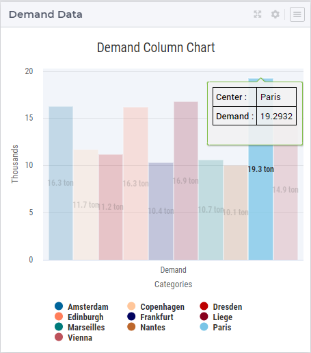
In the Index Settings tab of the widget options editor, for each index it is possible to specify an element parameter in the same set which will store the corresponding value when the user selects a specific column or dot in the chart (by clicking on it, in which case the color of the column or dot turns grey). For example, we can specify an element parameter ep_Center for the index c and en element parameter ep_Focusidentifier for the <IDENTIFIER-SET> index, where ep_Center and ep_Focusidentifier are element parameters in our application at hand with ranges the sets Centers and AllIdentifiers, respectively. The values of ep_Center and ep_Focusidentifier may be displayed for inspection in some other widgets outside the column chart:
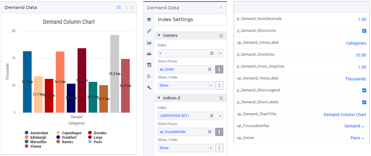
As can be noticed in the picture above, for each index it is also possible to specify an option whether to show or hide that index in the chart. If this option is set to the value ‘Hide’, then the corresponding index is not shown anywhere in the chart. More specifically, that index will be hidden in the labels, in the legend, and in the default tooltips.
Select, Hover, and Tooltips
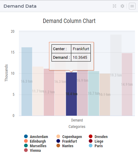
When the user selects a specific column or dot value, the corresponding center value is stored in the element parameter ep_Center as shown above. When the user hovers with the mouse cursor over a column or a dot (for example, before selecting it), then that column or dot is highlighted, while the other columns or dots are faded away. In this case, also a tooltip is shown, either a default tooltip or a custom tooltip specified using a webui::TooltipIdentifier annotation, see the section Identifier Annotations. The picture below depicts this situation:
When a column or a dot has been selected, the user may still hover over another column or dot and inspect the tooltip information, in the same way as the hovering works when no column or no dot has been selected:
As an additional remark, note that a selected column or dot may be unselected by clicking on it again. In this case, the stored value is not cleared off or emptied, only the highlighting is removed.
Custom Styling
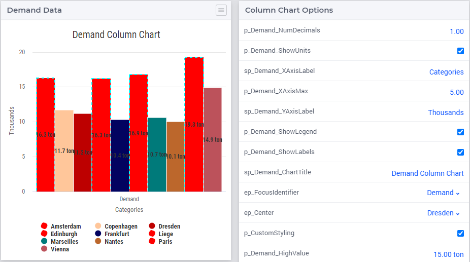
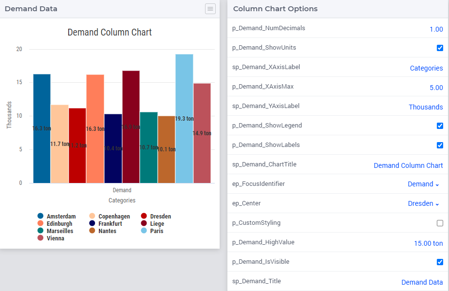
By specifying a webui::AnnotationsIdentifier as explain in the section Identifier Annotations and by using it subsequently for custom styling as explained in the section Custom Styling, it is possible to apply a custom styling to a combination chart as well. For instance, in our example application at hand one could style differently those columns in the chart which have a demand value greater than a certain threshold value given by a scalar parameter called p_Demand_HighValue. This situation is depicted in the following picture:
In case you want to use a custom color palette for your application, you can create a new CSS file, place the file in the MainProject\WebUI\resources\css folder, and populate it with something like
:root {
        --color_data-palette-19_1: red;
        --color_data-palette-19_2: orange;
        --color_data-palette-19_3: yellow;
        --color_data-palette-19_4: green;
        --color_data-palette-19_5: blue;
        ...
        --color_data-palette-19_19: #964B00;
}
Widget Extensions
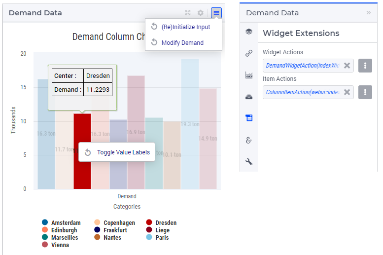
In the Widget Extensions tab of the widget options editor, it is possible to add the string parameters configured for the Widget Actions and the Item Actions for the widget. When these parameters are configured, then the widget actions may be accessed using the corresponding icon on the widget header or the item actions (for a selected column) may be called using the right-mouse click:
Miscellaneous
In the Miscellaneous tab of the combination chart options editor, other options may be set such as the title of the widget and a binary indicator whether or not the widget is visible on the page (besides literals, both may be specified using model identifiers as well):
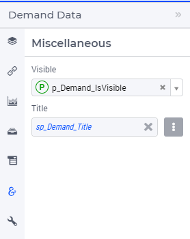
The specified chart title is then reflected on the widget header:
Developer Option for Threshold of Data Points
Starting from AIMMS 24.3 an option is available for the app developer to control the threshold of the number of data points shown by the combination chart.
This option is provided through the Application Specific Resource (ASR) file resources\javascript\webui-options.js.
If this file does not exist yet in the resources sub-folder, then it will be created automatically upon launching WebUI in developer mode.
Upon its automatic creation this file webui-options.js has by default some contents like the following:
// Configure the highcharts widgets data overload threshold limit
webui_highcharts_data_overload_threshold = 1000;
The option setting as shown in the example above means that any combination chart used in the WebUI will show in total at most 1000 data points (so, this option is applied to all combination chart widgets).
Note that, if a combination chart shows more than one identifier, then for that chart the total threshold set by this option is divided equally by the number of identifiers. For example, if this option is set to 1000 and a combination chart shows two identifiers (eg, with the same index domain, which is pivoted on the X-axis), then in that chart at most 500 points will be shown for each identifier.
The app developer has the possibility to change this option to a different value which is deemed more appropriate for the application at hand. When doing so, the app developer has the flexibility to experiment with various option values and eventually, to choose a setting which is appropriately balanced between accommodating the visualization needs of the application and at the same time supporting an acceptable behavior/performance of the combination chart widget, such that the chart does not get overloaded.
There is hardly any general option setting which would fit all situations. However, here are some recommendations and guidelines for best practices.
If the identifiers shown in any combination chart bear no associated customized information (such as annotations/CSS styling, special tooltips, or element text identifiers), then it is recommended to set this option to a value up to (around) 20000 data points.
If the identifiers shown in some combination chart do bear associated customized information, then the recommendation is to confine this threshold option to a value up to (around) 5000 data points.
In all situations when a large number of data points is to be displayed, it is recommended to set an appropriate value for the option “Maximum Number of Categories in Viewport” (and maybe also for the option “Step Size”) from the X-Axis group explained above. This option setting determines the maximum number of data points visible at a time in the viewport and, if necessary, it results in a horizontal scroll bar appearing along the X-axis such that the user can scroll through all the points, as illustrated in the picture below. It is recommended to set the “Maximum Number of Categories in Viewport” to a value up to (around) 500 data points.