List Widget
Important
The List Widget is available in software versions from AIMMS 4.74 onwards.
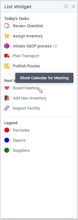
The List Widget allows you to show a generated list of (grouped) items and associate these with actions, if required. These items can e.g. represent a set of tasks, or a custom legend. Each group of items can have a title that is shown as a header. The items in the list can be interactive, meaning that some procedures can be configured to be executed upon clicking them.
The list widget is a versatile widget that can serve a number of different purposes. It is essentially a list of items consisting of an icon, a text and a procedure. The procedure is optional. The list can be subdivided with subtitles.
Creating a List Widget
The List widget can be added to a page using the same steps as for any other widget, see adding a new widget. After adding the list widget in the Widget Manager, you can click on its Settings wheel in order to configure it.
In the settings options editor, the following sections are available:
List Settings: List Groups and the List Group Items can be configured here.
Widget Actions: Widget Actions for the list widget can be configured here.
Miscellaneous: Title and Visibility can be controlled here.
Advanced: Advanced options for this widget are available here.
To configure list groups and their items in the widget you will need to create two string parameters. The first string parameter will configure the list groups with titles and tooltips, whereas the second string parameter will configure the items for each of these list groups.
Configuring List Groups
For illustration, let’s call the first string parameter
MyListsGroups(webui::indexListGroupOrder,webui::indexListGroupSpec)
This string parameter is indexed by the ExtensionOrder set with the index indexListGroupOrder and the ListGroupSpecification set with the index indexListGroupSpec. It is used to define the number of list groups, their respective titles and their tooltips. The values of this string parameter may be initialized in the Initial Data attribute, in a procedure or manually, by right clicking it in the AIMMS Model Explorer and clicking on the Data option in order to open its data page. There you can add the details for the list groups, their titles and their tooltips:
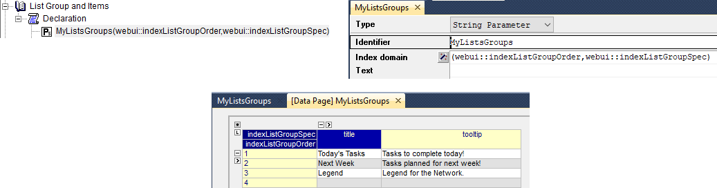
The values in the example above indicate that there are 3 list groups.
Configuring Items for Lists
Create the second string parameter, let’s call it
MyListGroupItems(webui::indexListGroupOrder,webui::indexNoOfListItems,webui::indexListGroupItemsSpec)
indexed over both indices of the ExtensionOrder set and over the index of the ListGroupItemsSpecification set. It is used to define the items for all list groups which have been defined in the MyListsGroups string parameter.

Note
The indices must follow the same order as described in the string parameter
MyListGroupItems(webui::indexListGroupOrder,webui::indexNoOfListItems,webui::indexListGroupItemsSpec)
There is no limit for the number of items each list group may have. As a guideline, AIMMS recommends no more than ten items per list group.
In order to inspect the values, right click on the MyListGroupItems string parameter and click on the Data option in order to open its Data page:
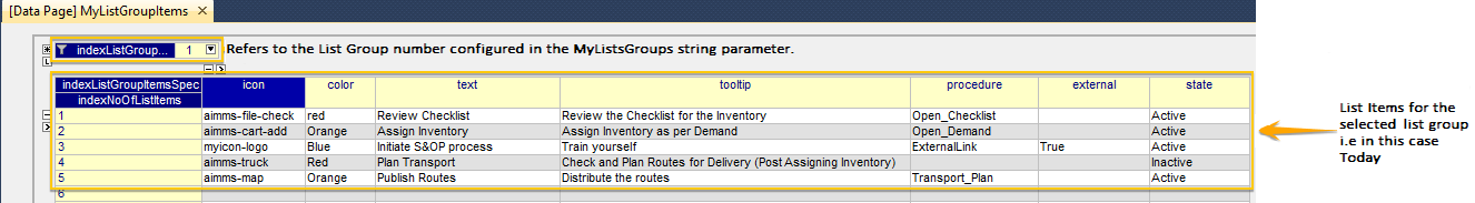
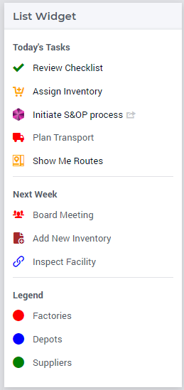
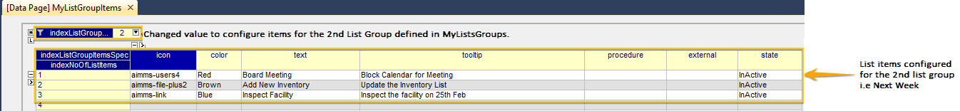
The data entered in the above illustration is for the first List Group which was configured in the MyListsGroups string parameter, that is, the “Today” list group (with five items defined).
In order to configure the items for the other list groups, you can just select the respective value for indexListGroupOrder at the top in the Data page.
For instance, 3 items can be configured for the 2nd list group “Next Week” as follows:
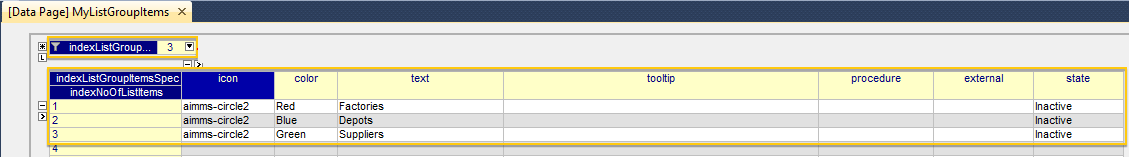
Similarly, an example of configuring 3 items for the 3rd list group “Legend” is illustrated here:
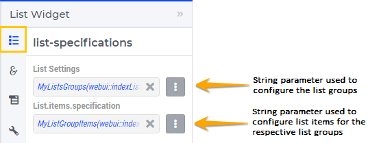
Configuring the string parameters in the List Widget
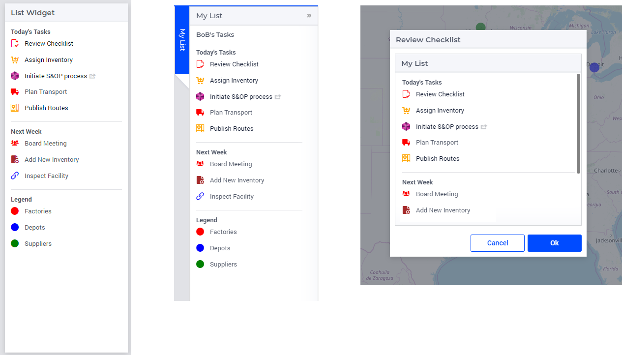
To display the configured List Groups and their respective items in the list widget, click on the widget settings and add the configured string parameters to the respective fields as illustrated below:
Once the string parameters are added in their respective fields, the items will appear under their respective list groups.
If the list groups and items exceed the widget’s height, a scroll bar will appear.
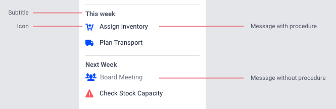
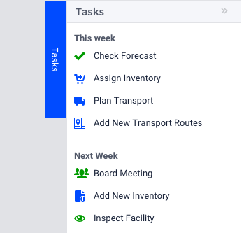
For list group items that are configured with a procedure and state “Active”, the text will be highlighted in blue and the cursor will change to a pointer indicating to the user that an action can be executed, when the user hovers over it.
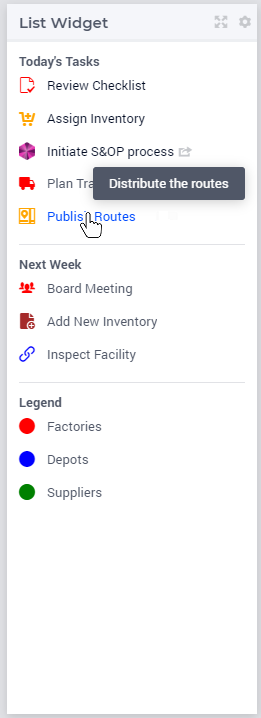
For list group items that are configured with a procedure and state “Inactive”, the text will be grey, the cursor does not change and clicking will not execute the procedure.
The list widget can be added on all page types (i.e. Regular pages, Side Panels and Dialog Pages).
Slicing the List Group and List Group Items
You can also create lists for different users and then slice the data based on the current user. You can simply extend the string parameter with an additional index of the Users set and then slice the data based on the element parameter for the selected user.
Let’s say we have a set Users with the index indexUsers. You can add this index to the MyListsGroups and the MyListGroupItems string parameters as illustrated below.
MyListsGroups(indexUsers,webui::indexListGroupOrder,webui::indexListGroupSpec)
MyListGroupItems(indexUsers,webui::indexListGroupOrder,webui::indexNoOfListItems,webui::indexListGroupItemsSpec)
You can then slice these string parameters on indexUsers with an element parameter that determines the current user.
Note
It is currently not possible to slice on the key indices, i.e. webui::indexListGroupOrder, webui::indexNoOfListItems, webui::indexListGroupSpec and webui::indexListGroupItemsSpec defined in the string parameters.
Examples of usage of the List Widget
Use as a task-list
Users may need to keep eyes on a number of different applications. Having a to-do list for various applications in one place helps them tame the chaos.
Users may also have periodically repeating tasks that happen every quarter, month or week. Having these to-dos in one list creates a cadence of tasks that makes it easier to maintain them.
Since a to-do list is usually something users do not need to see all the time, a sidepanel will be the most obvious place for it.
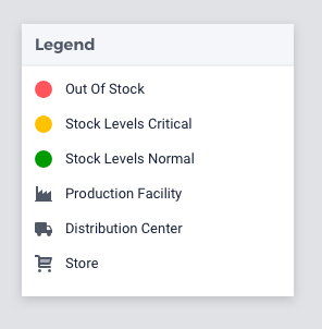
Use as a legend
With the introduction of icons and colored nodes, much data can be displayed on a map. For example:
Icons indicate the type of asset, like Distribution Center, Production Facility and Stores.
Color could indicates stock levels, like green for “in stock” and red for “out of stock”.
Node sizes to indicate the volumes in a product flow.
To easily understand this information, users need a good legend. This is an important use case for the list widget.
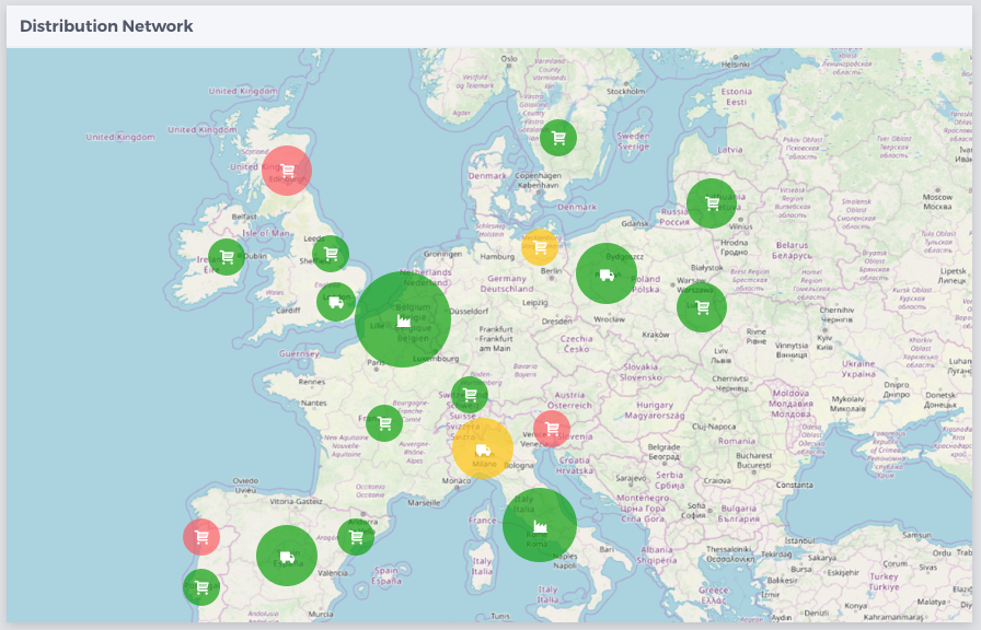
Creating a legend for icons is straightforward: just use the appropriate icon and text. Making a legend for colors can be done by using a circle icon (aimms-circle2) and give it the right color.
Often one type of visualization is used per information category. For example, icons represent a type of asset and colors represent stock levels. Using two types (both a color and an icon to visualize a type of asset) can be useful if:
Users need to scan a map very quickly.
Better accessibility for users with colorblindness is needed.
Be aware however that using multiple types of visualization for the same information may be confusing to users. Green and red for example have strong connotations with positive and negative and using these colors for type of asset may cause users to read meaning where there is none.
Additional Features Support
Note
Starting with the WebUI 25.4 release, the List widget now supports two new features: Store Focus and Annotations.
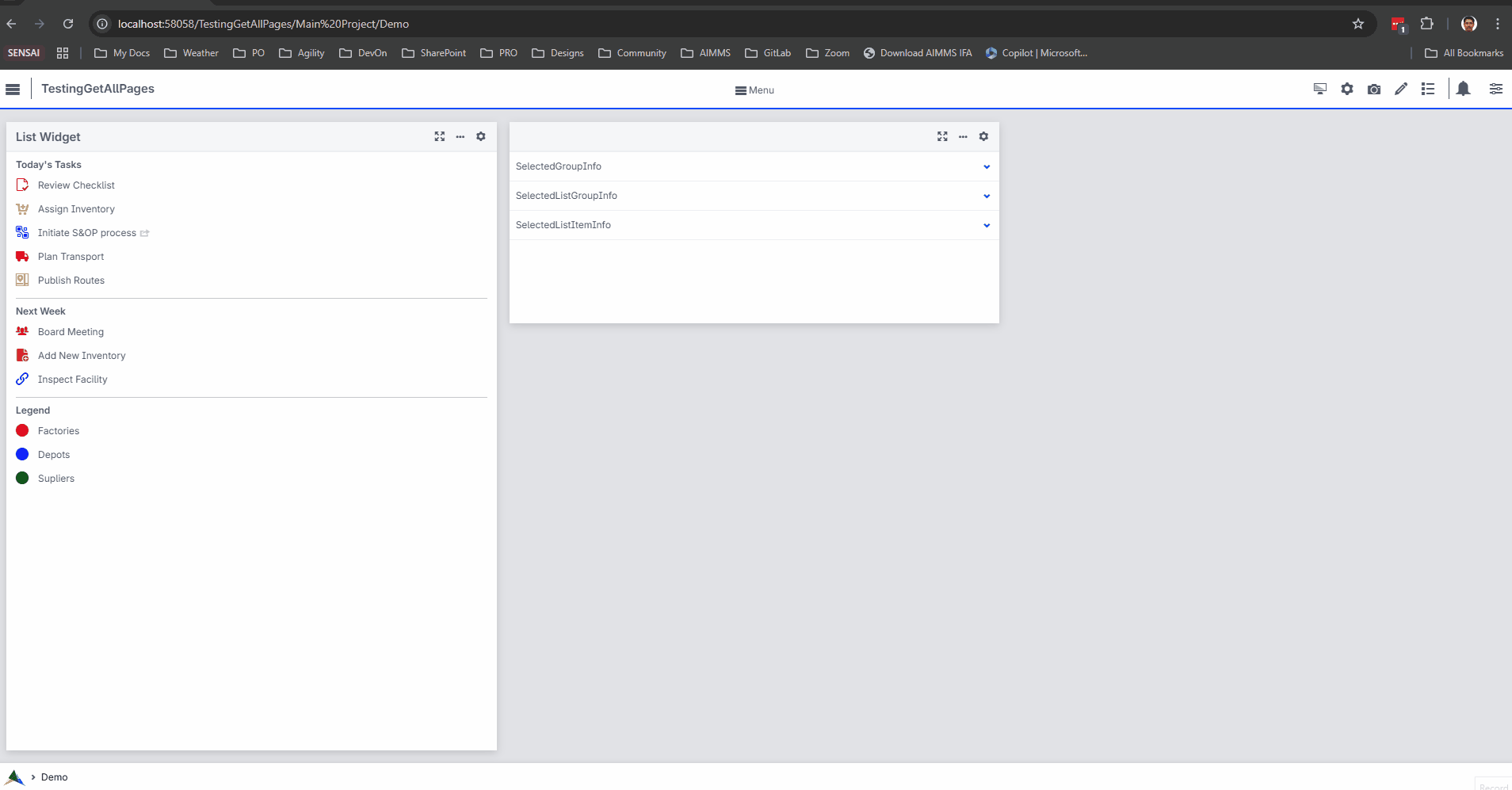
Store Focus Support
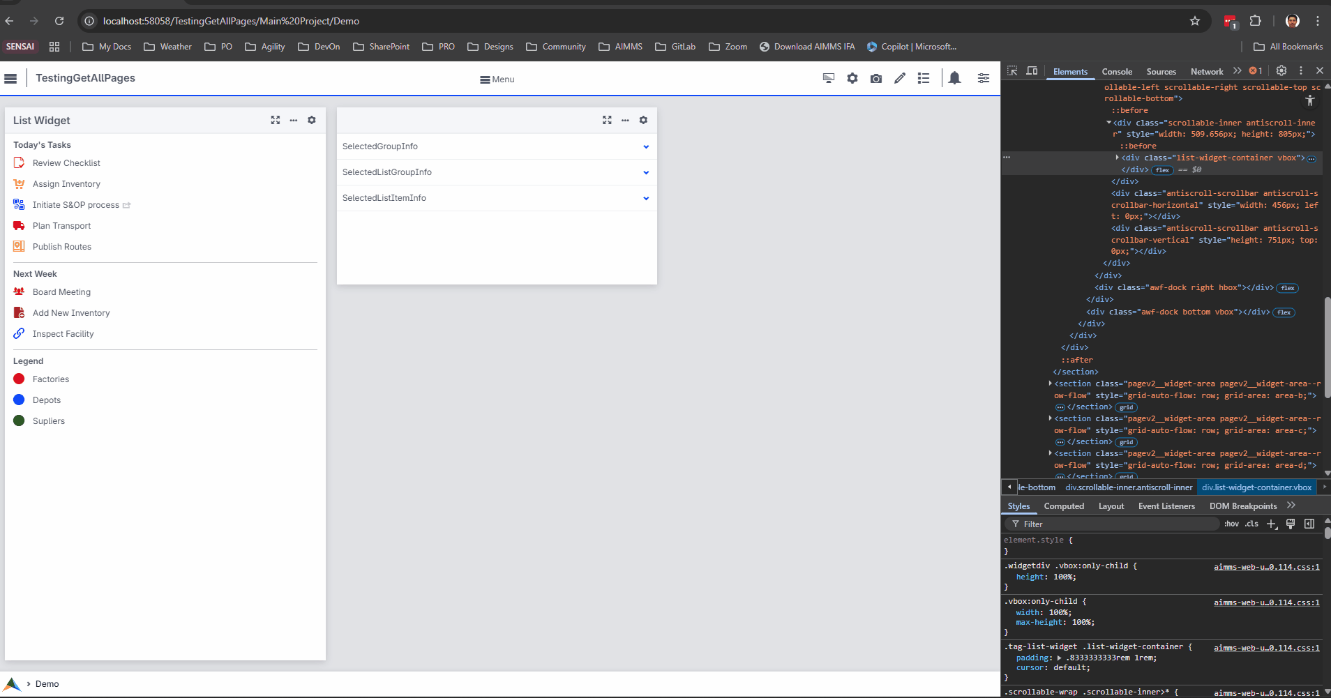
The List widget now allows capturing user interactions by clicking on a list group header or an individual list item. When a user interacts with these elements, the corresponding information is stored and can be used to create interactive UIs or drive application logic.
Watch this video for a walkthrough of how to configure Store-Focus and see it in action.
Note
The Store Focus feature enables capturing data from user interactions on the UI. However, changes made directly to the associated element parameter (programmatically or through other means) do not reflect back on the UI.
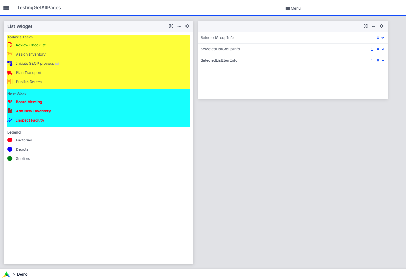
Annotations Support
In addition to the data specified for display, you can now attach annotations to both list group headers and list items. These annotations can be used to dynamically style or otherwise enhance the UI based on custom logic or conditions.
Watch this video for a walkthrough on configuring annotations and their effect on UI behavior.
Here is an example of styling List widget items using annotations and following custom CSS:
.annotation-TestAnnotation-GH-1 {
        background-color: yellow;
}

.annotation-TestAnnotation-GH-2 {
        background-color: aqua;
}

.annotation-listitemAnnotation-G1-I1 .list-display-text{
        color:green;
}

.annotation-listitemAnnotation-G2-I1 .list-display-text,
.annotation-listitemAnnotation-G2-I2 .list-display-text,
.annotation-listitemAnnotation-G2-I3 .list-display-text
{
        color:red;
        font-weight: bold;
}
A few best practices on using icons/colors
Using many different colors for icons can make the List Widget too busy and increase the user’s cognitive load.
Be sparse with colors: consider if it is needed to give an icon a different color. When in doubt, it is probably wise to remember the saying “less is more” and keep colors the same.
Colors can be used to create categories, for example to-do items with an action required are blue. The number of colors that work well on screens and can easily be differentiated by users is limited however. With more than about ten colors the differences become hard to distinguish.
Colors can communicate meaning, like green for OK and red for error. One of the most common forms of color blindness is red-green color blindness. It is therefore good practice to not rely on color only to communicate meaning, but shape as well, like a check mark or a warning-triangle.
Avoid using colors with not enough contrast. This makes it hard to see for users, especially when using a lower-quality screen or a projector.
When using different colors for icons, try to use a harmonious set of colors with matching lightness/saturation. This makes the interface calmer and helps users feel in control. This website has useful sets of colors that work together.