Status Bar
Important
Status Bar is available in software versions from AIMMS 4.70 onwards.
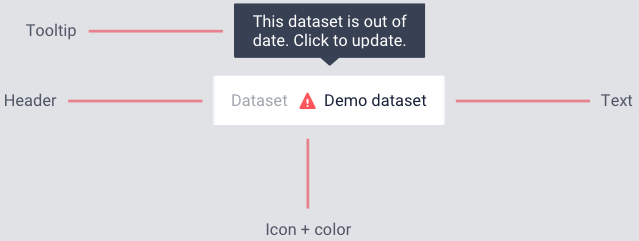
The Status Bar is used to display custom messages i.e status messages, like the dataset that is currently in use or the connection status to a database to users. The Status Bar is displayed in the footer across the application, on all pages. These status messages can be updated when necessary or as required.

A status message typically has a header or title, an icon with a color and the actual message. A tooltip is display when the user hovers over the message, if configured.

A procedure can also be configured for each status message such that it is executed when the user clicks on the specific message. Texts in messages with a procedure is slightly darker and blue on hover.
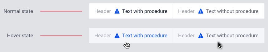
If a procedure is configured for a status message, when the user hovers over the message the text is highlighted in blue and the pointer changes to indicate to the user that they can click and execute a procedure.

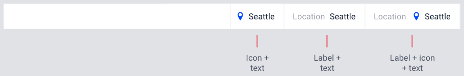
Variants are also possible, e.g. a text and an icon but no header, a header and text without icon, or even only a text. In general, it is good advice to make status messages short and concise and only use elements that add value to the user. For example, when displaying relatively abstract terms (like supply or utilization rate) it might be difficult to find an appropriate icon. If it does not add extra information anyway, it is probably better to leave out the icon.
Messages in the Status Bar can be configured by the application developer via the AIMMS model and defined in the Application Settings under the Application Extensions section.
A new section, StatusBar Support, has been defined in the AIMMS WebUI system library to configure the Status Bar and the messages.
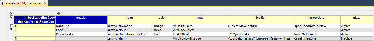
StatusBarSpecification - This set is used to configure messages in the Status Bar. The attributes of this set are the following:
header- The Header/Title text you want to display for the status message. This is an optional field. If left empty, no value is displayed.icon- The icon you want to associate with the message. You can select from a list of 1600+ icons, the reference can be found in the icon list. Custom icons can also be used if required. This is an optional field and if left empty, no icon will be displayed.color- The color you want to display for the icon configured, e.g., Blue, Red, etc. Browsers support around 140 color names. This is an optional field. You can also use Hex codes e.g., #FF0000 for Red.text- The text you want to display for the status message. This is a required field.tooltip- The text to be displayed when the user hovers over the status message. This is an optional field and if left empty, no tooltip is displayed.procedure- The procedure you want to execute when the respective status message is clicked. This is an optional field.state- This property holds three values, Active (displayed and clickable if procedure is configured), Inactive (displayed and not clickable) and Hidden (not displayed). By default, the state is Hidden. This is an optional field and if left empty, the state is hidden.
Configuring messages in the Status Bar
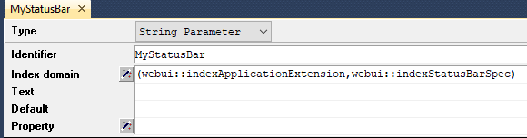
Create a string parameter indexed by the ExtensionOrder and StatusBarSpecification. Let’s call this MyStatusBar(webui::indexApplicationExtension,webui::indexStatusBarSpec). Right click the string parameter and click on the Data option to open the data page. Add the details for the status messages you would like to display. For example:
In the illustrated example, we have defined four status messages. We display the Active and Inactive actions.
The status messages are added to the right hand side of the footer. Each new message is added to the right, shifting the existing messages to the left. There is no limit to the number of status messages that you can configure. AIMMS recommends not more than seven. The footer is divided into two sections with 30% width for the Breadcrumb on the left and 70% for the Status Bar. When the messages exceed the allocated space, the header is first displayed with an ellipsis. If the messages still cannot fit, the text of the message is also displayed with an ellipsis. When too many messages are added, only the icon will be displayed for each message.
Configuring Status Bar in the Application Settings
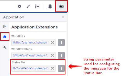
To enable the Status Bar, click on the Application Extension icon  of the Application Settings and add the configured string parameter to the Status Bar field as illustrated below:
Once the string parameter is added, the Status Bar is displayed with the configured status messages, in the footer of the application.
How to define a different Status Bar per page
You may want to have a different status bar depending on the page your user is visiting.
The Status Bar can be configured to display different messages on each page of the application
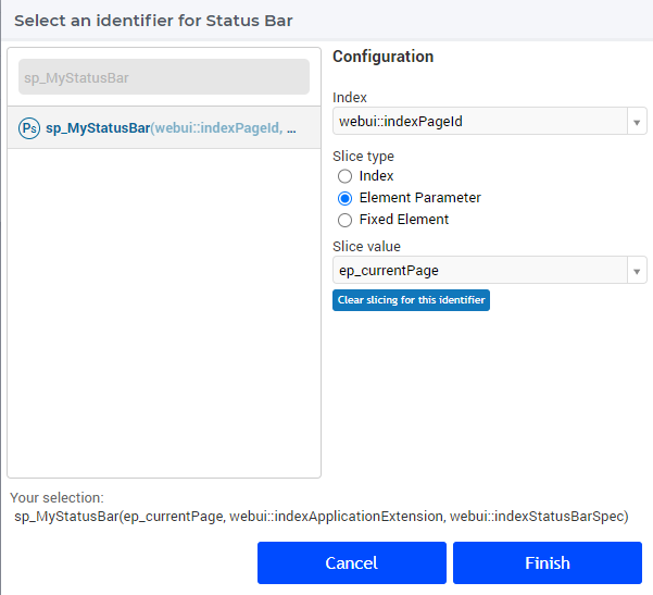
by indexing the string parameter sp_MyStatusBar over the index of the webui::AllPageIDs set
sp_MyStatusBar(webui::indexPageId,webui::indexApplicationExtension,webui::indexStatusBarSpec).
add the
webui::indexPageIdto the index domain of the status bar string parameter (sp_MyStatusBarin our case)enable the experimental feature “webui state support”
define an
ep_currentPageelement parameter such that
ElementParameter ep_currentPage {
  Range: webui::AllRegularPages;
  Definition: webui::CurrentPageId(webui::LastActiveWebUITab);
}
Choose to slice
sp_MyStatusBaronep_currentPagewhen configuring the application settings
You may now define, for each page, the data to be displayed. You’ll have to explicitly define every page you want each message to appear. All the pages that were not explicitly defined in the string parameter will not display any message on the Status Bar.
Some best practices on using icons/colors
Icons can be given a color, but if no color is given icons will be dark grey (#898989).
Using many different colors for icons can make the Status Bar to busy and increase cognitive load.
It’s not advisable to use icons as an illustration of what is already written. For example, when the header says “Transport” using an icon of a truck. This doubles information without delivering extra value to users.
Colors can communicate meaning, like green for OK and red for error. One of the most common forms of color blindness is red-green color blindness. It is therefore good practice to not rely on color only to communicate meaning, but shape as well like a check mark or warning-triangle.
Avoid using colors with not enough contrast. This makes it hard to see for users, especially when using a lower-quality screen or a projector.
When using different colors for icons, try to use a harmonious set of colors with matching lightness/saturation. This makes the interface calmer and helps users feel in control. This website has useful sets of colors that work together.
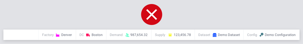
Too many and meaningless colors.
Icons try to illustrate the word.
Icons used that do not add value.
Colors not harmonious.
Colors too light.
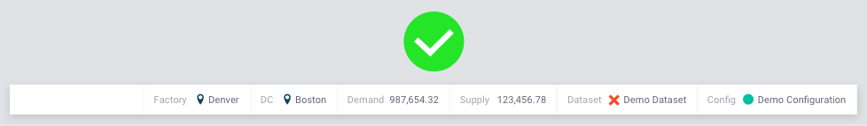
Neutral, harmonious coloring.
Neutral icons, not trying to be an illustration of the word.
Color conveys meaning: red for out of date data.
Icons convey meaning: cross for out of date data. Using both shape and color means better accessibility for colorblind people.
No icon used when it does not add value.