Navigation Menu Bar Settings
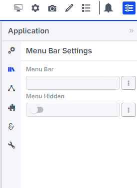
Menu Bar
indexWorkflowOrder and by the MenuBarSpecification set with the index indexMenuBarSpec, such as NavigationMenuBar(webui::indexWorkflowOrder, webui::indexMenuBarSpec). This string parameter defines the items to be displayed in the Navigation Menu Bar, including the display text, page link, nesting structure, state, and other details as outlined in the MenuBarSpecification.MenuBarSpecification attributes are as follows:
displayText- The link text shown for the item in the Navigation Menu Bar. This attribute is mandatory, each menu item must have a displayText defined. If it is missing, a validation error will occur.pageId- This represents the unique Id of the WebUI page that will be navigated to when the menu item is clicked. ThepageIdis case-sensitive. You can identify the unique Id’s of the existing WebUI pages by accessingwebui::AllRegularPagesidentifier data. Just likedisplayText, this is a required field for each menu item.tooltip- The tooltip text that appears when the user hovers over the menu item. If not specified, no tooltip will be shown.parentPageId- Enables creation of nested menu structures by linking child items under a common parent. To define a child menu item, specify the pageId of its parent as the value of parentPageId.state- Controls the visibility and interactivity of the link: Active (visible and clickable), Inactive (visible but not clickable, greyed out), or Hidden (not shown, default). If this attribute is not specified or contains an invalid value, the item defaults to Hidden.
Important
It’s important not to confuse the name of the page with the page’s unique Id.
Regardless of the Page Visibility option, it does not determine whether a page appears in the Navigation Menu Bar. Only the State attribute from the MenuBarSpecification is used for this purpose.
Note
The Navigation Menu Bar is automatically closed whenever the data of its associated identifier is updated.
Configuration Validation and Error Messages
Below are examples of configuration issues and the corresponding error messages generated by WebUI:
Missing both
displayTextandpageId:“Both Name and PageId must be specified for a menu item.”
Missing
displayText:“The Display text field is empty for the menu item with PageId ‘{menu-item-pageId}’.”
Missing
pageId:“The PageId field is empty for the menu item with Name ‘{menu-item-displayText}’.”
Invalid
pageIdorparentPageId(not referencing a valid page type):“The PageId ‘{menu-item-pageId}’ is not a valid type. Only ‘page’ or ‘page-v2-grid’ are valid page types for a menu item.”“The ParentPageId ‘{menu-item-ParentPageId }’ is not a valid type. Only ‘page’ or ‘page-v2-grid’ are valid page types for a menu item.”Duplicate
pageIdvalues across menu items:“The PageId ‘{menu-item-pageId}’ is duplicated.”
Invalid
parentPageId(not defined as a menu item):“The ParentPageId ‘{menu-item-ParentPageId}’ is not defined as a menu item in the list.”
Circular nesting caused by
parentPageId:“The ParentPageId ‘{menu-item-ParentPageId}’ results in an infinite loop.”
General Guidelines
To ensure a user-friendly and intuitive experience, it’s recommended to keep the Navigation Menu Bar simple and well-structured:
Avoid overcrowding the menu with too many page links. Include only the most relevant and frequently accessed pages.
Use nested menu items sparingly. Deep nesting can make navigation harder to follow and may overwhelm users.
Group related pages logically under clear, concise parent items.
Ensure that menu labels are meaningful and consistent with the content of the linked pages.
A clean and focused menu structure enhances usability and makes it easier for users to find what they need quickly.