Tabbed Widget
Important
Data Setup
webui::indexNoOfTabs and SidePanelSpecification set with webui::indexTabSpec indices.TabbedWidgetContents(webui::indexNoOfTabs,webui::indexTabSpec).Note
When creating the string parameter to configure tabs, the first index needs to be in a subset of integers. You can create your subset of integers and use the respective index as well. To make it convenient you can use the index from the pre-declared set ExtensionOrder for this purpose i.e. indexNoOfTabs.

This data input gets presented as below on the widget.

Note
Tabs are presented horizontally, following the same order from left to right as they are arranged in the data of the string parameter.
Case sensitivity applies to the mapping of the pageIds.
Only tabs linked to regular pages of grid-layout type are loaded. Other page types and incorrect
pageIdvalues will not be displayed.Case insensitivity applies to the mapping of the state. Only tabs with active and inactive states are displayed within the widget. Inactive tabs are shown but appear greyed out and are non-interactive.
Any state other than “active” and “inactive” is considered hidden, and tabs with such states are not shown on the widget.
When a tab is open in the widget and if the
displayText,tooltip,icon, oriconcolorare changed or updated, the currently selected tab remains active. Only when thepageIdorstateare changed or updated, then the first active tab in the data is selected.
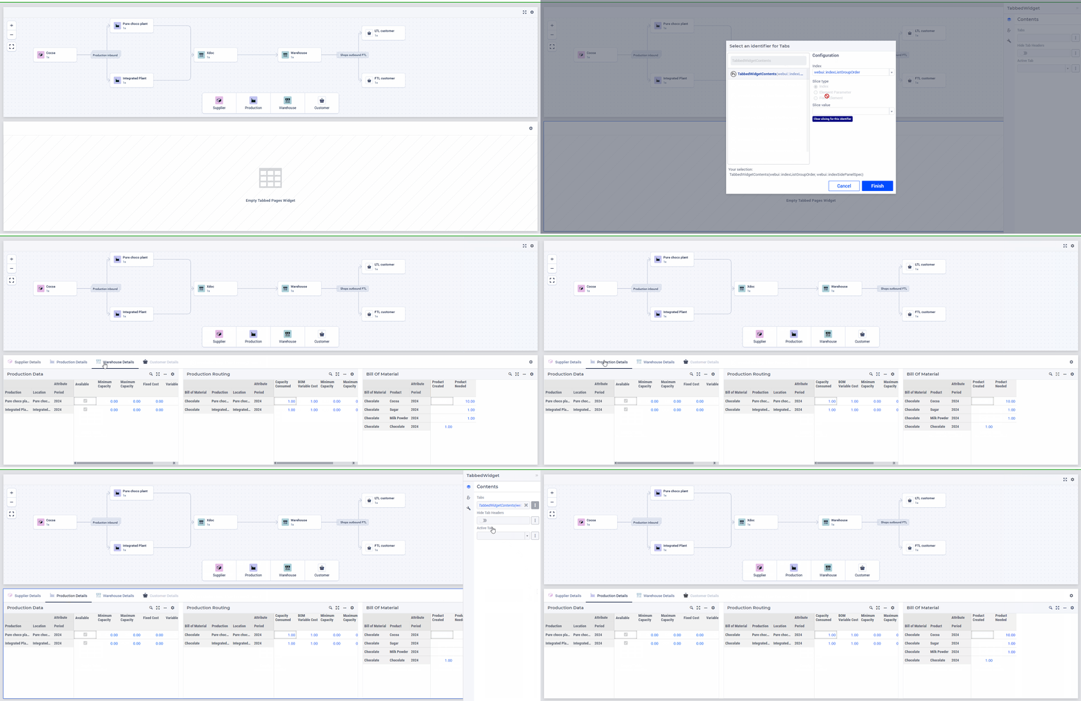
Configuring the string parameter on the widget
Tabs option.
Note
While the linked page is displayed within a tab of this Tabbed widget, please note that the page and its widgets will be confined to the viewable area of the Tabbed widget. For optimal display, we recommend placing this Tabbed widget in a wider and larger widget area.
This Tabbed widget can be placed on a regular page, in a Sidepanel, or on Dialog pages.
There is no limitation on the number of Tabbed widgets that can be placed on a page.
If the current page is configured as a tab within this widget, clicking on such a tab will display an appropriate error message.
Nested Tabbed widgets are not supported. If a Tabbed widget is configured to be displayed within a tab on a page, an appropriate error message will be displayed to handle this scenario.
Interacting with Tabs

Note
If all Tabs are either in an inactive or hidden state, a banner with the appropriate error message will be shown.
Special Settings
The Tabbed widget type includes several settings that enhance content presentation.
Within the Contents option editor tab, you will find several settings that improve data presentation. Here are the details.
- Hide Tab Headers:
- While the Tabbed widget typically displays horizontal Tabs, you have the option to hide all tab headers.By default, the tab headers are shown. However, you can choose to hide them by toggling this boolean switch or using a scalar binary parameter.If you set the UI Editable application option to 0 and show a Tabbed widget with such hidden tab headers on a PRO environment, you will not see an empty row at the top of the widget (which would normally show the cogwheel to change the widget settings) anymore. This increases the available area for displaying the widgets within the Tabbed widget a bit.
- Active Tab:
- By default, when the Tabbed widget is loaded, the first active tab is automatically selected, displaying the relevant content below. It is beneficial to control which tab is selected by default upon loading, as well as to know which tab the user has brought into focus.The “Active Tab” option lists the display text of the configured tabs, allowing you to choose one to be selected upon page load.Alternatively, you can control this through the model by selecting a scalar Element Parameter that ranges over
webui::AllRegularPagesor a subset of it. The tab is selected based on the pageId mapping from this element parameter. If the scalar Element Parameter’s value corresponds to an invalid or an inactive tab, an error message will be shown in a banner. If the value is empty, the first active tab in the list will be selected.When a scalar Element Parameter is configured, it is updated with information about the tab that the user has focused on.
Note
Each WebUI page can have its own Page-Upon-Load and Page-Upon-Leave options configured. When a page linked to a tab is selected and brought into focus, the configured Page-Upon-Load procedure for that page will be executed.
Currently, the Page-Upon-Leave procedure for the page linked to a tab is not executed. Support for this feature will be added in a future version.
Any Page Actions configured for a page used as a tab within this widget type will be ignored and not rendered within the tab.